The network for creativity
Join 1.25M professional creatives like you
Connect with clients, get discovered, and run your business 100% commission-free
Creatives on Contra have earned over $150M and we are just getting started
Back to feedPost
Most products feel inconsistent because decisions are made in isolation.
When design, copy, and flow don’t share the same intent, users feel it immediately.
Good products feel coherent because every decision points in one direction.
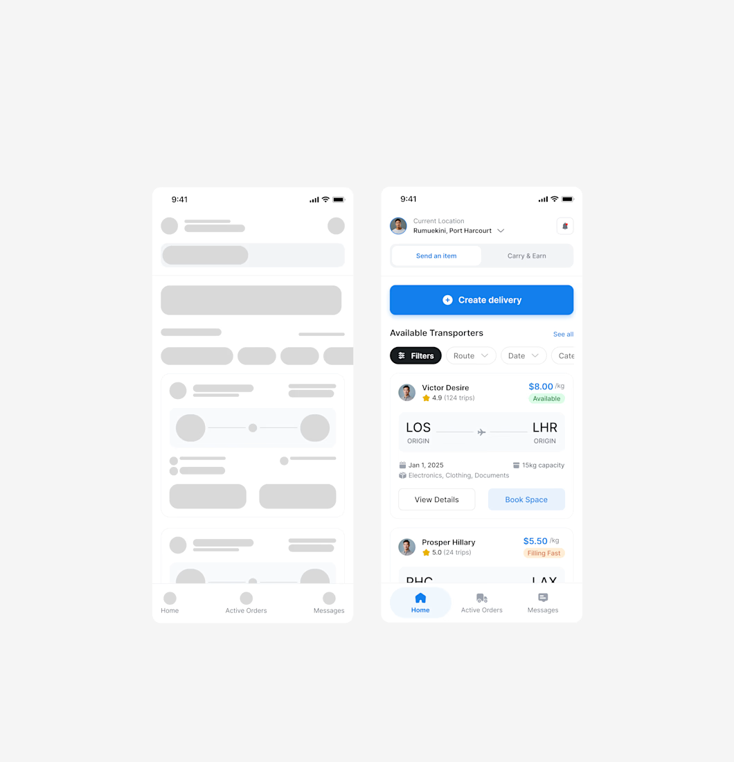

Great point! How are you making sure everythink is cohesive?

It starts from the design, Good product design reduces the need for handoffs in the first place. It creates shared understanding early, defines intent clearly, and aligns everyone around the same user outcome.
The network for creativity
Join 1.25M professional creatives like you
Connect with clients, get discovered, and run your business 100% commission-free
Creatives on Contra have earned over $150M and we are just getting started





Related posts

A cleaner dashboard can sometimes be a slower dashboard.
Especially when it's designed for people who work with complex information every day.
Imagine a financial analyst reviewing hundreds of transactions.
They need to compare data, identify exceptions, apply filters, and move between different records throughout the day.
Now imagine simplifying that interface by hiding most of the information behind expandable sections, secondary menus, and separate pages.
The result might look considerably cleaner.
But the analyst now needs more interactions to access information that was previously available at a glance.
And when those actions are repeated dozens of times a day, the difference becomes significant.
This is something I find particularly interesting about designing for experienced users.
There's a distinction between an interface that's unnecessarily complicated and one that supports genuinely complex work.
Data density isn't automatically a usability problem.
Neither are advanced controls, detailed tables, or multiple pieces of information displayed together.
Sometimes they're exactly what makes a professional tool efficient.
Of course, that doesn't justify cluttered interfaces or poorly organized information.
The challenge is understanding what needs to remain visible, what can be progressively disclosed, and where customization or saved views might help different users work more effectively.
A first-time user may benefit from additional guidance and a more focused experience.
Someone who has been using the product every day for years may value direct access, shortcuts, and the ability to work without unnecessary interruptions.
Both perspectives matter.
But designing for experts means understanding their workflows well enough to know which complexity serves a purpose.
Sometimes simplifying an experience isn't about removing information.
It's about removing the effort required to work with it.

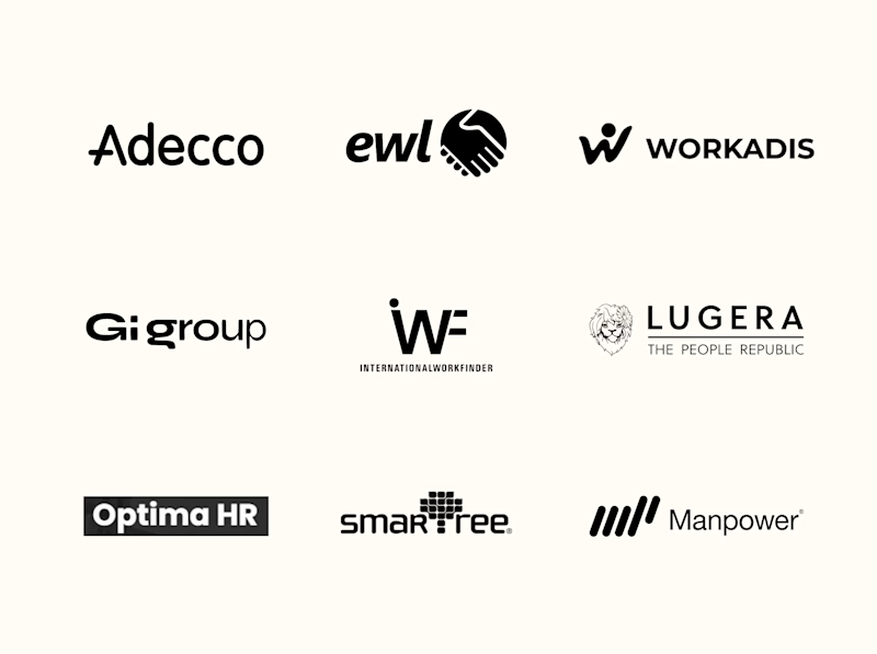
Standing apart doesn't always mean looking unconventional. It means knowing where to be different.
For Tandem, the challenge was building an identity that felt confident, dependable and approachable without looking like every other workforce management company.
We built that distinction through four key decisions:
1. Naming: Tandem. Simple, memorable and rooted in partnership.
2. Logo: Free from predictable workforce symbols and category clichés.
3. Visual & Motion Language: Bringing businesses and workers together to create momentum.
4. Brand Voice: Confident, dependable and approachable.
While much of the category focuses on workforce scale, Tandem positions itself as a trusted operational partner.
Which would you choose? Familiar market conventions or Tandem's point of view?
3 votes
Ends in 1d

What if your design had to solve a problem before it got to look good?
Today’s exploration: a manta ray, retro terminal code, one line. “A little chaos looks good on you.”
My process: understand the problem first, design second.
Your outcome: a brand people get in seconds.