The network for creativity
Join 1.25M professional creatives like you
Connect with clients, get discovered, and run your business 100% commission-free
Creatives on Contra have earned over $150M and we are just getting started
Back to feedPost


designed the "luxe marketplace" for an e-commerce client.
the idea: shopping for the ultra wealthy shouldn't feel transactional.
The network for creativity
Join 1.25M professional creatives like you
Connect with clients, get discovered, and run your business 100% commission-free
Creatives on Contra have earned over $150M and we are just getting started

Challenges
View all


Related posts

Luxury Lighting E-commerce Website Design for Modern Home Decor
A modern luxury lighting e-commerce website concept crafted to showcase premium statement pieces through a refined, immersive, and editorial-inspired digital experience. The design combines warm ambient lighting, bold typography, cinematic imagery, and clean minimalist layouts to create a sophisticated online presence for a high-end home decor brand. Every element is thoughtfully designed to enhance product storytelling, improve user engagement, and deliver a seamless shopping experience across all devices.


really nice design


Amazing work


A good product page doesn’t just show the product — it makes the buying decision easier.
I recently worked on this Collagen Peptides eCommerce PDP concept, focusing on the areas that can directly influence conversion:
→ Clear product benefits above the fold
→ 1, 2 & 3-pack options to support higher AOV
→ Subscribe & Save for retention
→ Strong social proof
→ Easy-to-scan product information
→ Shipping, guarantee & secure checkout signals
→ Clear Add to Cart experience
→ Responsive UX across desktop, tablet & mobile
Every section has a job: reduce friction, answer objections, build trust, and move the customer closer to purchase.
This is the kind of thinking I bring to every eCommerce product page I design.
UI/UX + CRO + eCommerce Strategy. 🚀
#eCommerce #CRO #Shopify #ProductPage #UIUX #WebDesign


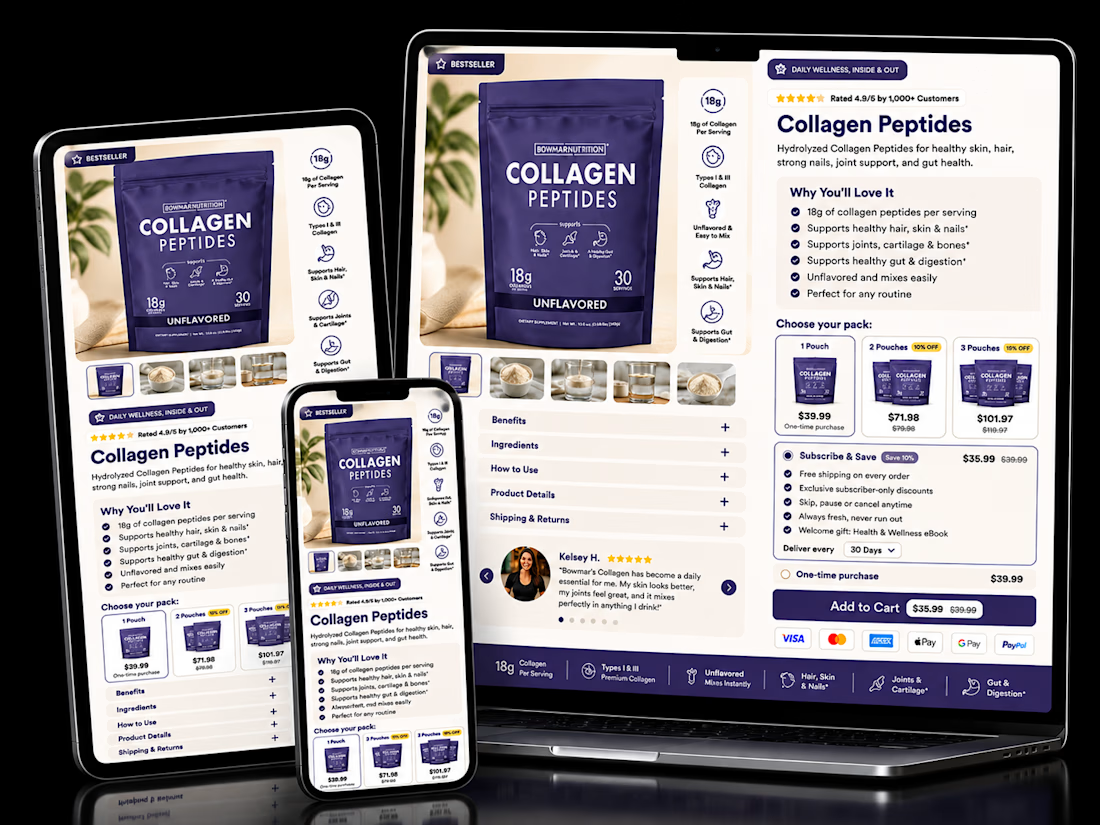

The pack-size tiers sitting right next to Subscribe & Save is the right order. Anyone already comparing 1, 2 or 3-pack is primed to pick a cadence too, so showing both choices together nudges toward the higher-LTV option without it feeling like an upsell.