The network for creativity
Join 1.25M professional creatives like you
Connect with clients, get discovered, and run your business 100% commission-free
Creatives on Contra have earned over $150M and we are just getting started
Back to feedPost

Is your website working for you or just sitting there?
A beautiful website is great. But a website that converts visitors into partners is a business asset.
I’ve spent years helping brands/ agencies bridge the gap between looking good and performing well. Whether it’s a high-stakes relaunch or a strategic brand refresh, my focus is always on three things:
Precision: Following your brand guidelines to the pixel.
Performance: Ensuring fast loads and seamless mobile responsiveness.
Purpose: Designing every section to lead the user toward a specific goal.
If you’re looking for a collaborator who treats your deadlines as sacred and your brand vision as the blueprint, let’s talk.
Ready to elevate your digital presence? DM me RELAUNCH or drop a comment below, and let's see if we’re a fit for your next big move.

looks fantastic 👌
The network for creativity
Join 1.25M professional creatives like you
Connect with clients, get discovered, and run your business 100% commission-free
Creatives on Contra have earned over $150M and we are just getting started







Related posts

Created the complete brand identity for Nerada, a natural tea brand — developing the visual direction and design elements that shape how the brand looks and feels across every touchpoint. The goal was a clean, organic aesthetic that reflects the brand's natural positioning and builds a consistent, recognizable identity.


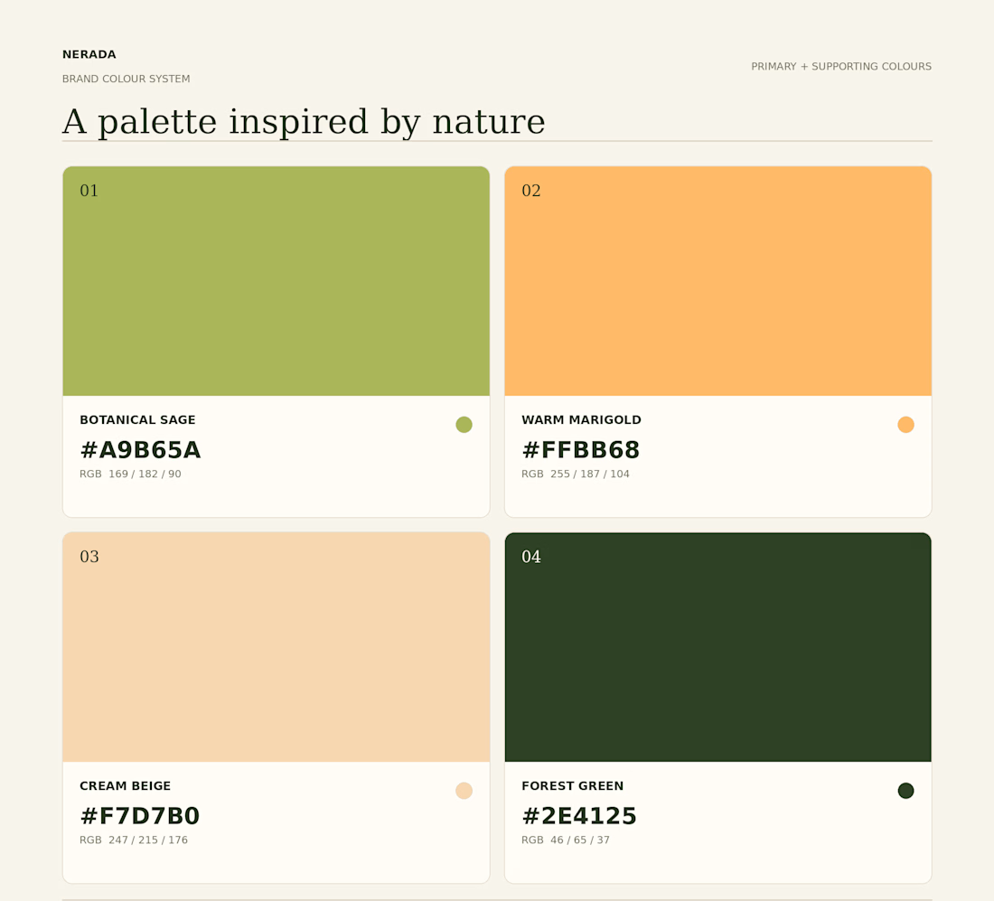
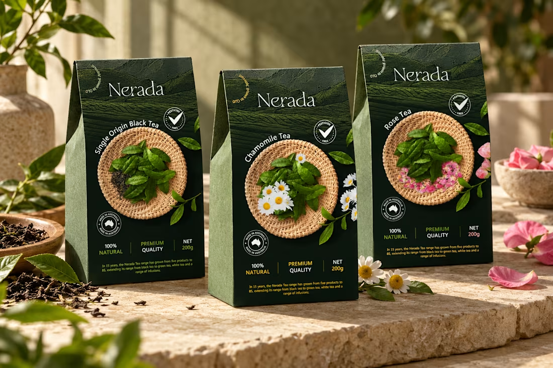
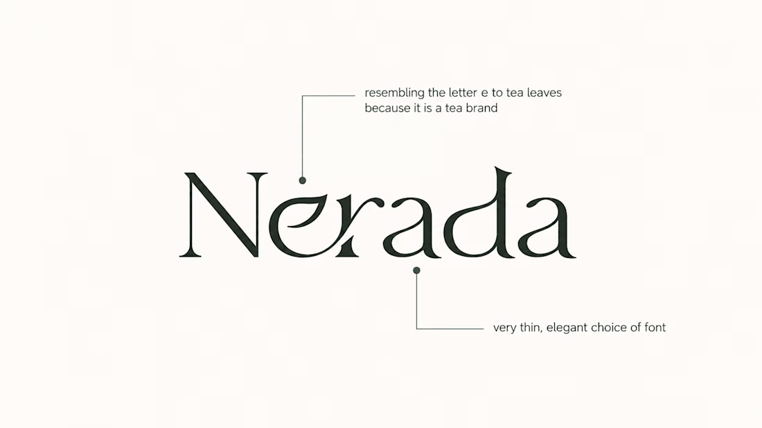


The mark feels grown rather than drawn, which is exactly right for a natural tea brand. Packaging is where tea brands win or lose. Does the identity change tone across blends, or stay one voice with different colours?

I built this project to test Pixel studio with a playable COIN DASH arcade cab. Spriteworks is a tiny studio making pixel-perfect games with heart. Play our catalogue, meet the team of two, and press start. The core engineering challenge was sustaining uncompromised 60 FPS rendering using Canvas2D while handling continuous user interaction without framework overhead.
WHAT I WAS TESTING:
I focused on two core engineering benchmarks:
Precision implementation of pixel art under continuous interactive user input
Sustained 60 FPS render performance and zero-dependency browser execution
THE TECHNICAL SIDE:
Engineered directly in the browser with Canvas2D, Pixel art. The application runs without third-party frameworks or build-step dependencies, using hardware-accelerated rendering and custom event loops to achieve zero-latency response.
Everything executes in the browser using Canvas2D, Pixel art. No third-party frameworks, no heavy runtime bundles, and zero external tracking.
WHAT I LEARNED:
Balancing the mathematical rigors of pixel art with tactile browser interaction required tuning event throttling and memory allocation to eliminate all garbage collection stutters.
Finding the sweet spot between mathematical precision and frame budget took careful profiling, but the result runs at a steady 60 FPS even on modest hardware.
TRY IT YOURSELF:
The live build is deployed on my JSFiddle. Open it in your browser, test the controls, and observe the render response times.
If you are building high-performance 3D, physics, or creative web systems and want to collaborate, reach out here on Contra.


Best 👌
A generative ambient station of drones, rain, and distant thunder.
I built this project to test A generative ambient station of drones, rain, and distant thunder. The core engineering challenge was sustaining uncompromised 60 FPS rendering using Web Audio API while handling continuous user interaction without framework overhead.
WHAT I WAS TESTING:
I focused on two core engineering benchmarks:
Continuous algorithmic generative music that never repeats, with sub-bass drone layers
Atmospheric rain, vinyl static, and distant thunder audio synthesis
THE TECHNICAL SIDE:
Built entirely with native Web Audio AudioNodes. Oscillators tuned to just-intonation intervals modulate lowpass filters, while brownian noise generates random rain and thunder rumbles.
Everything executes in the browser using Web Audio API, Generative Ambient Synthesis, Binaural Noise Engine. No third-party frameworks, no heavy runtime bundles, and zero external tracking.
WHAT I LEARNED:
Audio clipping easily occurs when multiple generative sound layers peak concurrently. Implementing a master dynamics compressor node preserved acoustic clarity.
Finding the sweet spot between mathematical precision and frame budget took careful profiling, but the result runs at a steady 60 FPS even on modest hardware.
TRY IT YOURSELF:
The live build is deployed on my JSFiddle. Open it in your browser, test the controls, and observe the render response times.
If you are building high-performance 3D, physics, or creative web systems and want to collaborate, reach out here on Contra.

