The network for creativity
Join 1.25M professional creatives like you
Connect with clients, get discovered, and run your business 100% commission-free
Creatives on Contra have earned over $150M and we are just getting started
Back to feedPost

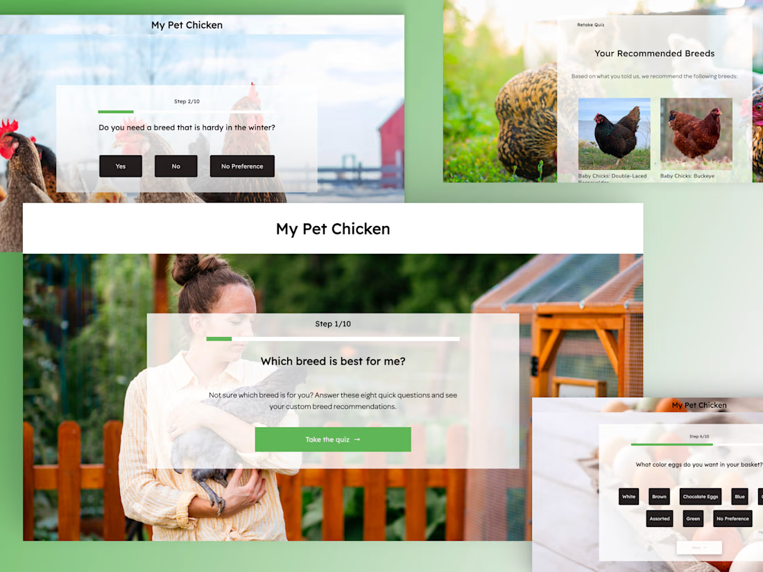
Shopify - Product Recommendation Quizzes
Sole designer delivering 10+ product recommendation quizzes across international Shopify brands, from UX through front-end build.
Full Case Study : https://imalshakandamby.github.io/project-shopify.html
Problem:
Every client brand had different goals, audiences, and products, so no single quiz template worked. Some brands had underperforming quizzes with low completion; others needed one built from zero.
Solution:
I designed brand-specific quiz logic for each client, rebuilt underperforming quizzes at the flow level (not just visually), designed new experiences from first principles where needed, and delivered every quiz fully responsive.
Impact:
45% higher completion on rebuilt quizzes, 30% lift in conversion through brand-specific logic, and 10+ quizzes shipped across international brands, proving the approach was repeatable, not a one-off.


The network for creativity
Join 1.25M professional creatives like you
Connect with clients, get discovered, and run your business 100% commission-free
Creatives on Contra have earned over $150M and we are just getting started







Related posts

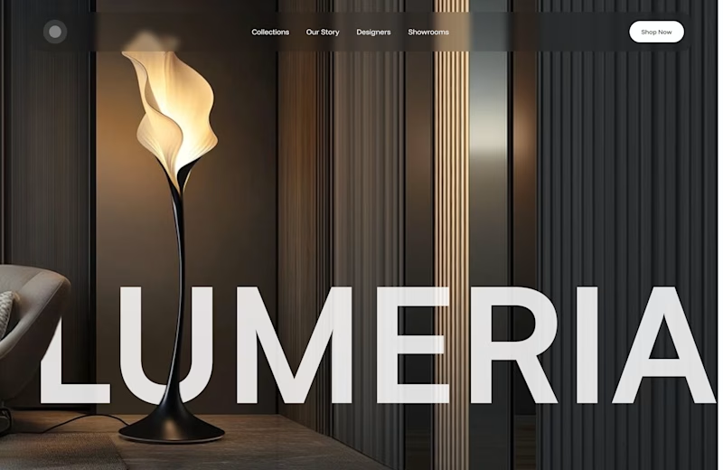
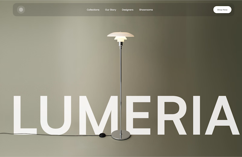
A little design exploration for practice ✨
This time, I’m working on a concept for a lighting brand.
Which direction do you prefer?
74 voted
70%
31 voted
30%
105 votes
Closed

Atmospheric, for a lighting brand it feels almost unfair not to show the product actually doing its job in a real room. The minimal version reads more like a furniture catalog to me. Is Lumeria leaning toward a specific price point or market that would push this one way or the other?



Amazing!

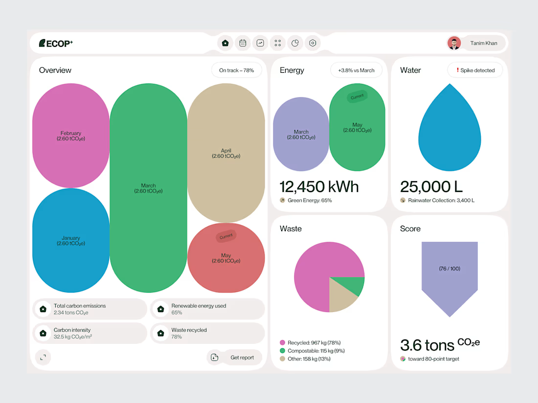
Sustainable Emission Tracker Dashboard
Sustainability platforms often bring together a large amount of environmental data.
The challenge is turning that information into something people can understand quickly.
For this Sustainable Emission Tracker Dashboard, we designed the experience around emissions performance, sustainability targets and progress tracking.
The interface uses clear metric cards, structured charts and visual indicators to create a more understandable view of environmental performance.
Rather than treating every data point equally, the dashboard creates hierarchy around the information users are most likely to monitor and act on.
Focus: Carbon Emissions Tracking · Sustainability Dashboard · ESG UI/UX · Data Visualization · Climate-Tech Product Design
The goal was to make complex environmental data feel structured, readable and useful.
Designed by WaxyWeb.
Building a sustainability or climate-tech product?

Excellent job!