The network for creativity
Join 1.25M professional creatives like you
Connect with clients, get discovered, and run your business 100% commission-free
Creatives on Contra have earned over $150M and we are just getting started
Back to feedPost

Some of the packaging designs I created over the past few months.
The fun part of creating packaging design is that every element from the text to the images to any custom brand assets has to be carefully thought of to ensure they all balance each other out without obstructing or contradicting the existence of the other.
Examples of this process is what I have done with these designs
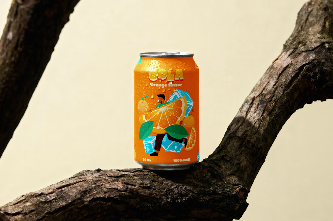
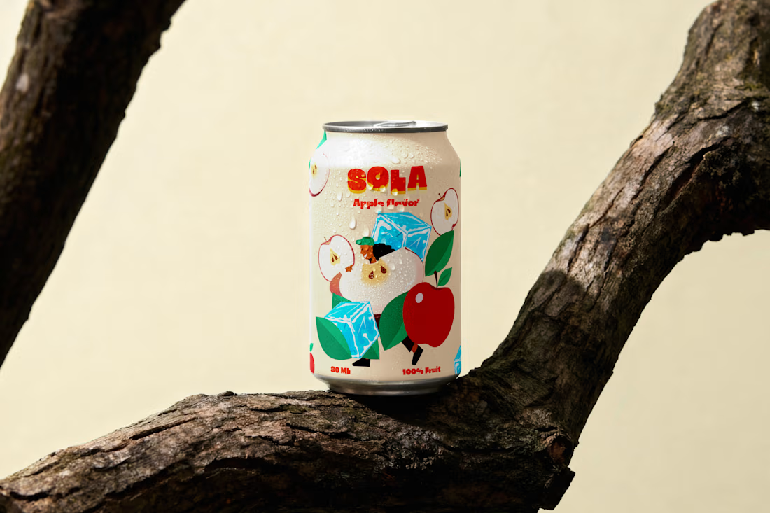
1 SOLA FRUIT DRINK: A premium sparkling fruit drink made for young and modern audiences that enjoys refreshing beverages with bold flavors.
Design rationale: Sola's packaging was designed to emulate a feeling of freshmen and fun, it uses custom illustrated art of an ice, apple and a fun character running with the fruit to portray
a vibrant and fun nature while still portraying the main flavors of the products
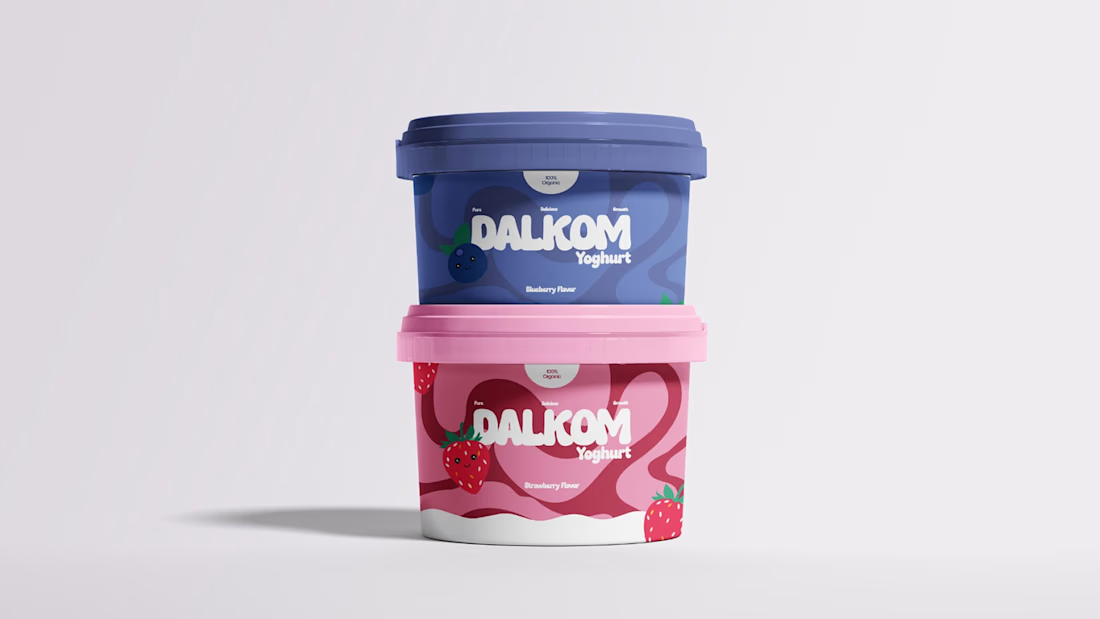
2 DALKOM YOGHURT: A premium yogurt brand meant to be crave worthy and visually appealing
Design rationale: Dalkom yoghurt included the use of a flowing pattern to mimic the thick flowing effect of a yoghurt, the color used was correspondent to the strawberry and blueberry flavors.
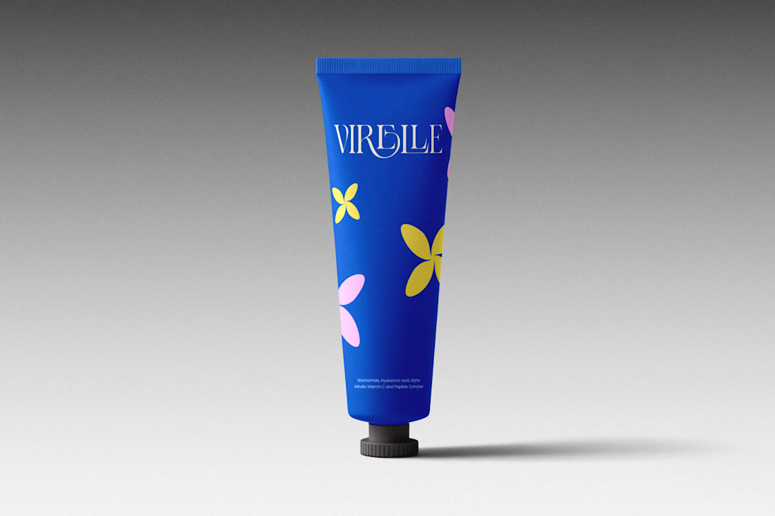
VIRELLE SKIN : virelle skin is an high end dermatological skin care that bridges the gap between cellular science and raw organic luxury
Design rationale: virelle aimed at looking luxurious and fun, a product that doesn't look clinical like the rest, something that is not the common beige or cream based design like other skincare brands. The goal was to stand out and that's exactly what I did with this packaging, the use of illustrated flower petals envisioned the less clinical, fun and luxurious side of the packaging while still maintaining the message of trust and beauty
If you're building a product based brand and want your packaging to communicate the quality and value behind what you offer . I'm currently open to selected projects
Send a DM or mail ayomideakadiri6875@gmail.com
The network for creativity
Join 1.25M professional creatives like you
Connect with clients, get discovered, and run your business 100% commission-free
Creatives on Contra have earned over $150M and we are just getting started











Related posts

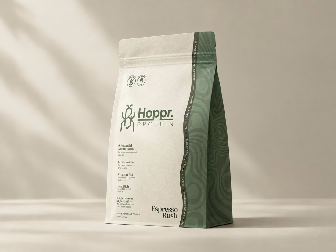
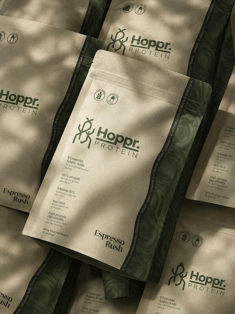
Not every client comes to me for a brand identity and not all my clients are skincare or cosmetic brands.
That was the case with Hoppr, a protein powder brand made from crickets. 🦗 YES, CRICKETS!
Sometimes the logo, colors, and visual system are already there and my job is to bring them to life on packaging and see how far I can push them.
I love projects like this because I get to play with typography, layout, and materials while working within an existing identity.
How much freedom do you think a designer should have when working with an established brand?


Great packaging work, nice job

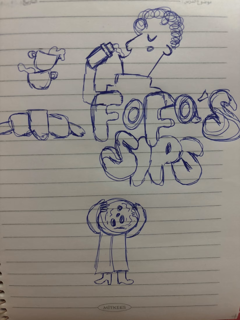
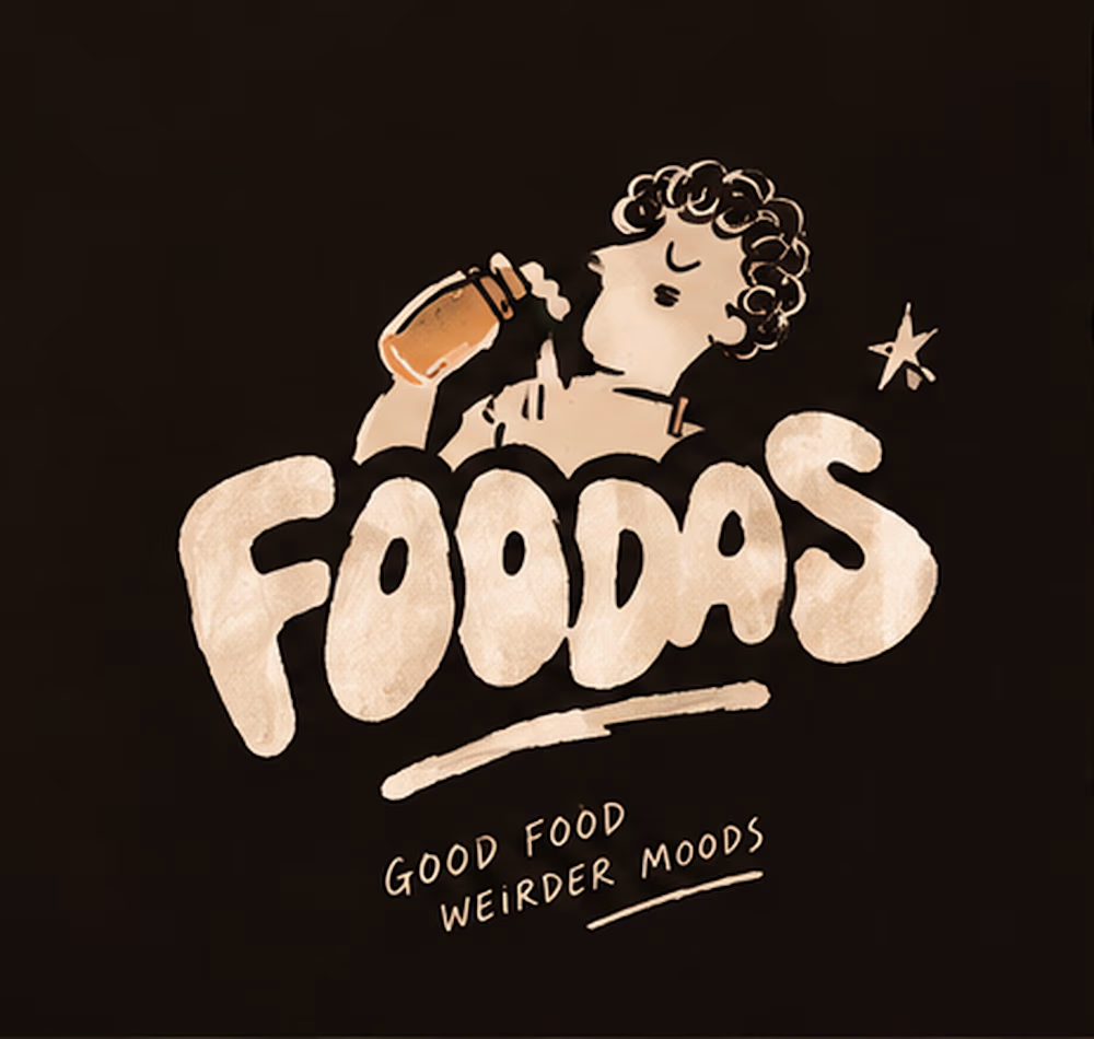
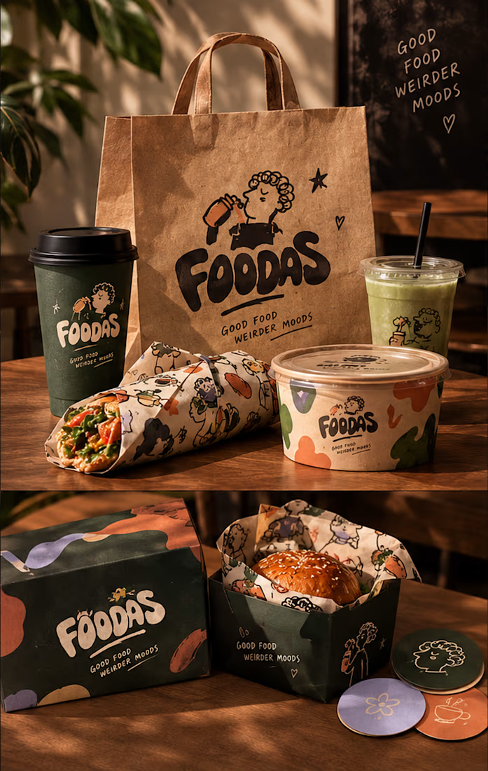
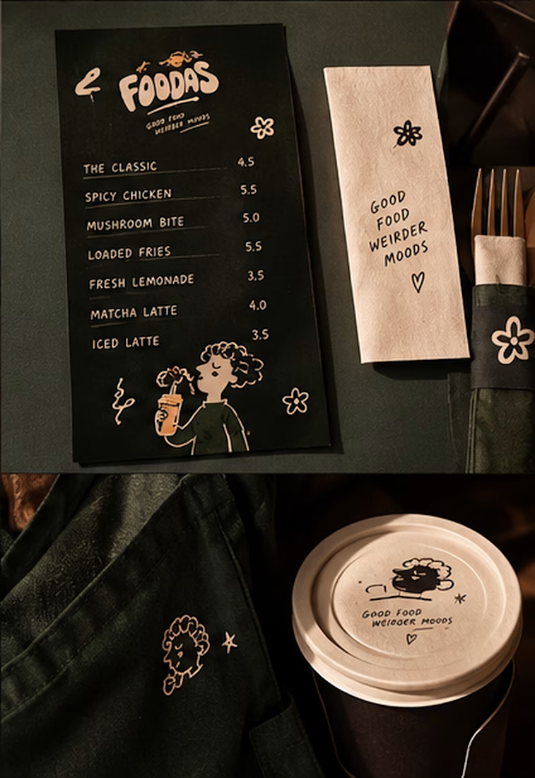
I turned one of my notebook doodles into a whole brand identity. And honestly this was way more fun than I expected I usually work on UI/UX and digital products so I wanted to take a step back from screens and explore something completely different: illustration-led branding.
I took my original FOODAS sketch and built an entire visual world around it from the logo and mascot illustrations to the color palette packaging, cups, and menus
The goal wasn't to make it look perfectly polished and predictable I wanted it to feel playful, a little weird, and still premium.
Now I'm curious about one thing:
Can playful, imperfect illustrations make a brand feel more premium or do you think premium branding needs to be more minimal?
I have a feeling designers will disagree on this one



The team is cooking
Motion design for the logo we are making for Nation e-commerce


Wou