The network for creativity
Join 1.25M professional creatives like you
Connect with clients, get discovered, and run your business 100% commission-free
Creatives on Contra have earned over $150M and we are just getting started
Back to feedPost

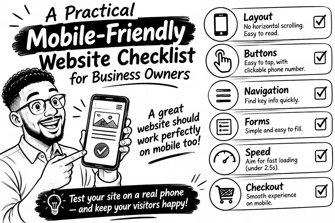
A Practical Mobile-Friendly Website Checklist for Business Owners
Your website may look great on a laptop but frustrate customers on phones.
A mobile-friendly site is more than a smaller desktop design. Visitors should find information, call you or buy without struggling.
Use this checklist to test your WordPress site
Layout: Does content fit without horizontal scrolling? Can people read without zooming? Buttons: Are links easy to tap, with space between them? Make your phone number clickable.
Navigation: Can visitors quickly find your services and contact details?
Forms: Test every field on a phone. Are labels clear and forms easy to complete?
Speed: Check PageSpeed Insights. Google's Core Web Vitals targets include main content loading within 2.5 seconds, interaction response under 200ms, and layout shift below 0.1.
Checkout: For WooCommerce, test product selection, cart and checkout on a real phone.
This matters because Google primarily uses your site's mobile version for indexing. Don't hide important information on smaller screens.
Don't just resize your browser.
Test the real customer journey.
Open your website on your phone. What's the first thing you'd improve?
The network for creativity
Join 1.25M professional creatives like you
Connect with clients, get discovered, and run your business 100% commission-free
Creatives on Contra have earned over $150M and we are just getting started



Related posts

A beautiful website isn't necessarily a website that converts.
I've seen websites that look visually impressive but make it difficult for visitors to understand what the business offers, find important information, or take the next step.
Good website design should do more than look good.
It should:
- Communicate your business clearly.
- Build trust within seconds.
- Make navigation effortless.
- Work smoothly on mobile devices.
- Guide visitors towards taking action.
Whether it's a new website or a redesign, every design decision should have a purpose.
Your website is often your first impression. Make it count.
What is the first thing you look for when visiting a business website ?




honestly the phone number. if i cant tap to call on the first screen im gone. who are you building for mostly, local businesses?

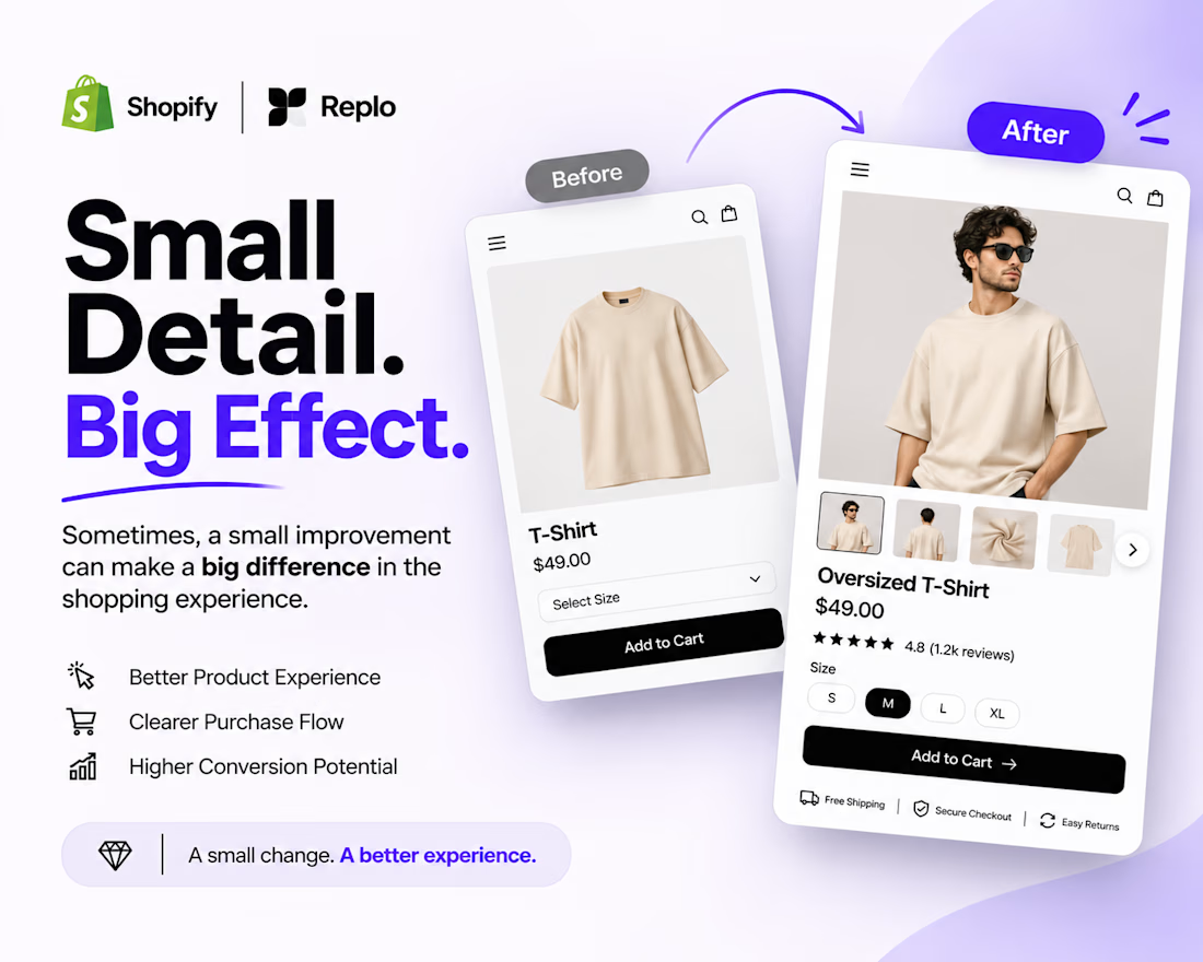
Small Detail. Big Effect. 🚀
Sometimes, a better shopping experience doesn't require a complete website redesign.
It's the small details that matter.
Think about:
Clearer product image galleries.
Better product variant selection.
Easy-to-use size options.
More visible Add to Cart buttons.
A smoother product page experience.
When building with Shopify + Replo, I focus on these details to create cleaner, more intuitive e-commerce experiences.
Because great e-commerce design isn't just about how a page looks. It's about how easily customers can use it.
Small improvements. Thoughtful design. Better experiences.
Working on a Shopify store or planning a Replo landing page?
Let's connect!



Agreed, small product page fixes often beat a full redesign. Clear variant selection and size options remove hesitation right at the point of buying.


Cool idea for a mood check-in.