The network for creativity
Join 1.25M professional creatives like you
Connect with clients, get discovered, and run your business 100% commission-free
Creatives on Contra have earned over $150M and we are just getting started
Back to feedPost
I have been refining this hero exploration over the past few days, and this is where it has landed. It started as a simple question about how much I could take away from a portfolio and still have it feel finished.
So I designed the explorations on a single grid. The oversized wordmark came first, then one black and white portrait, and then a lot of empty space around both of them.
I kept it to a single typeface throughout, because once the grid and the spacing are doing the real work, you do not need much else. And to be honest, Helvetica always hits the spot. I am happy with how quiet it turned out. What are your thoughts?
Thanks!
Wow thats is great. Is there a live preview link?
The network for creativity
Join 1.25M professional creatives like you
Connect with clients, get discovered, and run your business 100% commission-free
Creatives on Contra have earned over $150M and we are just getting started
Related posts
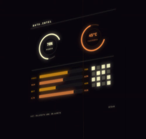
I wanted to build a Sci-fi HUD creation tool with plenty of customization options.
So I built the SINGULARITY HUD CREATION TOOL
Live site: https://singularityhud.figma.site/
GitHub Repository: https://github.com/nytrite/SingularityHudCreationTool
SINGULARITY is a notch web-based studio for making cool animated graphics, technical drawings, and futuristic interfaces.
It works in your browser and uses special technology to make smooth animations.
The studio has a professional look, with a dark theme, orange accents, and a clean, simple design.
This makes it easy for designers to create and animate graphics and export them in a ready-to-use format, such as MP4.
The tool is great for making all sorts of graphics from animated user interfaces to schematics and cinematic sci-fi interfaces.
It uses an animation engine that makes everything look smooth and realistic.
With SINGULARITY, designers can make high-quality motion graphics and HUDs quickly and easily.
My process:
Pen and paper → Figma make → Using Figma make to generate ideas → Prompting it out as perfectly as I can get it to work → Connected to Supabase → Deployed
Thank you!
Pip is a zero-friction health companion built to turn tracking your health (SYMPTOMS, DIET AND MORE) into clinical clarity. It abandons rigid 0–10 numeric scales and replaces them with a compassionate, glanceable interface.
❤ Why It Was Built
Pip was born out of pure personal necessity. I built it because it was something I desperately needed, and something a few close friends and someone incredibly close to my heart needed too. I wanted to strip away the clinical coldness of modern software and create something beautifully simple that could be truly, deeply helpful on someone's hardest days
⚠️ The Problem
Traditional health apps suffer from "Data Collection Theater." They force users suffering from chronic illness or fatigue to rate dozens of variables daily, causing severe decision fatigue.
Worse, they act as data sinks, dumping raw, chaotic charts onto doctors. In a high-stakes, 15-minute medical consultation, physicians don't have the time to audit raw logs. They need high-yield, synthesized clinical signals, not noise. Pip bridges this gap by assuming "bad days are the default," capturing symptoms effortlessly, and compiling them into a clean, one-page summary sheet.
🛠 The Figma Workflow Pipeline
To bring Pip to life, I leveraged the Figma ecosystem:
Figma Weave: Used to iterate and generate the visual asset layers for Pip’s mascot.
Figma Agent: Brainstormed layouts directly on the canvas, instantly pairing elegant fonts and organizing simple, stress-free forms.
Figma Make: Instantly turned those canvas designs and components into a live, fully working, and responsive web application while allowing rapid iteration.
I built Spectra Walls — a premium wallpaper and 3D wall design website concept.
Built with Figma Make.
The idea was simple:
Most wallpaper websites feel like catalogs.
Grid after grid.
Tiny thumbnails.
No atmosphere.
No real sense of transformation.
I wanted to create something more cinematic.
Spectra Walls is designed like a luxury interior experience where wallpapers, murals, and 3D wall panels are shown inside real spaces — living rooms, bedrooms, studios, hotels, lounges, and creative interiors.
The focus was on:
→ colorful cinematic room visuals
→ realistic 3D wall depth
→ premium wallpaper collections
→ before/after wall transformations
→ room-based browsing
→ wallpaper visualizer interactions
→ elegant editorial typography
→ image-heavy interior design layouts
Instead of making the wall feel like a product thumbnail, I wanted every section to show how a wall can completely change the mood of a room.
The result is a modern, colorful, premium website direction for a brand that sells atmosphere — not just wallpaper.
Spectra Walls — walls that change the atmosphere.
The 3D wall depth and cinematic room visuals make this feel high-end and memorable.
Trending
Claude
Claude has entered the design space. How are you using Claude Design?
Contra University
Learn from expert creatives how to earn more using next-gen AI tools.
MagicPath
The canvas is infinite, and exploration is becoming the workflow. How are you using MagicPath?
creativeaiflow
Creative AI workflows are evolving. What tools do you use, and what are their strengths and weaknesses?
freelancerlife
Freelancer life is wins, pivots, and everything in between. What’s yours right now?