The network for creativity
Join 1.25M professional creatives like you
Connect with clients, get discovered, and run your business 100% commission-free
Creatives on Contra have earned over $150M and we are just getting started
Back to feedPost
Taste Test
Which landing page direction would you trust more for a pilot training school?
Working on a redesign for a flight academy and split between two visual directions:
⬛ Deep version — dark, cinematic, authoritative. Feels like you're already in the cockpit.
🩵 Breathe version — light, open skies, aspirational. "The sky is your office" energy.
Both target career-change adults seriously considering aviation — so trust and credibility matter as much as inspiration.
Cast your vote 👆 and drop a comment — does the dark version feel more serious, or does it just feel heavy?
19 votes
Ends in 22h
intentional work
The breathe version has a light and airy-ness feeling in the design that I think might correlate better with the pilot training!
Thanks for your vision!
both are gorgeous, but i think the breathe version almost feels like the viewer is taking in the information as it flies in from midair, which is a really engaging way to embrace the overall energy & the given setting of the job.
Nice one!
Looks awesome!
The network for creativity
Join 1.25M professional creatives like you
Connect with clients, get discovered, and run your business 100% commission-free
Creatives on Contra have earned over $150M and we are just getting started
Related posts
Most property platforms make you feel like you need a real estate license just to browse listings.
We designed Ownly, a global real estate landing page that takes buyers from search to a shortlisted property in minutes.
Solution:
Hero filter sets Type, Price ($261–$317K), and Area before the user scrolls once
Featured Properties shows Coastal Retreat ($7,200), Bayview Luxury ($6,500), and Sunset Villa ($5,500) with bed, bath, and sq ft on every card.
Four-step process cards (Eco-Friendly Homes → Prime Locations → Community Living → Sustainable Architecture) explain the platform without a wall of text
Testimonials from a buyer, investor, and seller sit on the same page; no separate reviews section
FAQ accordion covers fees, authenticity, international transactions, and viewings in one place
Result:
Less friction. More trust. One page closes the gap between browsing and buying.
Built for real estate agencies, proptech startups, and property platforms serving international buyers and cross-border investors.
If your real estate platform needs a landing page that turns visitors into serious inquiries, you know where to find us.
Let's build something better. 👋
I don’t always have the opportunity to work on illustration-led videos, but I really enjoy them whenever I do. This one was in the works for almost two months, from completing the storyboard to animation and sound design, plus a few tweaks along the way. Collaborating with the team at Olyra made the process smooth and fun, and I’m definitely looking forward to creating more animations like this!
This is exactly why quality beats quantity every time. Taking the time to refine the animation and sound design creates that 'Visual Authority' that brands are starving for right now. It’s so refreshing to see a team like Olyra prioritize the process over a quick post.
Beautifully done!
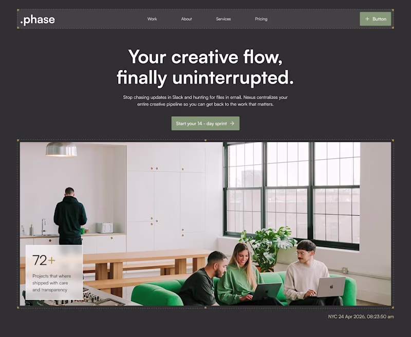
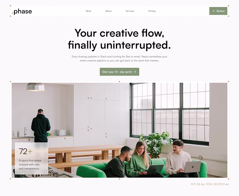
Playing around with the hero for a new framer template. Trying to decide which of the two works best. What would you choose?
The overall vibe of the template would be light with accents of dark and other soft colors.
7 voted
28%
18 voted
72%
25 votes
Closed
Both are good
Trending
Claude
Claude has entered the design space. How are you using Claude Design?
Contra University
Learn from expert creatives how to earn more using next-gen AI tools.
creativeaiflow
Creative AI workflows are evolving. What tools do you use, and what are their strengths and weaknesses?
portfolioreview
The best portfolios tell a story, not just show a grid. Share yours for feedback.
freelancerlife
Freelancer life is wins, pivots, and everything in between. What’s yours right now?