The network for creativity
Join 1.25M professional creatives like you
Connect with clients, get discovered, and run your business 100% commission-free
Creatives on Contra have earned over $150M and we are just getting started
Back to feedPost

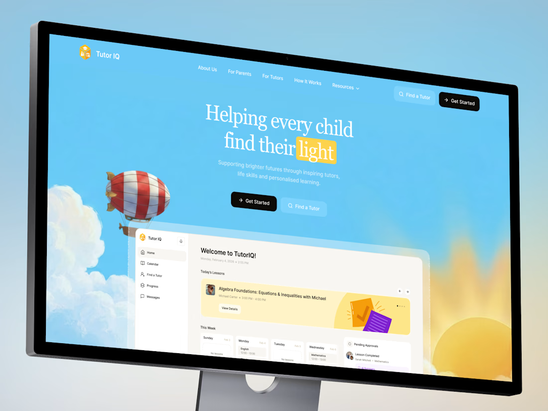
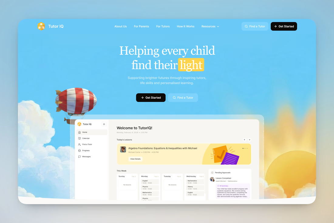
Your votes are in! Here's the final TutorIQ website ☀️
Thank you to all 20 of you who voted on the two concepts 🏄🏼♀️ It was close: 55% chose light and playful and 45% chose softer and calmer.
The final version mixes the two moods. Its bright colors are from the playful first concept. From the second one, it took the serif headline and the product preview on the first screen.
Quick context: TutorIQ is an AI tutoring platform for UK families. It matches each child with a tutor based on how they learn. Our task was a website that attracts parents and tutors before the platform launches.
Every parent comes with one question: 'Is this the right place for my child?' So the first screen answers it with the product itself. Parents see the lesson schedule and the AI summary they get after each lesson.
Now it's your turn 👇🏻 What would you keep from this version? And what would you change?


The network for creativity
Join 1.25M professional creatives like you
Connect with clients, get discovered, and run your business 100% commission-free
Creatives on Contra have earned over $150M and we are just getting started





Related posts

How to create a simple cursor tracking effect for your website 👀
Cursor interactions are a simple way to make a website feel more responsive and engaging without adding too much complexity.
In this tutorial, I break down how to create the effect and how you can use it to add more personality to your web projects.
Watch the video, follow the steps, and try it in your next build.

Great work

Most creative brands try to say everything at once.
More colour.
More shapes.
More visual noise.
But for this identity exploration, the idea was simpler:
Make creativity feel meaningful.
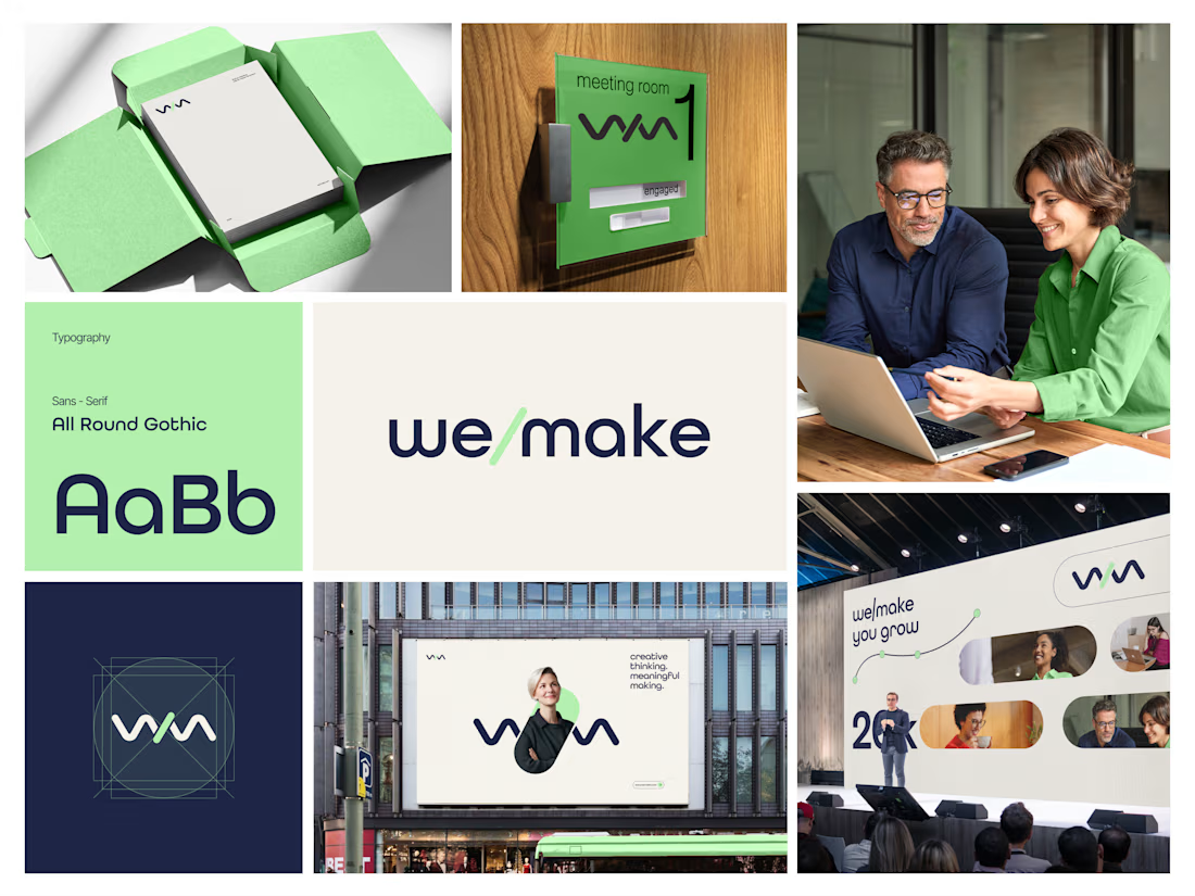
Introducing we/make, a bold, human-centred visual identity built around collaboration, growth, and purposeful making.
The mark is designed as a flexible expression of “we” and “make” coming together.
It represents:
• Ideas turning into action
• People creating together
• Growth through meaningful work
• A creative process that stays clear, warm, and confident
The visual system pairs a deep navy foundation with a fresh green accent, bringing together trust, focus, energy, and optimism.
Rounded typography and soft graphic elements keep the brand approachable, while the structured layouts give it a modern, professional feel.
From stationery and meeting-room signage to campaigns, billboards, and event spaces, the identity is built to work wherever creativity needs to show up.
Creative thinking. Meaningful making.
Would love to hear your thoughts on the visual direction.
What stands out to you first, the logo, colour palette, or overall brand feel?
#BrandIdentity #BrandDesign #CreativeDirection #VisualIdentity #GraphicDesign #LogoDesign




Very nice