The network for creativity
Join 1.25M professional creatives like you
Connect with clients, get discovered, and run your business 100% commission-free
Creatives on Contra have earned over $150M and we are just getting started
Back to feedPost
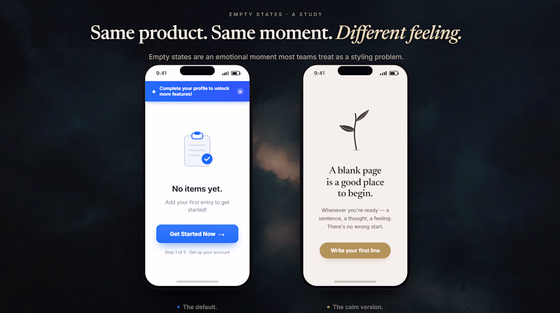
A concept design study exploring the difference between the default empty-state pattern and a more intentional one — designed to show how the same product moment can land very differently depending on the design choices.
Most empty states are treated as a styling problem. The default goes something like: "No items yet. Get Started Now!" — a bright primary button, exclamation marks, a nagging banner pushing the user toward profile completion or upgrades. The cognitive cost is real. Pressure at moments of vulnerability — a brand-new user, an empty page — signals that the app wants something from the user before trust has been built.
The "calm version" shows what changes when the empty state is designed as an emotional moment instead of a conversion opportunity. Warm cream background instead of stark white. A small hand-drawn sprout instead of a stock clipboard icon. A serif welcome line: A blank page is a good place to begin. Copy that meets the user where they are: Whenever you're ready — a sentence, a thought, a feeling. There's no wrong start. No banner. No exclamation marks. A single quiet button: Write your first line.
Same conversion path. Completely different relationship with the user
This is lovely!
Thank you!😊
The network for creativity
Join 1.25M professional creatives like you
Connect with clients, get discovered, and run your business 100% commission-free
Creatives on Contra have earned over $150M and we are just getting started
Related posts
Aura - The World's First Emotion-Adaptive Interface System
Designed with Google Stitch.
As a developer, I've used plenty of AI tools that can generate screens, but I was curious about something different with Stitch:
Could I use it to create an experience-first interface that felt alive rather than just another website?
That question became AURA — an experimental emotion-adaptive interface that transforms its visual environment based on how users want to feel.
Instead of approaching the challenge as a traditional landing page, I wanted to explore a more immersive direction. What if an interface could behave like a living environment? What if changing an emotional state could alter the atmosphere, motion, lighting, color palette, and overall experience?
To test that idea, I designed AURA as a digital experience where users can explore emotional worlds such as Joy, Peace, Wonder, Creativity, Ambition, and Reflection.
How Stitch fit into the workflow
I didn't start with prompts, I started with ideas.
The first step was sketching rough wireframes and visual concepts to establish the structure and flow of the experience. I then created a custom design.md document containing the creative direction, emotional worlds, visual principles, motion goals, typography, color systems, and overall artistic vision for the project.
After importing those references into Stitch, the process became incredibly fluid. The streaming generation experience was one of the most impressive parts of the workflow. Instead of waiting for a final output, I could literally watch the interface take shape directly on the canvas and react to ideas in real time.
Once the foundation was generated, I spent most of my time using in-place AI edits.
I'd select sections, experiment with different visual treatments, adjust atmosphere, refine layouts, introduce new interactions, and push the experience closer to the vision I had in mind without having to restart from scratch.
That iterative loop felt much closer to actual design work than traditional prompting.
Motion was another area where Stitch stood out.
Since the challenge theme was "Build interfaces that feel alive," I focused heavily on creating smooth transitions, hover interactions, atmospheric movement, environmental effects, and immersive visual storytelling.
The result feels less like a conventional website and more like a digital art installation.
New Stitch features I leaned on
📄 Imported custom design.md creative direction document
📄 Imported rough wireframe concepts and visual references
🌊 Streaming generations directly to the canvas
⏩ In-place AI edits using prompts and point-and-click interactions
🎥 Motion-rich interactions, hover states, and immersive transitions
🎨 Rapid visual experimentation and iteration
🚀 Export-ready workflow for deployment
Feedback on Stitch
Most AI workflows involve repeatedly prompting, waiting, evaluating, and starting over. Stitch felt different, The streaming canvas made the process feel much more collaborative and interactive. Watching designs appear in real time created a stronger sense of momentum and made iteration feel natural.
The ability to import references and then refine sections through in-place edits was probably my favorite part of the experience. Rather than constantly rewriting long prompts, I could focus on improving specific parts of the design while preserving everything that was already working.
As someone who enjoys experimenting with interface concepts, that workflow felt significantly closer to how designers and developers naturally think.
One feature I'd love to see expanded further is even more granular visual control directly within the canvas, allowing creators to tweak generated elements while maintaining the speed of the AI workflow.
Overall, Stitch helped shorten the distance between a rough idea and a polished interactive experience.
Live Prototype: https://8d2a7837-aura-living-interface-system.netlify.app/
Link to Stitch: https://stitch.withgoogle.com/projects/6682479894200923414
This is awesome
Most travel apps solve booking. None of them solve the reason people never book in the first place.
The problem is not money. Most people who want to travel actually have enough. The problem is that travel has no due date. Your EMI comes out on the 5th. Your insurance renews in March. Your electricity bill arrives every month without asking. They all get paid - because they have a structure that does not accept someday as an answer.
Your dream trip has none of that structure. So it waits. Every year. Until it stops feeling like a plan and starts feeling like a personality trait.
That insight became Voya.
This is the Original Workflow but due to certain issues I am not able to create prototype in same file so I duplicate that workflow and create new prototype.
Prototype:
https://stitch.withgoogle.com/preview/17661579163113846531?node-id=052829c9edd64f84b05c85db6b5bd998
𝗪𝗵𝗮𝘁 𝗺𝗮𝗸𝗲𝘀 𝗶𝘁 𝗱𝗶𝗳𝗳𝗲𝗿𝗲𝗻𝘁:
→ Saves a fixed amount from your income every month automatically - like an EMI, but for your next trip
→ Shows you where your rupee goes furthest right now based on live currency exchange advantages
→ Monitors flight prices 24/7 and alerts you the moment fares drop on your target routes
→ Tracks hotel pricing cycles so you book the same property for significantly less
→ Forecasts exactly where you can travel with your current savings - and when you unlock better destinations in 3, 6, or 12 months
→ Builds four completely different trip packages for the same destination - one for people who want luxury hotels and economy flights, one for business class comfort with simple stays, one for slow deep travel, one for multi-city discovery - you compare and pick yours
→ Shows you the real cost of waiting - how much more you will pay if you book when you originally planned versus booking now with your savings
→ Gives you back the mental peace of knowing the trip is already funded - so when you return home you return to the exact financial life you left. No investments liquidated. No recovery period.
wow this is very nice man
I'm testing out dark themes for the daily motivation app.
Which version you prefer?
6 voted
21%
23 voted
79%
29 votes
Closed
version 1
Challenges
View allTrending
Claude
Claude has entered the design space. How are you using Claude Design?
Contra University
Learn from expert creatives how to earn more using next-gen AI tools.
MagicPath
The canvas is infinite, and exploration is becoming the workflow. How are you using MagicPath?
creativeaiflow
Creative AI workflows are evolving. What tools do you use, and what are their strengths and weaknesses?
freelancerlife
Freelancer life is wins, pivots, and everything in between. What’s yours right now?