The network for creativity
Join 1.25M professional creatives like you
Connect with clients, get discovered, and run your business 100% commission-free
Creatives on Contra have earned over $150M and we are just getting started
Back to feedPost

A lot of software looks good in demos.
Then real users arrive… and everything starts bending.
Slow queries. Edge cases nobody thought about. “Temporary” fixes that quietly become permanent.
I’ve been spending more time in that phase lately — where things either hold up, or fall apart.
If you’re at that point where your product almost works the way it should, but not quite… that gap is usually fixable.
The network for creativity
Join 1.25M professional creatives like you
Connect with clients, get discovered, and run your business 100% commission-free
Creatives on Contra have earned over $150M and we are just getting started



Related posts

🔮 Interface Design: Retaining Users Through Editorial 404 Layouts
Every single viewport is an opportunity to prove your premium digital standard. Most default error screens make users close the tab—Faro turns a wrong turn into an elegant interaction.
The Design Blueprint:
· Engineered an asymmetric, cinematic fallback layout using global design system tokens.
· Maintained clean grid boundaries and the main structural navigation layer frameworks completely intact.
· Integrated a high-contrast return pathway to rescue lost traffic and guide users back into active client conversion tracks.
Don't overlook edge-case user interfaces.
Look through the layout details live:
🔗 Framer Marketplace: https://www.framer.com/marketplace/templates/faro/
🌐 Live Preview: https://farotravel.framer.website/


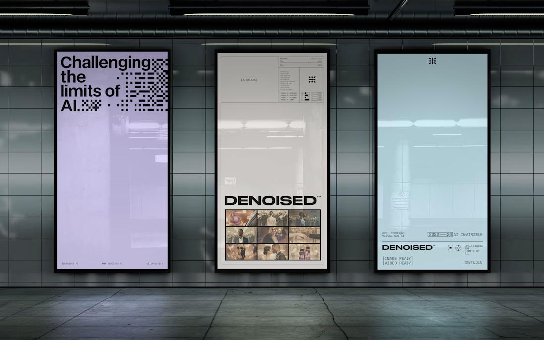
Noise recedes. The scene remains.
For Denoised, an AI image and video studio for advertising, noise turns into bars and matrices that clear as the mark appears. The same modules sign every delivery: image ready, color locked, QC passed.
When AI is the tool, what should the brand show: the process or the result?


A presentation should build toward a decision.
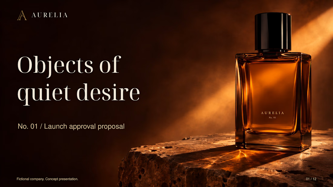
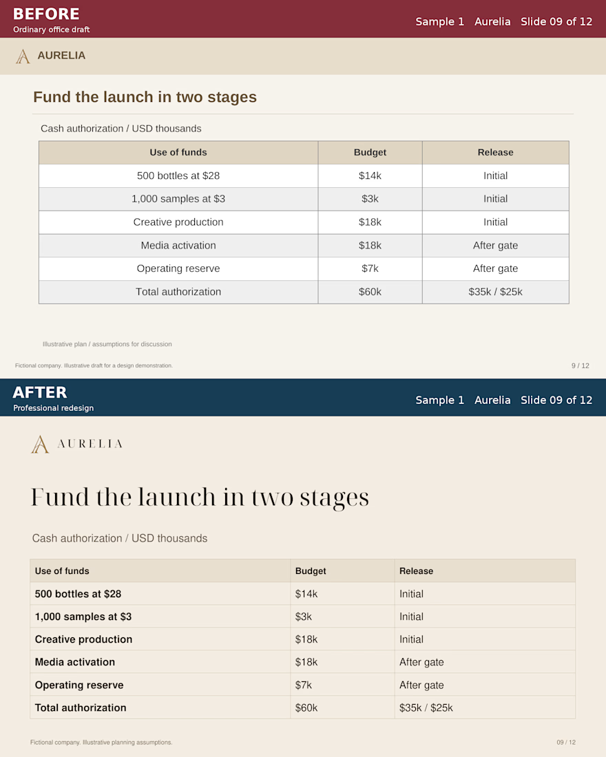
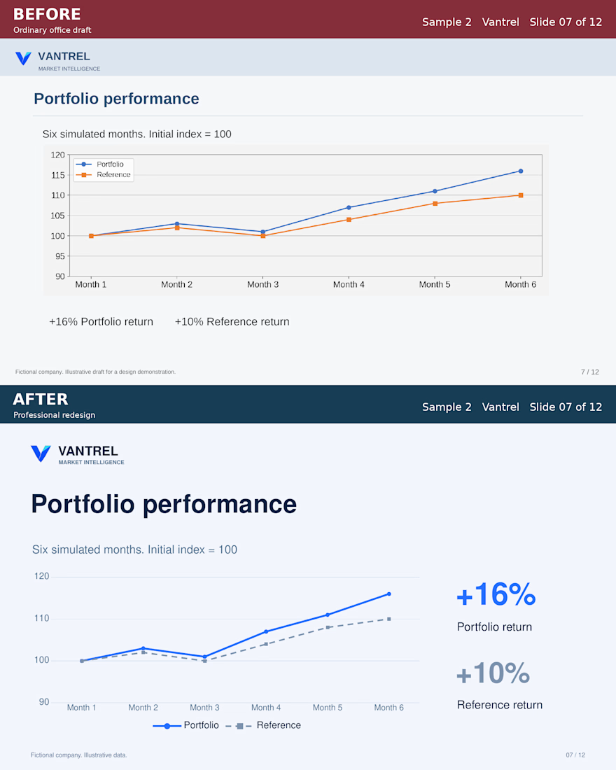
For these Aurelia and Vantrel studies, I developed two complete 12-slide business presentations. Aurelia builds toward a staged launch authorization. Vantrel builds toward a defined pilot.
Each BEFORE/AFTER pair keeps the same message and illustrative data, making the design changes easier to judge. The downloadable PowerPoint includes editable text, tables and charts.
These are self-initiated fictional projects developed with AI assistance and checked for content consistency, chart data and final rendering.
Looking at the AFTER slides, what would you simplify further to make the decision clearer?
Have a rough business deck? Send the deck, audience and deadline for a scoped redesign quote.
https://contra.com/s/v7NPev2Y-power-point-cleanup-and-presentation-redesign
Full case and downloads:
https://contra.com/p/esqL6Bvc-power-point-redesign-aurelia-and-vantrel