The network for creativity
Join 1.25M professional creatives like you
Connect with clients, get discovered, and run your business 100% commission-free
Creatives on Contra have earned over $150M and we are just getting started
Back to feedPost

Every good logo project starts with a conversation.
Before going into Illustrator, I get on a call with the client. We talk about the business, who they serve, and what they actually want people to feel when they see their brand.
Then, during my research process, I synthesize everything into a word map. This is one of the most enjoyable parts for me. Digging deep into semantics and the symbolic world.
I called this concept “Fast Lightning”, based on three keywords: speed, effectiveness, direction.
This mark is one of three presented to the client.

Love this!
Thanks!
The network for creativity
Join 1.25M professional creatives like you
Connect with clients, get discovered, and run your business 100% commission-free
Creatives on Contra have earned over $150M and we are just getting started





Related posts



That's great it really saturated with joy specially with this cute character in the top and the vibrant colors 🎉🎉🎉🎉

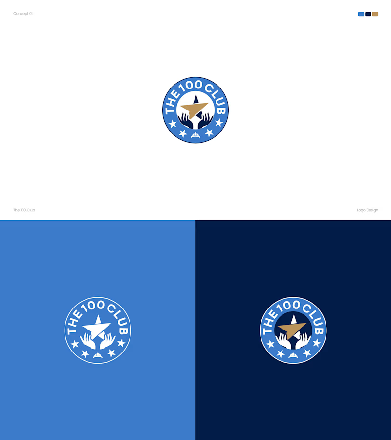
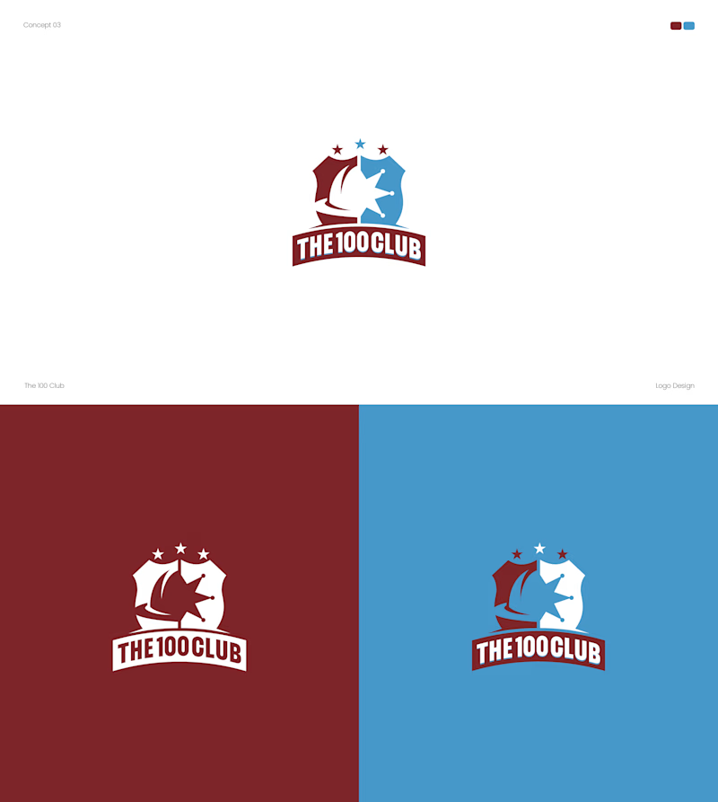
Working on a logo for The 100 Club. Two very different directions.
Concept A: Badge style, blue and gold, hands holding a star.
Concept B: Shield crest, red and blue, bold and sporty.
Which one fits a club identity better? A or B? 👇
4 voted
25%
12 voted
75%
16 votes
Closed


Both options turned out amazing