The network for creativity
Join 1.25M professional creatives like you
Connect with clients, get discovered, and run your business 100% commission-free
Creatives on Contra have earned over $150M and we are just getting started
Back to feedPost

A wellness website can look calm and still be confusing.
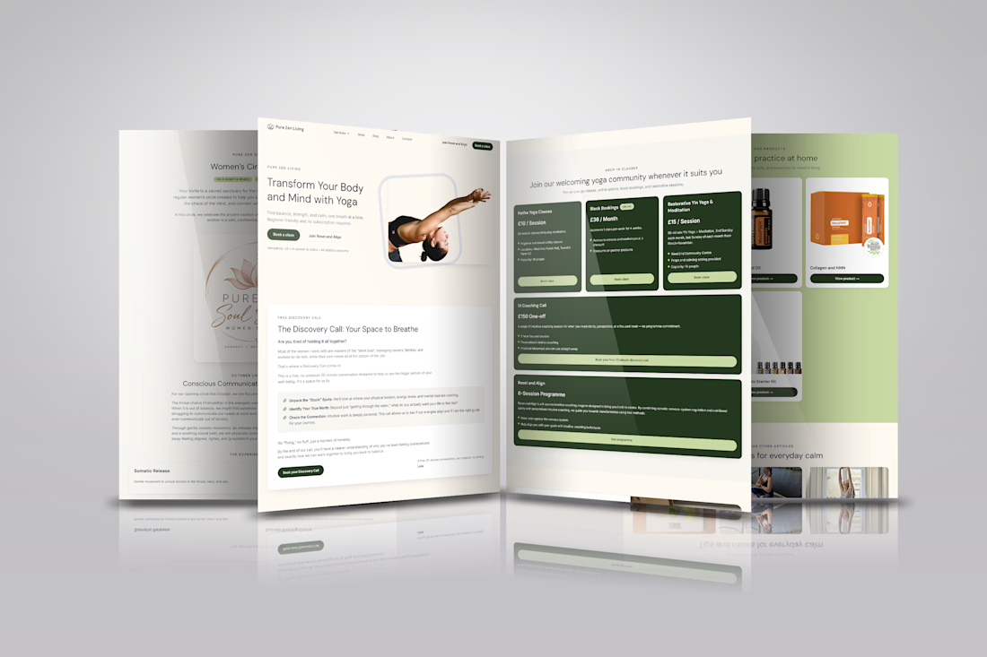
For Pure Zen Living, the challenge wasn’t simply creating a beautiful yoga website. The brand offered yoga classes, coaching, programmes, discovery calls, and wellness products, all with different customer journeys.
So I designed the experience around one question:
“What does this visitor want to do next?”
I structured the website so visitors could quickly move from discovering the brand to choosing an action.
Classes and programmes are presented with clear pricing, descriptions, and individual booking CTAs. Visitors who aren't ready to choose can book a discovery call instead.
The shop is also integrated into the experience without competing with the primary service offerings.
The result is a website that feels calm and premium, while the UX quietly guides visitors toward the action that's most relevant to them.
Good UX isn't about adding more features.
It's about making the next step obvious.
Built in Framer.
#Framer #UXDesign #WebDesign #WebDevelopment #WebsiteDesign
The network for creativity
Join 1.25M professional creatives like you
Connect with clients, get discovered, and run your business 100% commission-free
Creatives on Contra have earned over $150M and we are just getting started

Challenges
View all


Related posts

Luxury Fashion E-commerce Landing Page
A premium e-commerce website concept created for a modern luxury fashion brand. The experience focuses on elegant visuals, refined typography, and an intuitive shopping journey that reflects the brand's premium identity.
Project Goal💯
The objective was to design a sophisticated online shopping experience that combines visual storytelling with seamless product discovery. Every section was crafted to highlight the brand's quality, build trust, and encourage conversions while maintaining a clean, minimal aesthetic.


Stunning work


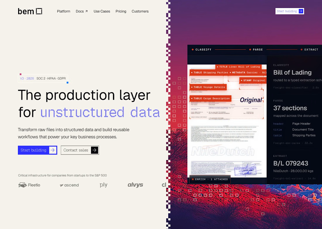
For bem, our Document Mode images start neutral, with the red/blue treatment and pixel dissolve applied later in Figma. If your campaign needs several formats, keeping that treatment editable lets you adjust the finish without regenerating the photograph.

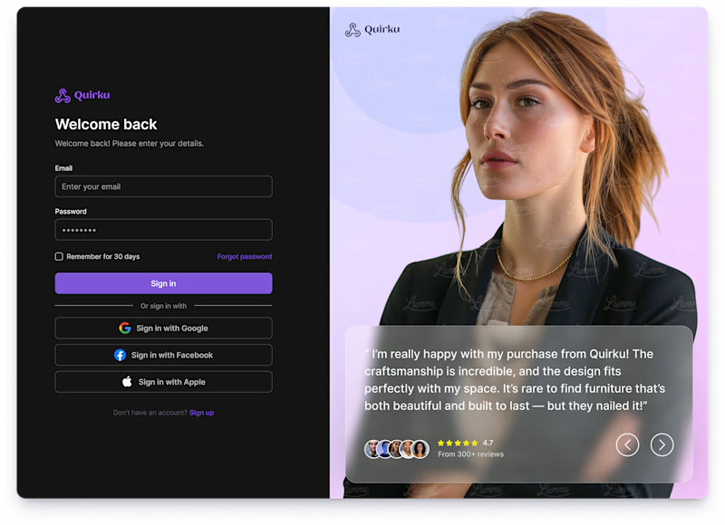
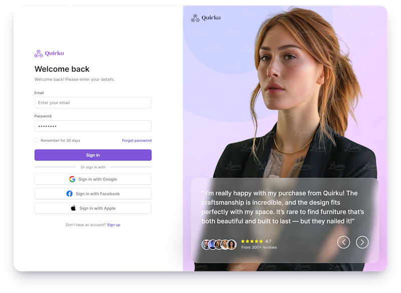
Which one works better for you — Light or Dark? 👀
11 voted
46%
13 voted
54%
24 votes
Closed

Both of them are great ❤️❤️