The network for creativity
Join 1.25M professional creatives like you
Connect with clients, get discovered, and run your business 100% commission-free
Creatives on Contra have earned over $150M and we are just getting started
Back to feedPost
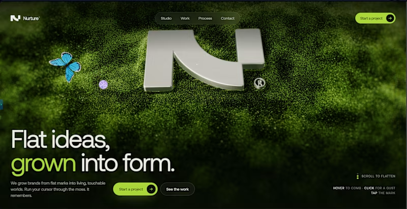
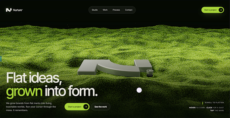
Taste Test


The network for creativity
Join 1.25M professional creatives like you
Connect with clients, get discovered, and run your business 100% commission-free
Creatives on Contra have earned over $150M and we are just getting started











Related posts

Which one do you think is better? 👀
3 voted
38%
5 voted
62%
8 votes
Closed

Voted A. The clouds give the grass island more depth and it feels cleaner.

Can’t take your eyes off this one. Literally, the eyes are the whole test A or B? Go with your gut, don’t overthink it.
P.S. The client already picked one. I’ll tell you which after you vote.

2 voted
25%
6 voted
75%
8 votes
Closed

Going with my gut: Option 2, Mark. The unobstructed eye ring with NOTICE is hypnotic on its own, while the Maison Cura card in Option 1 covers the best part of the eye. Curious if the client agreed.


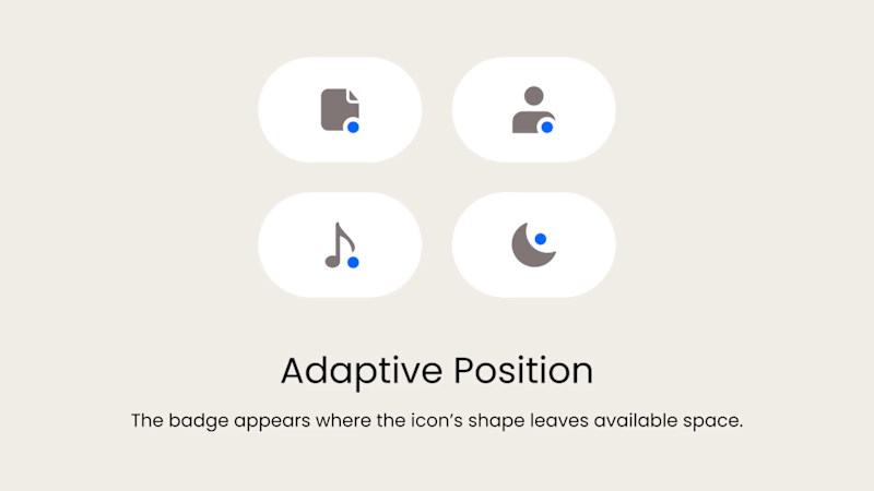
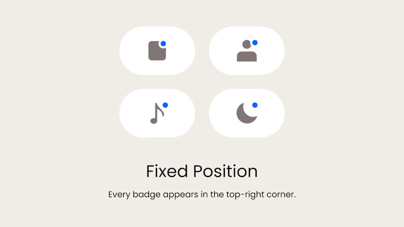
Badge Placement: Consistency or Visual Balance?
Even a small indicator can change how the entire interface feels
Adaptive Position
The badge placement changes depending on the icon’s shape and available space. The result feels more visually balanced but requires individual adjustments.
Fixed Position
The badge always appears in the top-right corner. This creates a consistent and predictable system, but on some icons it may feel disconnected or awkwardly placed.
What matters more in a design system: consistency or optical balance?
17 voted
43%
23 voted
57%
40 votes
Closed
Fixed for me. In a system, people learn where to look. I'd tweak the odd icons before breaking the rule.