The network for creativity
Join 1.25M professional creatives like you
Connect with clients, get discovered, and run your business 100% commission-free
Creatives on Contra have earned over $150M and we are just getting started
Back to feedPost


how lovely, i love how you incorporated even smaller effects when users chose to hover over individual testimonials! it all is in the details.

Thank you! That’s exactly what I was going for, making the smaller interactions feel intentional and consistent with the overall experience.
The network for creativity
Join 1.25M professional creatives like you
Connect with clients, get discovered, and run your business 100% commission-free
Creatives on Contra have earned over $150M and we are just getting started





Related posts

September was a good month:
> crossed $10k+ in revenue on Contra
> shipped 3 projects: landing page, brand design, website
> went fully independent as a designer
> got referred to a big client by another designer
Now opening 2 spots for October.

Great work on this


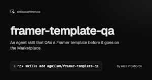
I made a free agent skill for Framer template creators. It QAs a template before it goes on the Marketplace: checks the editor project, the live site on every breakpoint, and SEO and AEO, fixes clear issues, and adds a getting-started guide for buyers.
Install: npx skills add agnilem/framer-template-qa
skills.startfrom.co

skills.startfrom.co
framer-template-qa, an agent skill by Alex Prokhorov
An agent skill that QAs a Framer template before it goes on the Framer Marketplace.

this helps a lot! thank you for sharing 🔥

Vowelle was free for a while, but I’ve decided to make it a paid template.
It’s now available for $125 🤍
A premium bridal Framer template with CMS collections, filtering, favorites, booking flow, and lots of carefully crafted details.

Beautiful work