The network for creativity
Join 1.25M professional creatives like you
Connect with clients, get discovered, and run your business 100% commission-free
Creatives on Contra have earned over $150M and we are just getting started
Back to feedPost

Such a thoughtful and attractive implementation

AI is not a vending machine. It is a thinking amplifier. I collaborated with it to explore concepts and iterate quickly.
Now I am split between two directions:
Which works better?
• With motion
• Without motion
20 voted
17%

97 voted
83%
117 votes
Closed
The network for creativity
Join 1.25M professional creatives like you
Connect with clients, get discovered, and run your business 100% commission-free
Creatives on Contra have earned over $150M and we are just getting started
Related posts

More than just presenting an idea, it's about creating a visual world around it.
Here's a look at Omnis AI, where bold visuals, abstract forms, and thoughtful layouts come together to shape a cohesive presentation.
I'd love to hear your thoughts on this visual direction. What stands out to you?


This is officially my first interface designed not with my hands, but with my voice.
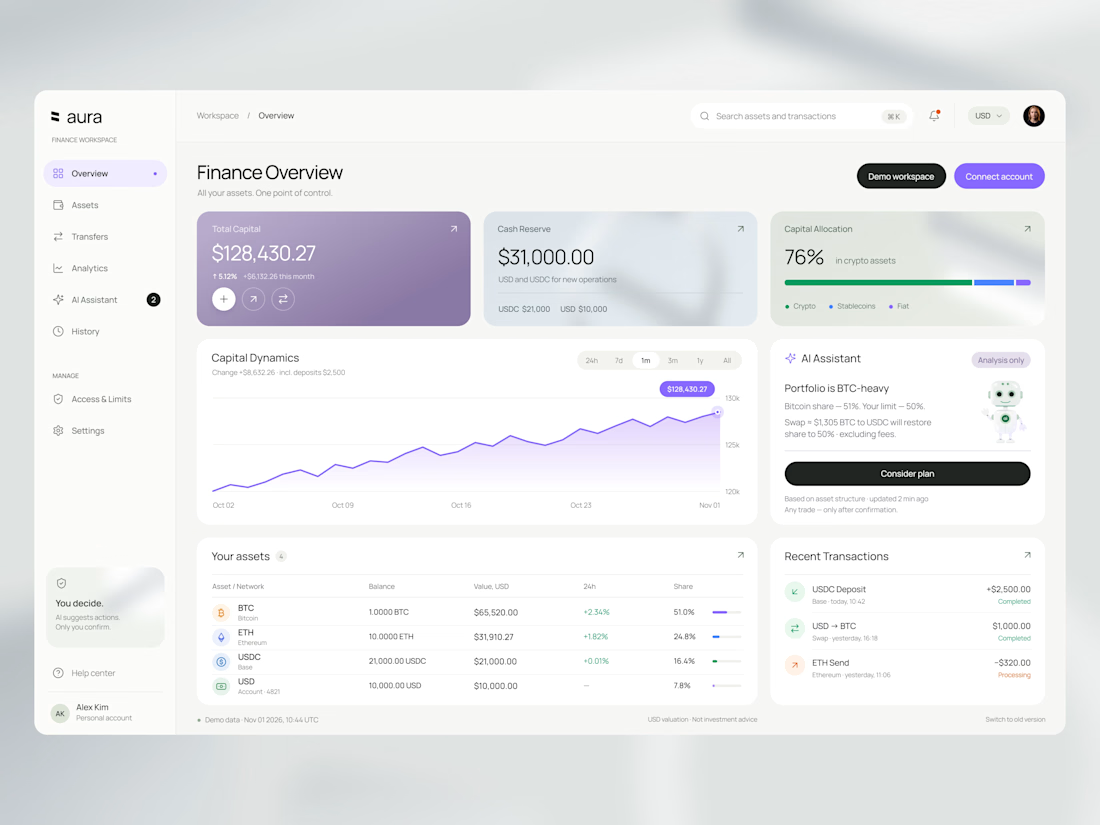
We talk a lot about AI changing our workflows, but experiencing it firsthand shifts your entire perspective. I wanted to see how far I could push a pure AI-to-UI pipeline for a complex digital asset management workspace, prioritizing LLM logic and voice commands over manual pixel manipulation.
Here is how this hybrid process actually played out:
01 / The Logic: Instead of sketching, I started by mapping out the structural architecture and edge cases in Claude, generating a solid low-fidelity blueprint.
02 / The Voice: This was the wild part. Armed with detailed usability specs and moodboards, I used voice prompts in Figma AI to establish the high-fidelity visual foundation. I literally spoke the core UI into existence.
03 / The Human Touch: I processed the raw output through Claude again to adjust specific UI parameters, and then finally stepped in for a strict manual polish. Perfect grid alignment and sharp visual hierarchy still require a designer's eye.
04 / The System: To wrap it up, I reverse-engineered the polished interface back through Claude to automatically construct a fully scalable atomic design system, complete with defined components and local variables.
The role of a product designer is fundamentally shifting. We are spending less time executing and more time directing architectural logic and curating systems.
I would love to hear how you all are integrating these new AI pipelines into your daily sprints. Let's discuss in the comments.
#ProductDesign #Claude


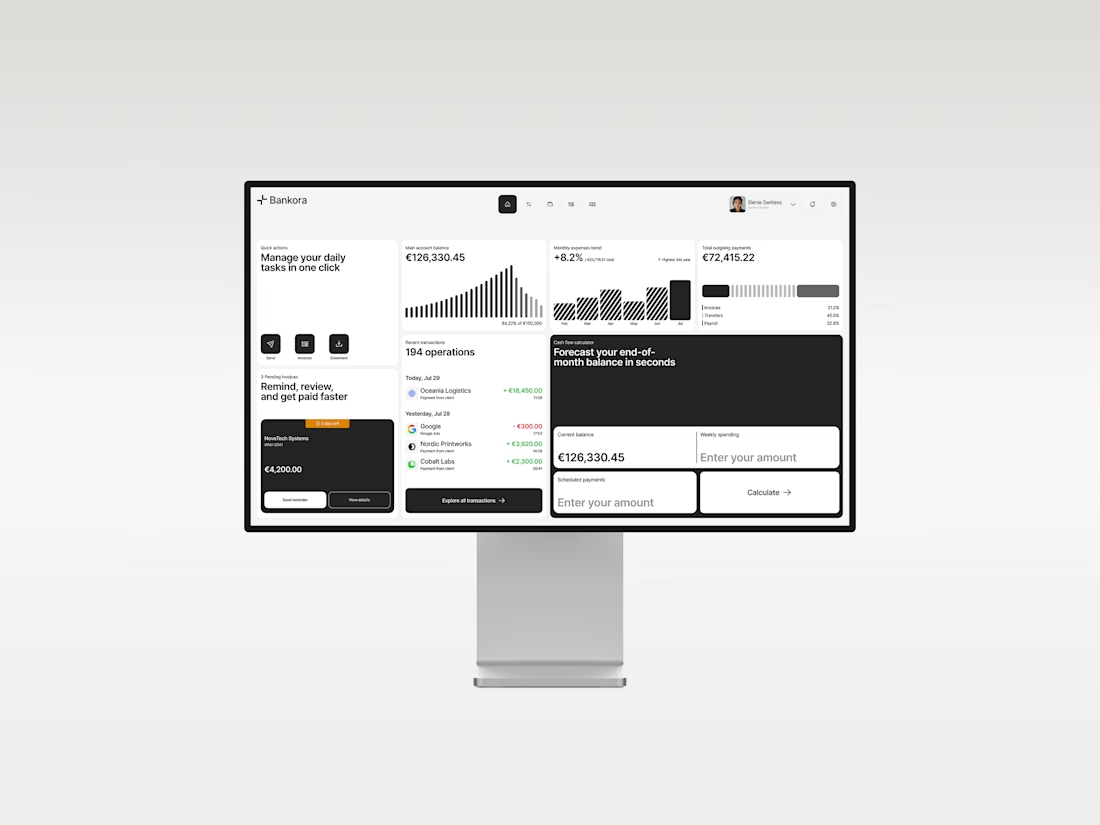
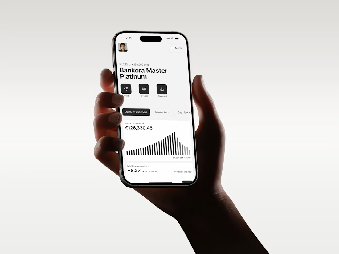
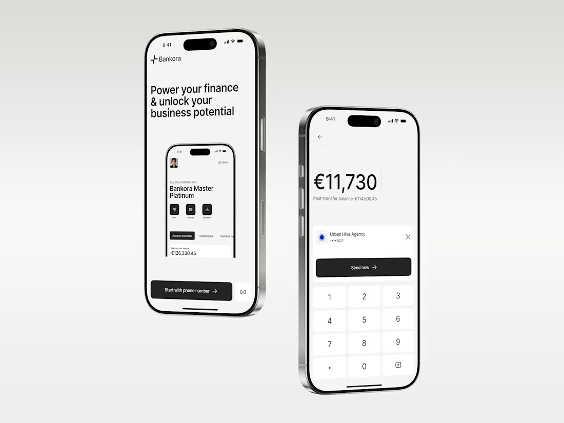
Business banking is already complex. The product shouldn’t make it feel even harder.
That was the thinking behind Bankora.
Payments, invoices, cash flow, financial overview. These are things business teams deal with constantly, yet many banking products still bury simple actions under dense data, long paths, and complicated navigation.
So I started with the workflows, not the screens.
I looked at the tasks people need to complete most often, where unnecessary steps appear, and what information actually needs attention first.
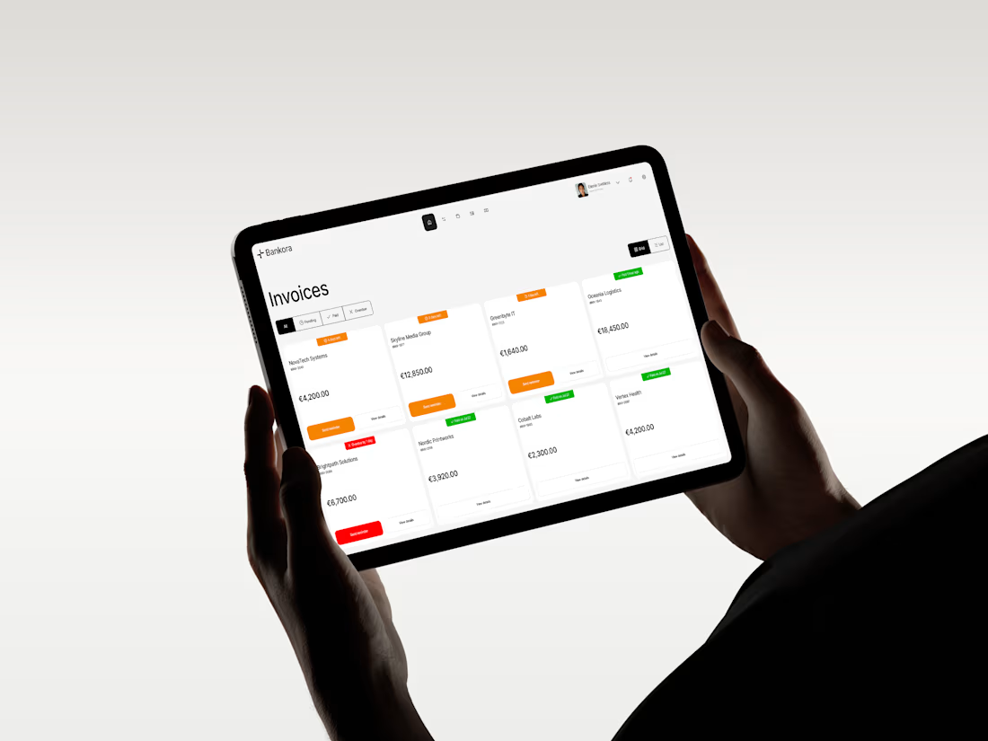
From there, I built the experience around clearer priorities: key actions available quickly, predictable navigation, structured financial data, and modular UI that makes things like pending and overdue invoices easier to understand at a glance.
I also designed an interactive cash flow calculator to help users see where the business may be heading, not just what has already happened.
The goal wasn’t to make financial operations simpler than they really are.
It was to make interacting with them feel simpler.
Less searching. Less cognitive load. More confidence in what to do next.
And it was especially nice to see Bankora later featured by Contra.