The network for creativity
Join 1.25M professional creatives like you
Connect with clients, get discovered, and run your business 100% commission-free
Creatives on Contra have earned over $150M and we are just getting started
Back to feedPost

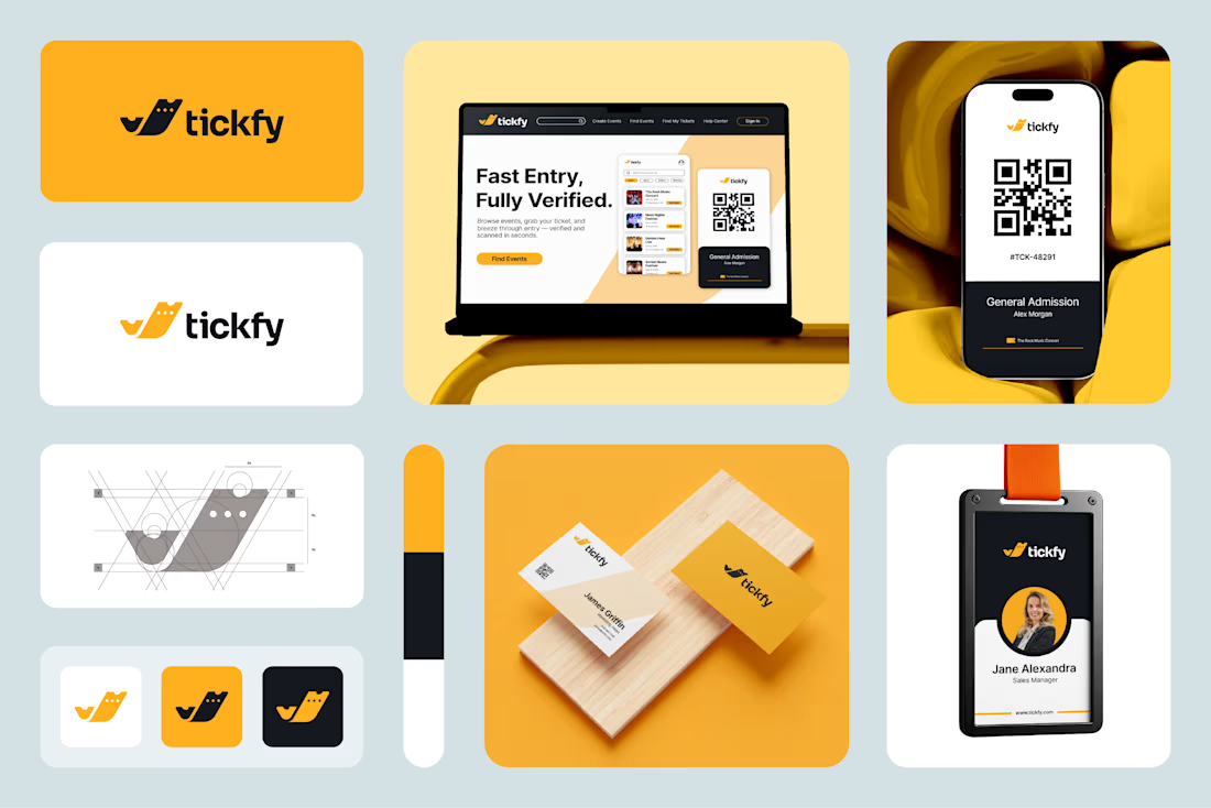
Designing a fast, frictionless visual identity for a modern ticketing event app 🚀
Traditional event check-ins are often slow, clunky, and frustrating for attendees.
For this project, my goal was to build a brand identity that feels fast, reliable, and effortless from the moment users open the app to the moment they walk through the event gates.
What I focused on:
Crafting a clean, dynamic logo grid that scales seamlessly across digital screens and physical print assets.
Choosing a modern typography and vibrant color palette that echoes speed, security, and excitement.
Creating vector assets using Adobe Illustrator for crisp resolution everywhere.
What do you think of this visual direction?
👉 Check out the full case study and branding details here: https://contra.com/p/ms37Pc3R-logo-and-visual-identity-design-for-a-ticketing-event-app?r=khoirul_jamhaarii_taaju_g_p36849
Need a custom brand identity or logo redesign for your app or startup? Let's connect or drop me a message!


The network for creativity
Join 1.25M professional creatives like you
Connect with clients, get discovered, and run your business 100% commission-free
Creatives on Contra have earned over $150M and we are just getting started
Related posts

New on Contra, not new to design.
I draw logos by hand, then build everything around them: the brand, the website, the store. Lately I also make product films and ads with AI.
Recent work: an RY monogram and site for a Koreatown law firm, a winged W for a defense firm, and my family's golf eyewear brand, from the mascot to Shopify.
Starting a brand, or have one that doesn't feel like you yet? Show me what you're building.

The logo-led system reads tight because the wordmark sits clean in the negative space instead of fighting the emblem — when a brand has that kind of restraint, the Shopify store usually carries the same hierarchy into the product grid and checkout without inventing new rules....

Just posted a new case study on Contra.
A 60-second promo for Ulta AI by Ultahost, a chatbot that runs a server through plain conversation. Script, storyboard and animation, all built around the real product UI.
Check it out
Let me know what you think💭😍


wow, impressive work


