The network for creativity
Join 1.25M professional creatives like you
Connect with clients, get discovered, and run your business 100% commission-free
Creatives on Contra have earned over $150M and we are just getting started
Back to feedPost

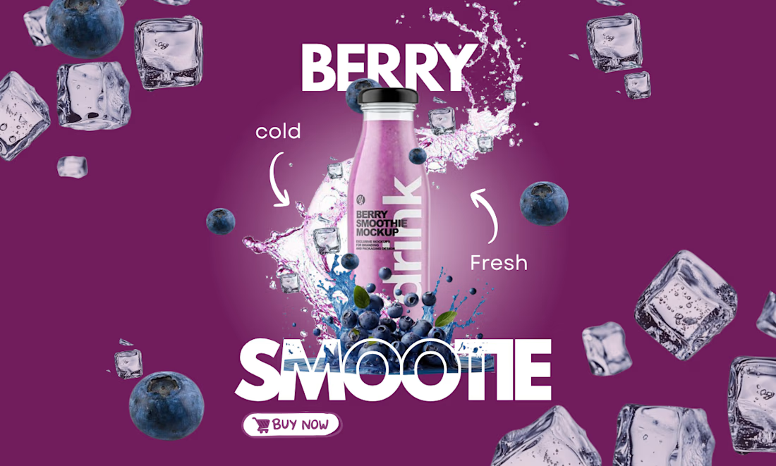
Berry Smoothie Social Media Advertisement 🍓🫐
A vibrant product advertisement concept designed to capture attention and showcase the freshness of a berry smoothie. This design combines bold typography, dynamic splash effects, floating fruit and ice elements, and a rich purple color palette to create an energetic and refreshing visual.
The composition is centered around the product, with supporting elements that enhance the feeling of freshness while maintaining a clean visual hierarchy. The call-to-action and modern layout make it ideal for social media promotions and beverage marketing campaigns.
Tools Used: Canva
Design Focus: Product Advertisement • Social Media Design • Typography • Visual Hierarchy • Branding • Food & Beverage Design
Designed to demonstrate my ability to create eye-catching promotional graphics that help brands showcase their products in a visually appealing and engaging way.
#GraphicDesign #SocialMediaDesign #ProductDesign #FoodAdvertising #BeverageDesign #CanvaDesigner #Figma #CreativeDesign #Branding #Portfolio

The network for creativity
Join 1.25M professional creatives like you
Connect with clients, get discovered, and run your business 100% commission-free
Creatives on Contra have earned over $150M and we are just getting started

Challenges
View all


Related posts

Client’s choice vs. Designer’s choice 👀
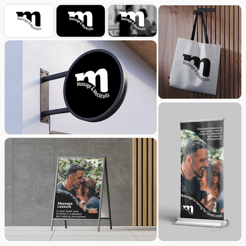
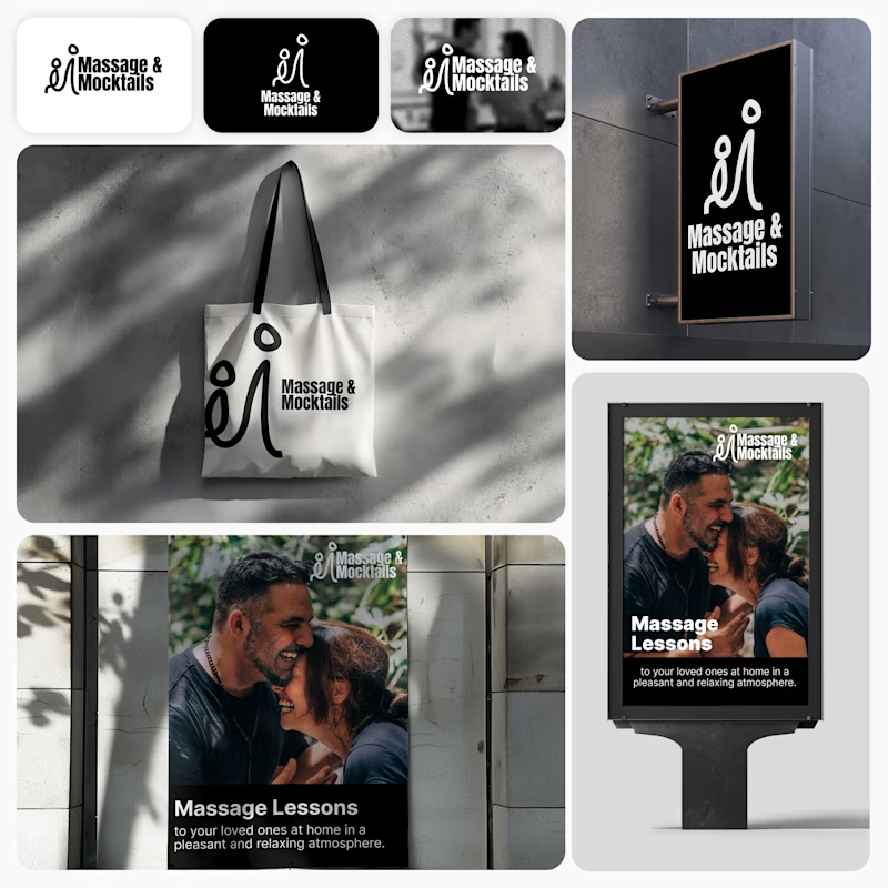
I’m currently working on a branding project for Massage & Mocktails — a concept built around couples learning massage together in a relaxed, social atmosphere.
These are two early, black & white directions from Stage 2 of my branding process, before moving into color, typography, and the full visual system.
The interesting part?
My client chose Concept 1. I chose Concept 2.
Now I’m curious what other creatives think.
Which direction would you choose — 1 or 2? And why?
Sometimes the most interesting part of branding is seeing how differently a client and a designer respond to the same brief.
21 voted
44%
27 voted
56%
48 votes
Closed

Concept 2 for me. That interlocking figure mark reads as two people meeting, which is the actual brief here, so it gives you more to build a system on. Concept 1 is the safer, more literal pick, which is usually why clients reach for it.

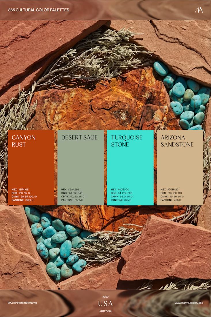
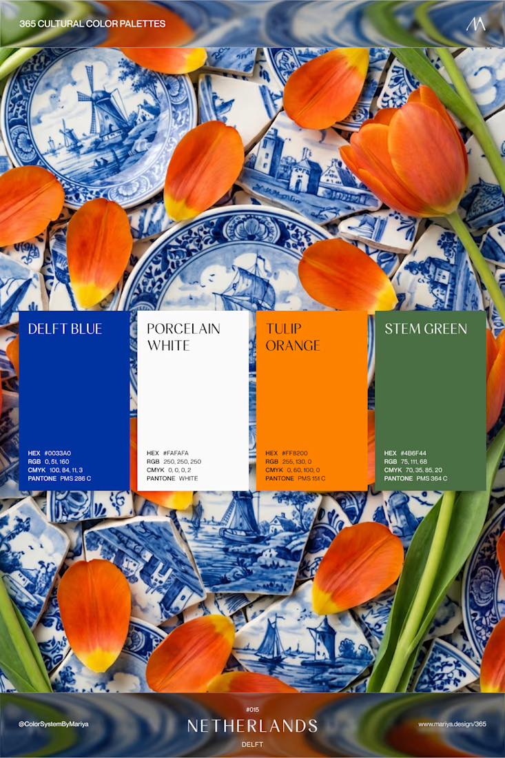
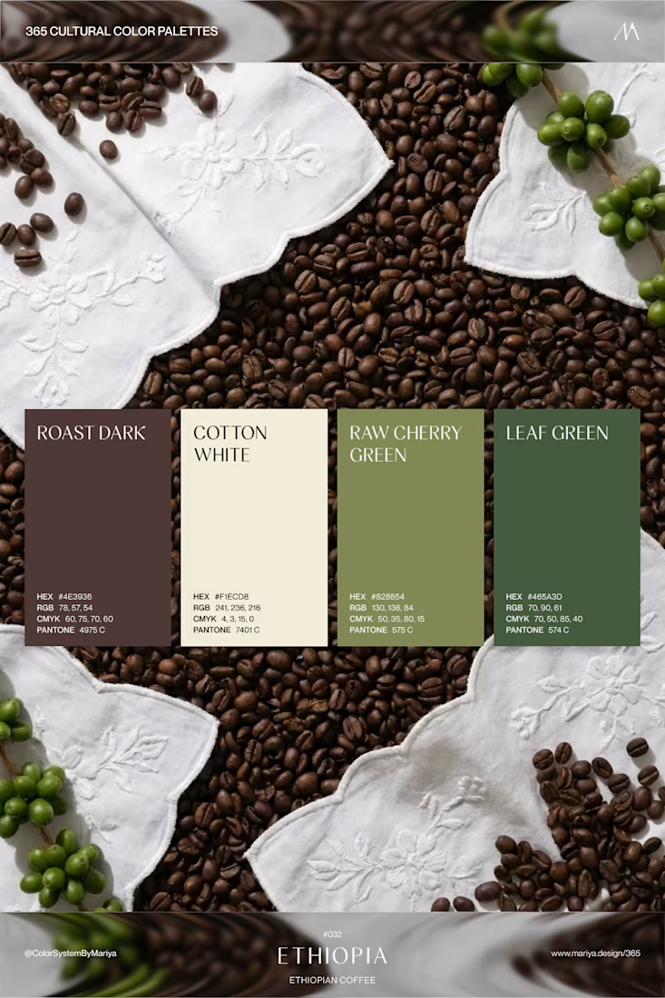
I joined Contra yesterday and I wonder if there are any other color-obsessed people here?




Aisha's Hair - Price List Flyer
I created a minimal and luxury price list flyer for a hair stylist brand.
Goal: Show prices clearly and make the brand look premium.
What I did:
Used elegant black and gold colors for luxury feel
Simple layout: Braids N15k, Wig Install N8k
Added Home Service Available for more bookings
Clean call to action: DM to book + WhatsApp
Tools: Canva
Result: A classy, easy-to-read price list that helps the client get bookings on Instagram and WhatsApp.
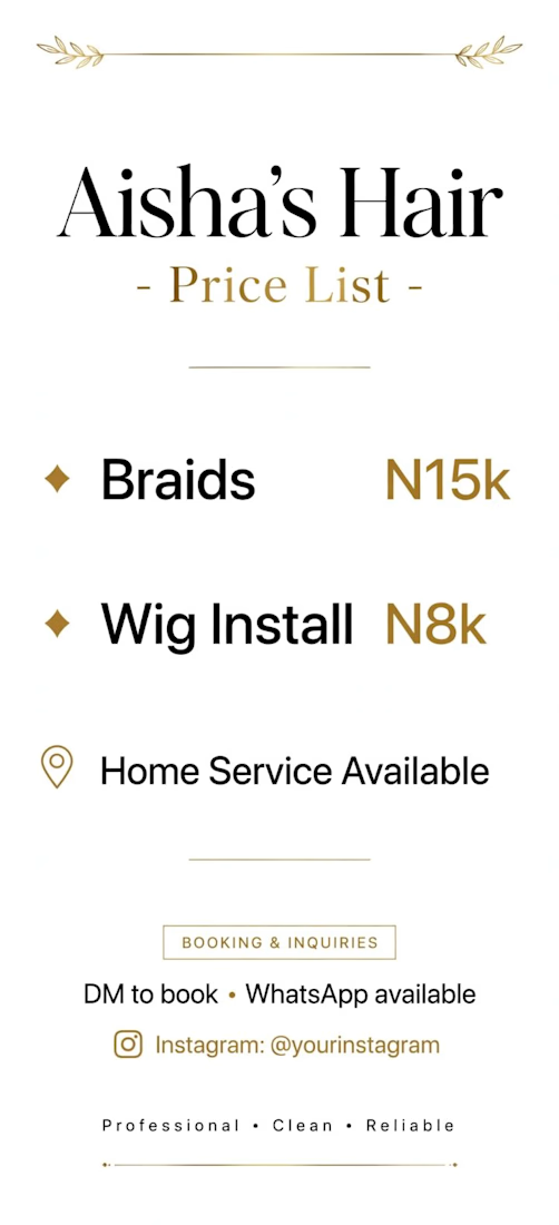

Putting the prices in gold rather than the service names is the choice doing the real work — the number becomes the accent instead of the thing you soften, which is the reverse of how most rate cards handle it. Hard numbers do date a flyer fast though; did she get an editable file so she can reprice without coming back to you?