The network for creativity
Join 1.25M professional creatives like you
Connect with clients, get discovered, and run your business 100% commission-free
Creatives on Contra have earned over $150M and we are just getting started
Back to feedPost

Custom GoHighLevel Landing Page Design For Fitness
Project Overview:
Designed and developed a high-converting, fully responsive sales landing page tailored for a specialized fitness and nutrition coaching program (AV8RFit). Built to capture high-ticket leads, the page combines crisp visual hierarchy, strategic call-to-action placement, and custom section styling to drive consultations.
Key Technical & Design Highlights:
Custom Visual Layout: Engineered angular section dividers and branded color blocks to create an energetic, modern aesthetic.
Lead Generation Architecture: Integrated intuitive lead-capture forms, interactive highlight cards, and testimonial carousels to maximize user engagement.
Conversion-Driven Structure: Clear value proposition framing paired with strategic sticky/repeating CTA buttons.
Responsive Build: Flawlessly optimized for smooth navigation across mobile, tablet, and desktop devices.


The network for creativity
Join 1.25M professional creatives like you
Connect with clients, get discovered, and run your business 100% commission-free
Creatives on Contra have earned over $150M and we are just getting started








Related posts

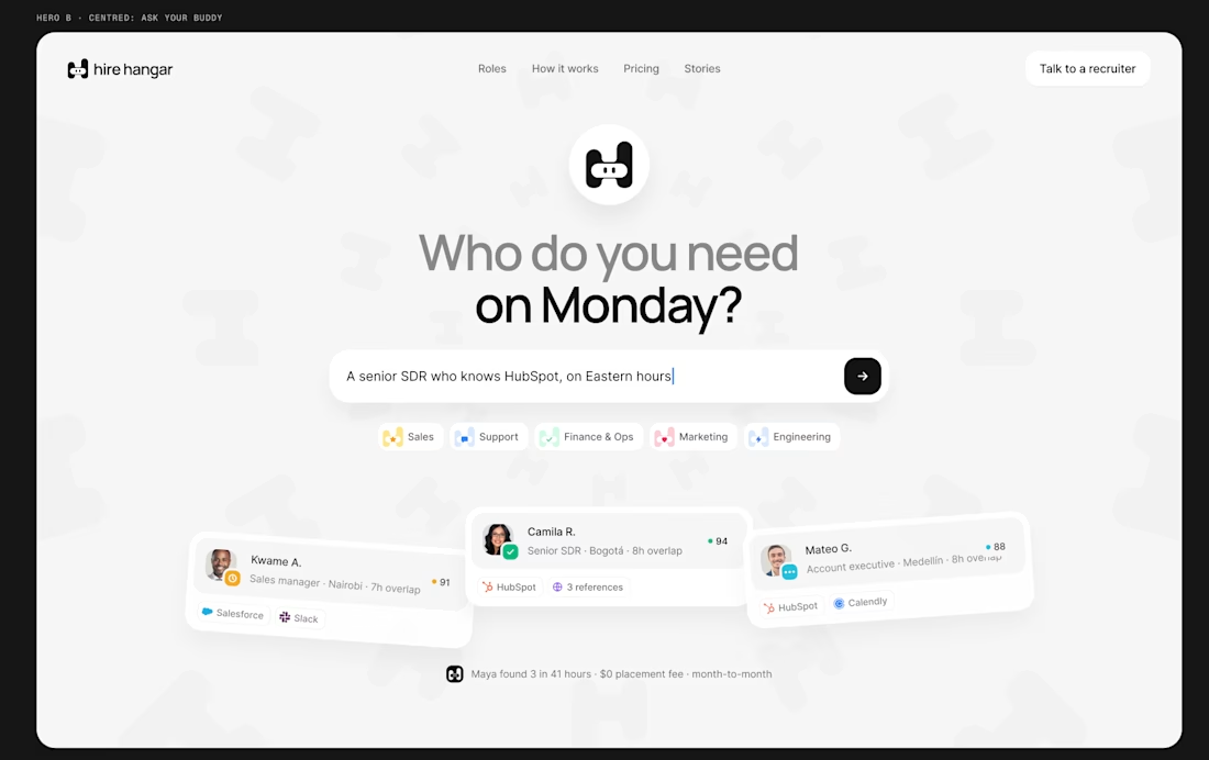
A good landing page shouldn’t make you work to understand it.
Been working on a new project where the goal was simple:
Make a complex product feel simple, clear, and easy to explore.
Less explaining. Less clutter. More visual hierarchy. A clearer path to the next step.
Still working through the details, but this one is coming together nicely.
Full case study soon.
This pairs well with the Hire Hangar screenshot because the design itself demonstrates the point—you don't need to reveal the whole project yet.



This is nice 👌

Bland is a choice.
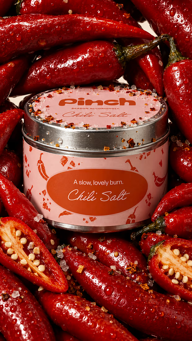
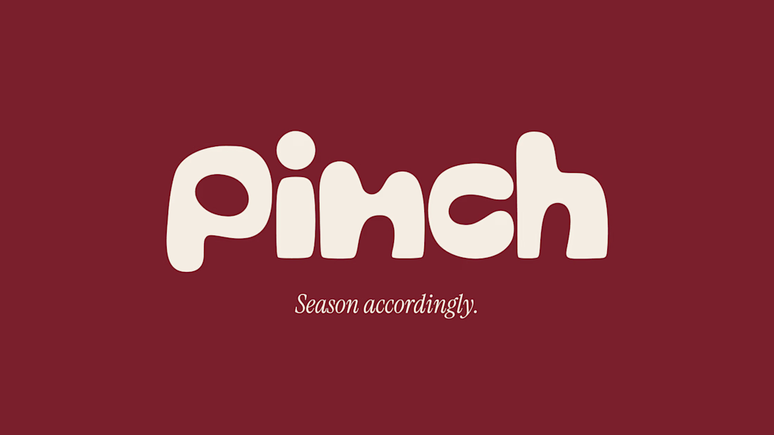
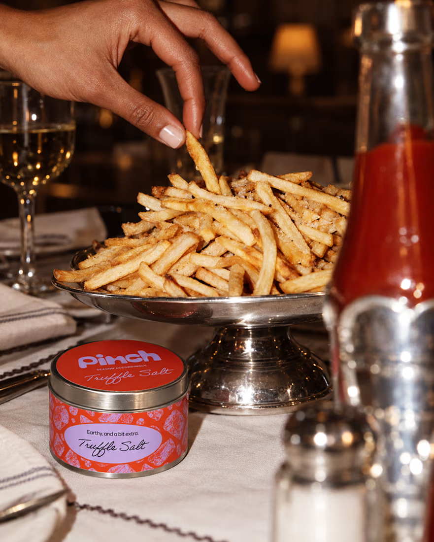
Pinch is a concept brand for a mid-high salt line made to live on the counter, not in the cupboard. Five flavors, five two-color tins, one refillable keepsake people leave next to the bar cart.
I built the full identity: wordmark, lid lockups, hand-stamped pattern system, tone of voice, and art direction.
More from the system coming soon.



Cool work 🔥

Designed a modern Healthcare Landing Page.
A calm teal and soft blue interface with elegant serif typography for a warm and trusted first impression.
A quick doctor search, friendly doctor profiles, hand-drawn medical illustrations, and patient reviews make finding care feel simple and human. Clean cards, generous spacing, and a smooth mobile booking section keep the whole page clear and easy to explore.
healthcarewebsitedesignmedicallandingpageProduct DesignUI DesignWeb DesignAdobe After EffectsFigmaJitter


I love this very much