The network for creativity
Join 1.25M professional creatives like you
Connect with clients, get discovered, and run your business 100% commission-free
Creatives on Contra have earned over $150M and we are just getting started
Back to feedPost
An ice cream brand went bankrupt this month because a judge ruled its pints copied Van Leeuwen's trade dress and made it hand back $23.8M. Every dollar the look ever earned.
The ruling turned on one word: deliberately. Intent is discoverable. The reference deck with the competitor pinned as "target" becomes evidence.
Your "make it feel like Linear" slide is the same slide. Nobody will sue you. You just pay differently: every impression you buy trains buyers to recognize their codes, not yours.

$23.8M for "looking familiar" is absolutely insane. Ig intent leaves a trail - references, iterations, assets, timestamps - and once that trail tells a story, the pixels are almost irrelevant.


$23.8M for copying a look, brutal


INSANE. much more than brutal

“Really interesting point — especially for designers. A reference can guide direction, but the final visual identity should still have its own rationale and distinctive system. Documenting the design decisions along the way can also make the creative process much clearer.”

Write the quality you admire in words, don't pin the screenshot might be the sharpest reframe of competitive research I've read. Translating into words forces you to actually understand why something works instead of just copying the output.
The network for creativity
Join 1.25M professional creatives like you
Connect with clients, get discovered, and run your business 100% commission-free
Creatives on Contra have earned over $150M and we are just getting started



Related posts

creating a consistent visual language that makes a brand recognizable, communicates its personality, and builds a stronger connection with its audience.


Very nice

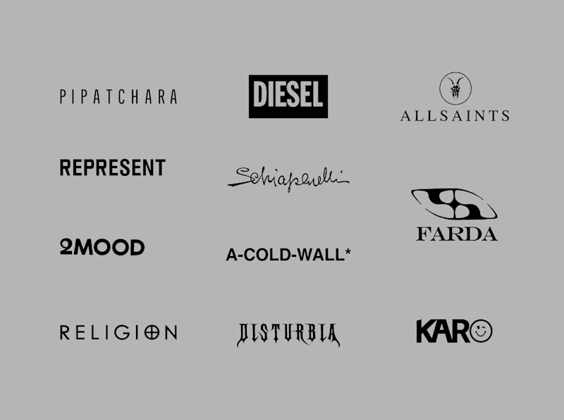
Another category comparison, and this one's going to make you look twice.
The fashion category needed a fresh point of view. Most established players relied on functional wordmarks and relatively restrained visual identities.
With Ru’asā, we took a different route. We challenged those conventions and built an identity designed to stand apart, be remembered and give the brand a world of its own.
Distinctive by design. Unconventional by nature.
Which would you choose?
Familiar category conventions
A fresh point of view
7 votes
Ends in 18h

Story or process?
A: the ad. 30 seconds of pure story. Rosita, a grandma's hot sauce, goes from one chat to a full brand, product shoot, original track, landing page and Shopify store.
B: the breakdown. How it was made, from the brief and the prompts to directing every shot, sound and final frame.
Same brand, built and launched with AI. Which one makes you want to hire the person behind it?

7 votes
Ends in 22h


