The network for creativity
Join 1.25M professional creatives like you
Connect with clients, get discovered, and run your business 100% commission-free
Creatives on Contra have earned over $150M and we are just getting started
Back to feedPost

What elements can you identify in this logo? 👀
Look closely and share your thoughts in the comments below! ✦

The network for creativity
Join 1.25M professional creatives like you
Connect with clients, get discovered, and run your business 100% commission-free
Creatives on Contra have earned over $150M and we are just getting started



Related posts

Happy Monday! Exploring early concept marks for a regional IT brand wanting to bridge modern IT services with Appalachian heritage.
Out of 10 sketches, my circle split right down the middle on these two:
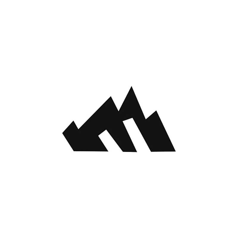
A: The Ridge Monogram holds a bold silhouette where the "E" acts as the bedrock of the mountain ridge. It became a fast favorite with non-designer friends.
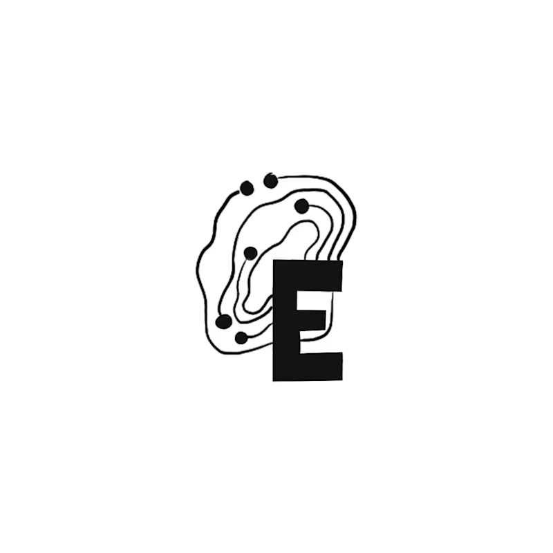
B: The Topo-Circuit idea plants a dynamic mark pairing circuit traces with elevation contours that can adapt to different locations as the business expands. (My personal pick!)
Which direction would you build out: A or B?
22 voted
73%
8 voted
27%
30 votes
Closed

I like the ridge monogram here!
because it is serving its purpose and it can be use in all applications.
The smallest ones as well.
Great work!🔥

Exploring Brand assets. Which one feels good?
24 voted
80%
6 voted
20%
30 votes
Closed

stack is cool but linear is doing the job better :)

Torna-te quem tu és. Become who you are.
That is the motto of Colégio Altiora, and the whole identity starts from it. Altiora is Latin for "higher things", so the symbol is a small "a" built from two pieces, an arch that rises and a yellow ball.
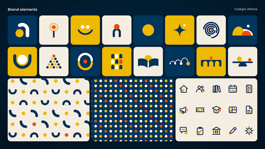
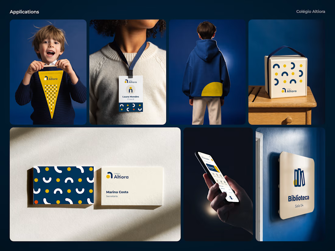
From those two pieces came everything else. The patterns, the brand elements, the icons for the school app, the classroom signs and the uniform all share the same arch and the same ball.
A school for those who always reach higher.



Great job nice icons