The network for creativity
Join 1.25M professional creatives like you
Connect with clients, get discovered, and run your business 100% commission-free
Creatives on Contra have earned over $150M and we are just getting started
Back to feedPost
🚀 Revisited an old idea and brought it to life with Google Stitch.
A while ago, I worked on a concept called 'EatSmart,' a smart refrigerator experience designed to help households reduce food waste through inventory awareness, freshness tracking, shopping assistance, and sustainability insights.
The project never progressed beyond low-fidelity wireframes.
For the Google Stitch Challenge, I decided to revisit it and see how quickly I could transform those wireframes into a polished MVP.
My workflow:
🧊 Imported the original .fig wireframes into Stitch
🎨 Generated an initial design system and visual direction
✨ Used in-place edits to refine screens and flows
🔄 Explored multiple dashboard and splash screen variations
🎬 Experimented with animated variations and ambient motion
🔗 Generated an interactive prototype in a single click
♿ Ran accessibility audits to identify improvements
📱 Explored alternate device adaptations
What impressed me most wasn't just the screen generation.
It was how quickly I could move from an abandoned concept to a complete product vision, complete with a design system, prototype, branding assets, and supporting materials.
Instead of spending most of my time rebuilding screens, I spent my time evaluating ideas, refining experiences, and making product decisions.
EatSmart started as a collection of old wireframes and evolved into a much more complete product experience.
Prototype Link:
https://stitch.withgoogle.com/preview/4918386598560619188?node-id=382d3ade6f3f48c6a8bd960c8d1b6ca7
Prototype walkthrough:
https://www.loom.com/share/0270b767bfba49aa9a666d293297aa52
Process walkthrough:


This is really nice, the transformation from wireframes to a full MVP using Stitch is very clear and well structured. Feels practical and thoughtful.
My submission for this challenge
https://on.contra.com/pnfJBQ
Open to feedback.

on.contra.com
Introducing Voya: Revolutionize Your Travel Planning Experience
Connect with next-gen talent and tools to get work underway. Hire more independents. Start more projects. Get more creative.

Thank you! @Rishi Shah
The network for creativity
Join 1.25M professional creatives like you
Connect with clients, get discovered, and run your business 100% commission-free
Creatives on Contra have earned over $150M and we are just getting started





Related posts

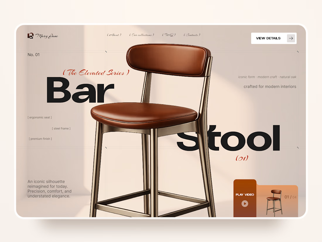
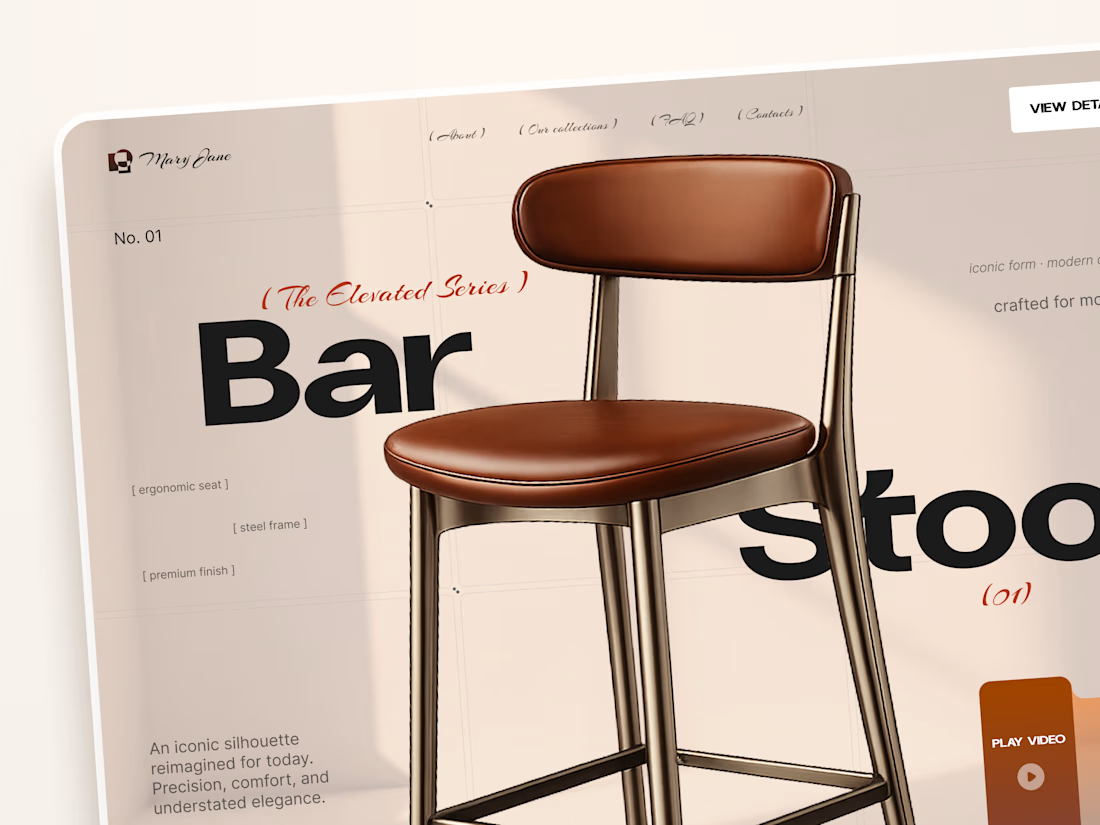
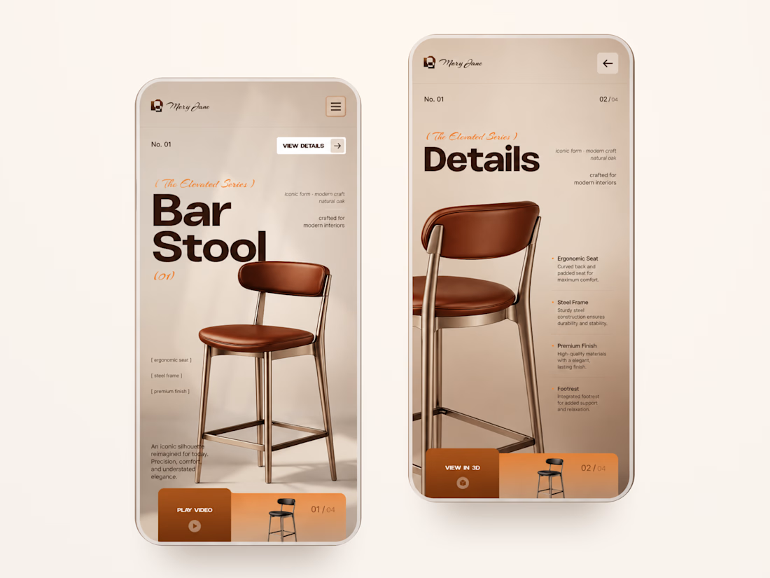
Mary Jane — Bar Stool Product Landing Page 🪑✨
A refined product landing page concept for a modern furniture brand, built around one statement piece
The design combines warm neutral tones, oversized typography, and editorial layouts to give the bar stool a premium, design-focused feel
Special attention was given to:
• Product-first composition
• Clean editorial typography
• Warm premium aesthetic
• Product details and features
• Video and 3D presentation
• Responsive mobile layout
The result is a simple, elegant experience that keeps the product at the center while giving the brand a distinctive visual character 🤎


Nice work

An old client project: a full redesign of a crypto app.
Created the video with Opus 5.5

Top-notch design.

A personal identity experiment for Super Intelligence.
The symbol combines a star and the letters SI into one compact mark.
Logo design + motion.


Excellent use of geometry in the logomark!