The network for creativity
Join 1.25M professional creatives like you
Connect with clients, get discovered, and run your business 100% commission-free
Creatives on Contra have earned over $150M and we are just getting started
Back to feedPost
Taste Test

Minimal or Data-rich — which slide style works better?
Both can be effective, but they solve different problems.
A minimal slide can help the audience focus on one clear message.
A data-rich slide can give more context, evidence, and detail.
The real question is not which one looks better.
The real question is: which one fits the decision being made?
For this concept, I explored two directions for the same business topic:
A — Minimal
Clean, focused, easy to scan.
B — Data-rich
Detailed, analytical, evidence-based.
Which one would you choose for a real client presentation?
Vote in the poll — and tell me why in the comments.
6 voted
100%

0 voted
0%

6 votes
Closed
The network for creativity
Join 1.25M professional creatives like you
Connect with clients, get discovered, and run your business 100% commission-free
Creatives on Contra have earned over $150M and we are just getting started



Related posts


Which homepage would make you more likely to explore the platform?
HackStack features bold typography, teal gradients, and a centered layout focused on AI tools and automation. DataVistaHQ uses purple accents, a split layout, and a prominent dashboard preview to introduce its business intelligence platform.
I would like your perspective on the visual design, clarity, and first impression. Which approach communicates its value more effectively and makes you want to take the next step?
Vote for your preferred design and share what influenced your choice: the colors, headline, layout, dashboard preview, or overall presentation.
#WebDesign #AIWebsites #UIUXDesign #SaaSDesign #TransformedDesign


2 voted
17%

10 voted
83%

12 votes
Closed

Visually, I lean toward DataVistaHQ, but the cognitive load is really high. The value proposition and the stats feel like they're competing for attention.
On the other hand, HackStack has a much better visual hierarchy. The value proposition and CTA group immediately give me a...

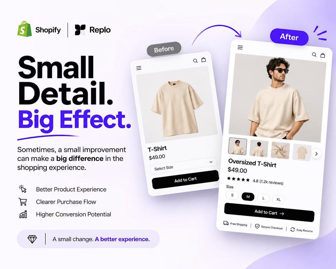
Small Detail. Big Effect. 🚀
Sometimes, a better shopping experience doesn't require a complete website redesign.
It's the small details that matter.
Think about:
Clearer product image galleries.
Better product variant selection.
Easy-to-use size options.
More visible Add to Cart buttons.
A smoother product page experience.
When building with Shopify + Replo, I focus on these details to create cleaner, more intuitive e-commerce experiences.
Because great e-commerce design isn't just about how a page looks. It's about how easily customers can use it.
Small improvements. Thoughtful design. Better experiences.
Working on a Shopify store or planning a Replo landing page?
Let's connect!



Agreed, small product page fixes often beat a full redesign. Clear variant selection and size options remove hesitation right at the point of buying.

Chic and minimalist fashion flat lay! ✨👜
For clothing and lifestyle brands, presentation is everything. This kind of clean, aesthetic layout instantly grabs attention and elevates your brand’s visual identity on social media.
Need custom social media templates or high-end visuals for your fashion store? Let's connect! 💬
#FashionDesign #CanvaTemplate #E-commerceDesign #BrandStyling #FreelanceDesigner #AestheticFeed