The network for creativity
Join 1.25M professional creatives like you
Connect with clients, get discovered, and run your business 100% commission-free
Creatives on Contra have earned over $150M and we are just getting started
Back to feedPost
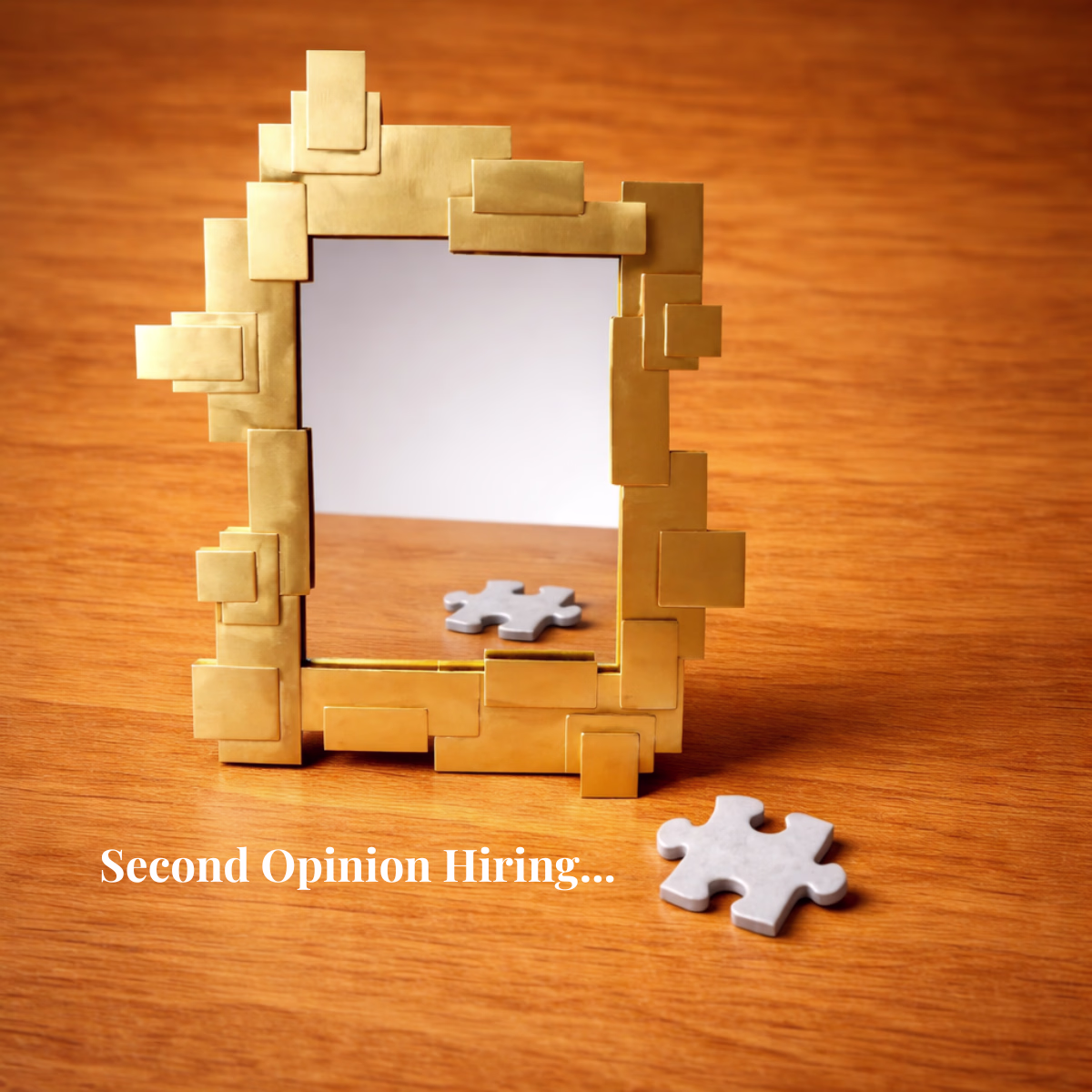
Second Opinion Hiring.
Not every hiring decision is obvious.
OUTSIDE VIEW means a second opinion, outside the internal hiring process.
👉 Learn more: www.humaniahrsolutions.com
The network for creativity
Join 1.25M professional creatives like you
Connect with clients, get discovered, and run your business 100% commission-free
Creatives on Contra have earned over $150M and we are just getting started
Related posts
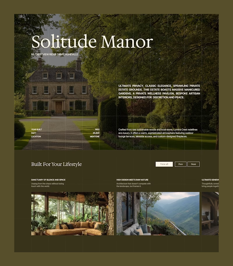
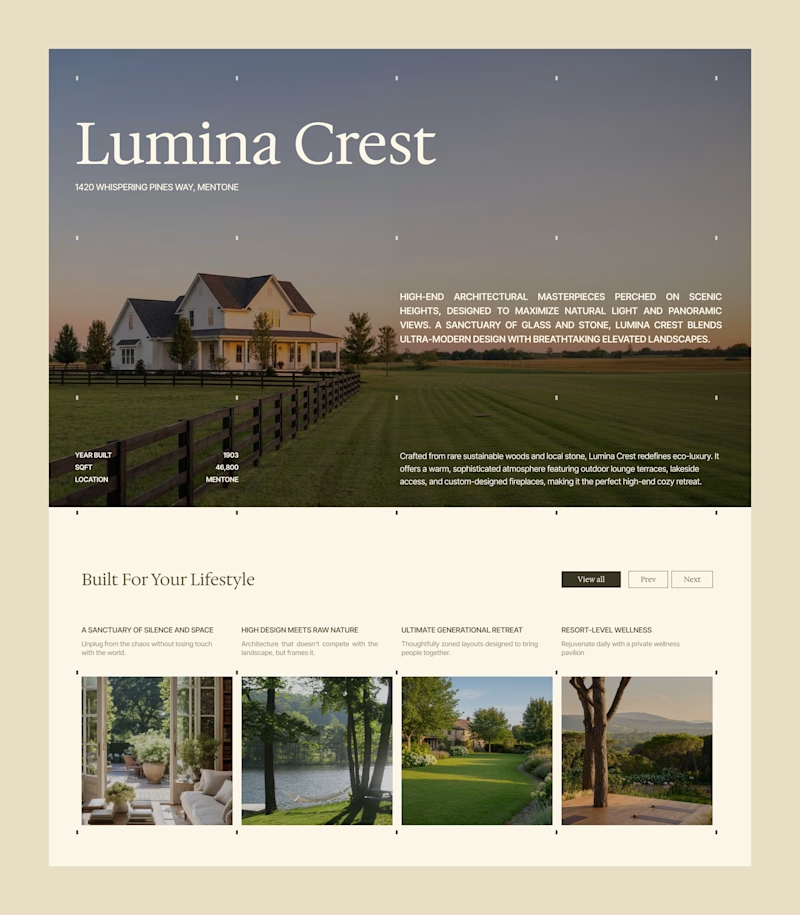
The landing page is where the decision happens.
I make sure it is easy to trust, not just beautiful to look at.
One layout, but two completely different price perceptions. 📐
Look at these two screens. This is exactly how visual positioning works for premium real estate. By shifting the atmosphere from a deep olive to an editorial cream, we change the target audience profile without touching a single line of text.
Which atmosphere cuts through the noise and builds instant authority for a high-end launch?
Work with me: I'm currently tracking projects for the upcoming summer months. If your brand is preparing a launch and needs crisp execution across Identity, UI/UX and Development, send over your project details.
8 votes
Ends in 1d
Trending
Claude
Claude has entered the design space. How are you using Claude Design?
Contra University
Learn from expert creatives how to earn more using next-gen AI tools.
MagicPath
The canvas is infinite, and exploration is becoming the workflow. How are you using MagicPath?
creativeaiflow
Creative AI workflows are evolving. What tools do you use, and what are their strengths and weaknesses?
freelancerlife
Freelancer life is wins, pivots, and everything in between. What’s yours right now?