The network for creativity
Join 1.25M professional creatives like you
Connect with clients, get discovered, and run your business 100% commission-free
Creatives on Contra have earned over $150M and we are just getting started
Back to feedPost

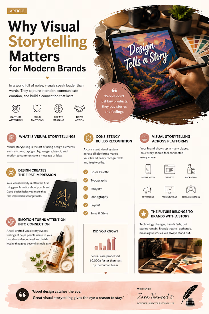
A polished editorial infographic combining professional writing, visual storytelling, typography, and engaging graphic design.

The network for creativity
Join 1.25M professional creatives like you
Connect with clients, get discovered, and run your business 100% commission-free
Creatives on Contra have earned over $150M and we are just getting started







Related posts

Food Magazine Website Design
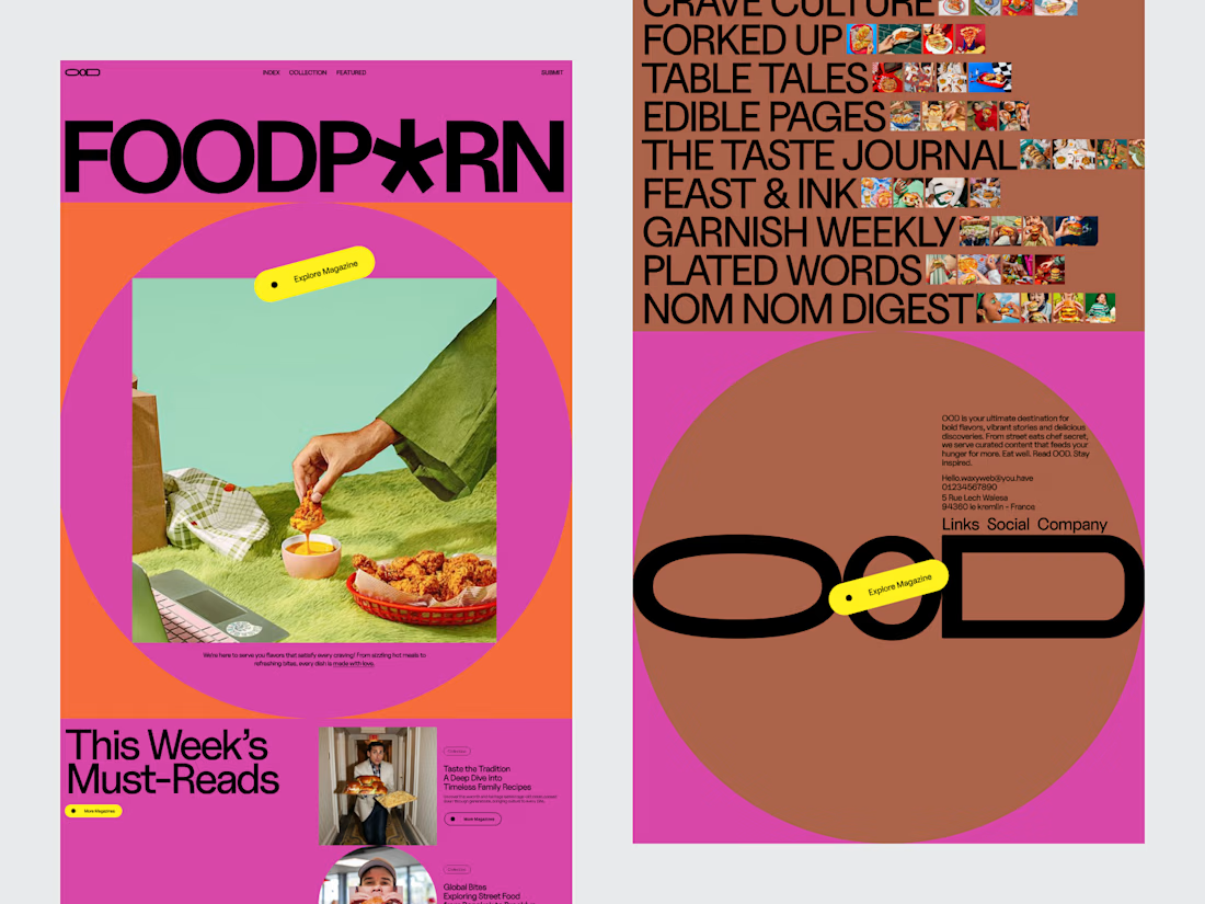
A modern editorial website concept created for a food-focused digital publication.
The design balances rich food photography with structured content, making recipes, stories and featured articles easy to discover without losing the character of an editorial publication.
The visual system is built around strong typography, clear hierarchy and photography-led layouts.
Design focus:
• Editorial Web Design
• Food Website Design
• UI/UX Design
• Content Architecture
• Typography
• Responsive Design
Designed by WaxyWeb.


Great Work

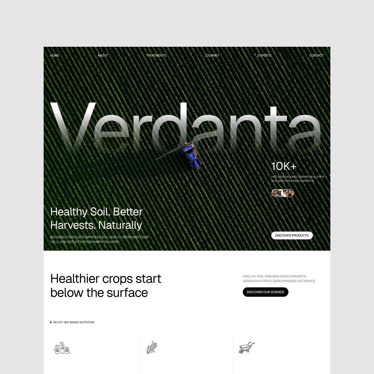
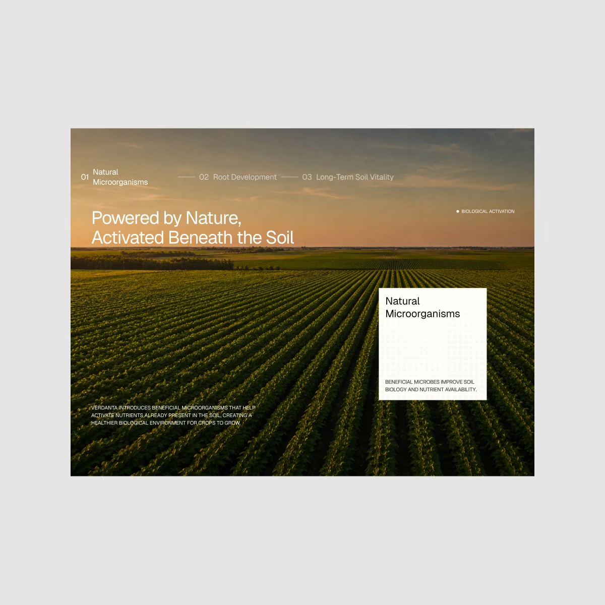
Verdanta — Bio-Fertilizer Landing Page. Where nature meets a more scientific side of agriculture.
I explored deep natural tones, agricultural photography, and clean editorial layouts to make the brand feel grounded in nature while still modern and credible.

Scalability should never come at the cost of personality when building an Identity.
A strong identity carries one big idea consistently, from the biggest brand moments to the smallest touchpoints, without losing what makes it distinctive. To me, that’s one of the clearest signs of a system built to last.
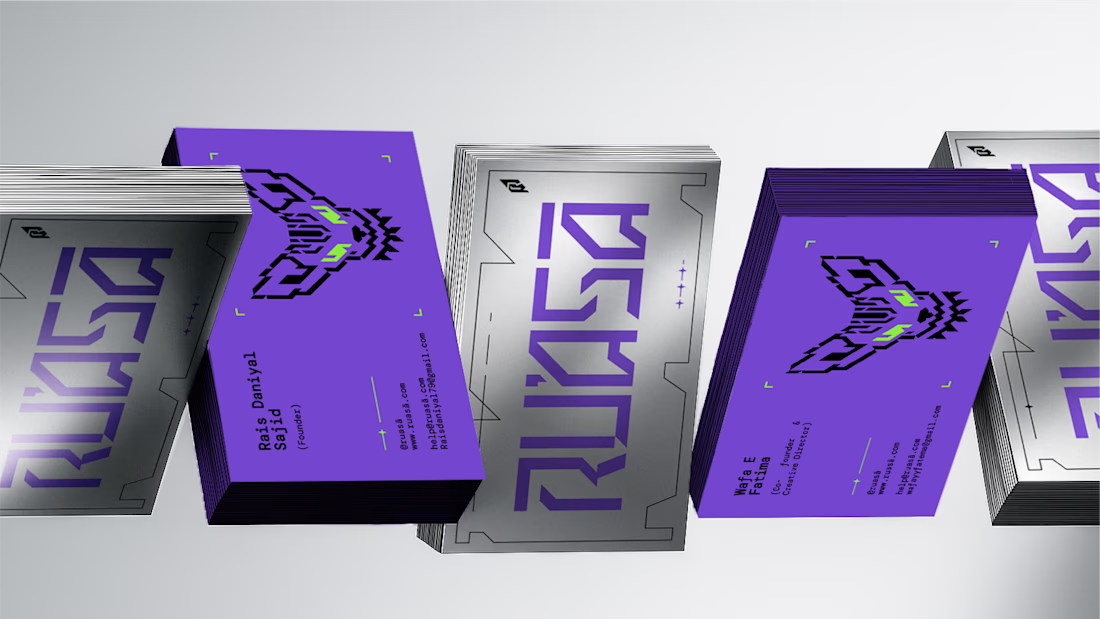
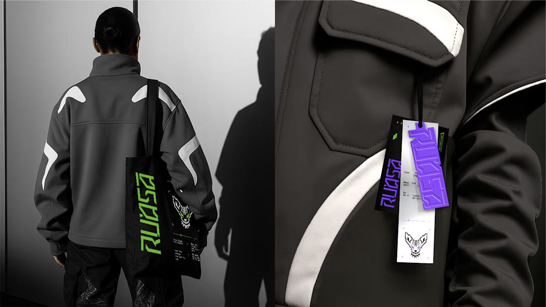
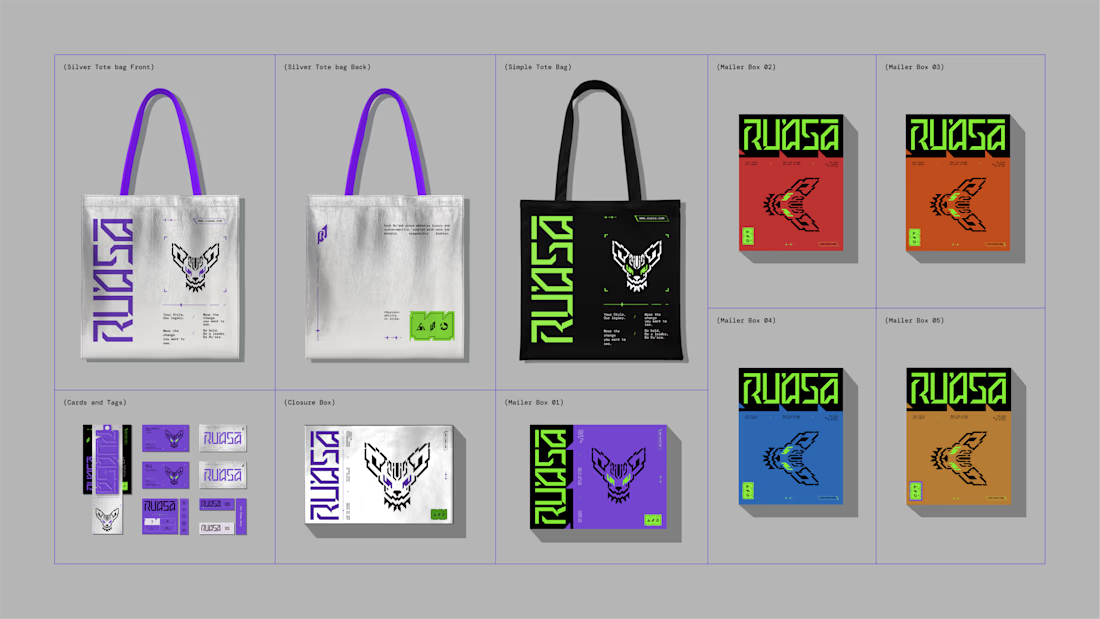
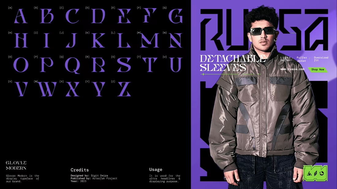
For Ru’asā, this was especially important. The identity is intentionally maximalist, which meant every application had to carry the same energy without becoming inconsistent or overwhelming.
The challenge was building something expressive, yet systematic enough to scale. And that’s exactly what we built.
Here are some of the touchpoints we created for Ru’asā. Do they feel like they belong to the same world?