The network for creativity
Join 1.25M professional creatives like you
Connect with clients, get discovered, and run your business 100% commission-free
Creatives on Contra have earned over $150M and we are just getting started
Back to feedPost

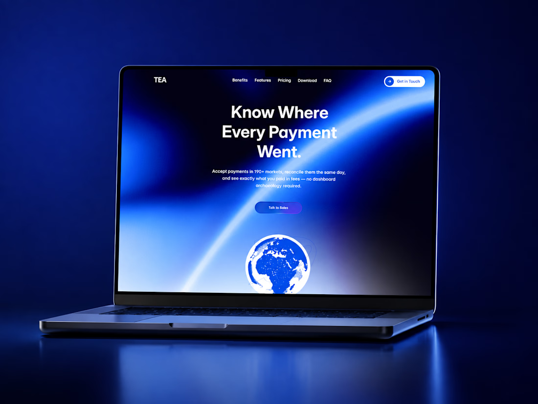
TEA Payments — Website & Visual Identity
A marketing site for a B2B payments platform, built around one question most competitors avoid: where did the money actually go?
Project description
Payments companies almost all sell the same thing — volume, speed, uptime. Open five of their sites and you'll get five variations of the same throughput number above the fold.
TEA's actual advantage was quieter. Not that it moves money faster, but that you can see what happened to every transaction, the day it settles. So the site leads with that instead: "Know Where Every Payment Went." Every section after it earns that claim rather than restating it — reconciliation that finishes the same day, one stated rate per transaction, 190+ markets under one contract.
I wrote the site end to end alongside designing it. Positioning, headlines, pricing tiers, FAQ, error states, the wording inside form buttons. Copy and layout were never handed off between two stages — the "no dashboard archaeology required" line in the hero exists because the layout had room for one more clause, and the pricing tiers are three because the product genuinely has three shapes of customer, not because three columns fill a grid nicely.
Identity. A single blue does the work — #1D4ED8, deep navy beneath it, white above. Finance sites reach for either sober navy or startup gradient soup; this sits between, saturated enough to feel current, disciplined enough to sign a contract in front of.
Motion. The heroes run a live liquid-gradient shader rather than a static image — slow enough to read as expensive, not as a screensaver. The centrepiece is a particle globe with the currencies plotted as real markets, USD in New York through AUD in Sydney, with flight paths tracing between them. It's the argument made visually: money crossing borders and staying accounted for.
Systems. Built in Framer as components with variants throughout — pricing cards, hover feature cards, an accordion where each open state is its own wired variant. Every section responsive across desktop, tablet and phone, with the components carrying breakpoint-specific geometry rather than being squeezed.
The curiosity showing up most is in the small decisions. The globe's hotspot labels pair each country with its currency instead of its capital, so the mark doubles as a coverage map. The subscribe button has written success and failure states, because a form that says nothing when it breaks is a design that stopped early.
Details block
Role , Design, front-end build, copywriting
Built with , Framer, custom shaders, code components
Deliverables , Marketing site (multi-page, fully responsive), visual identity direction, full site copy, motion design
Skills / tags
Web Design · Framer · Brand Identity · UX Writing · Motion Design · Design Systems · Fintech · Responsive Design

The network for creativity
Join 1.25M professional creatives like you
Connect with clients, get discovered, and run your business 100% commission-free
Creatives on Contra have earned over $150M and we are just getting started

Challenges
View all


Related posts

Thaw — AI Mental Wellness Platform Landing page
Designed the landing page and dashboard preview for Thaw — an AI platform that tracks anxiety, mood, and burnout, framing emotional buildup as frost that gradually melts through guided sessions.
Mental health apps tend to land in one of two places: too clinical to feel human, or too soft to feel like it takes anything seriously. So the whole design leans on one strong metaphor instead — a head encased in melting ice — and lets oversized typography wrap directly around it for real visual weight.
Below the hero, the dashboard preview does the harder work: mood stability, anxiety signals, sleep quality, and a specific AI-detected insight that makes the product feel genuinely perceptive rather than generic.
A warm dark palette with cool blue type keeps the tone serious without tipping into heavy.
Creative - Midjourney
Animation - Jitter


Most B2B tech brands try to look "disruptive." But when your business model is managed IT and technical operations for the world's largest enterprises, disruption is the last thing your clients want.
They want resilience. They want 24/7 global coverage. They want a team that can resolve 725,000+ tickets while maintaining a 99.9% uptime.
We redesigned Anovia’s digital presence to match that operational reality.
Anovia (formerly Innovatia Technical Services) supports organizations at a massive scale: LVMH, iFit, and Tempo rely on their 300+ certified specialists to handle the heavy lifting of infrastructure.
The design reflects that "extended team" philosophy. We used high-density grid systems, a deep enterprise palette, and a focus on transparency. It doesn't just describe their 98% customer satisfaction; it demonstrates the rigor that earns it.


🎰 6 POSTS AGO I ASKED: LUCK OR A PATTERN?
Well… apparently, a pattern.
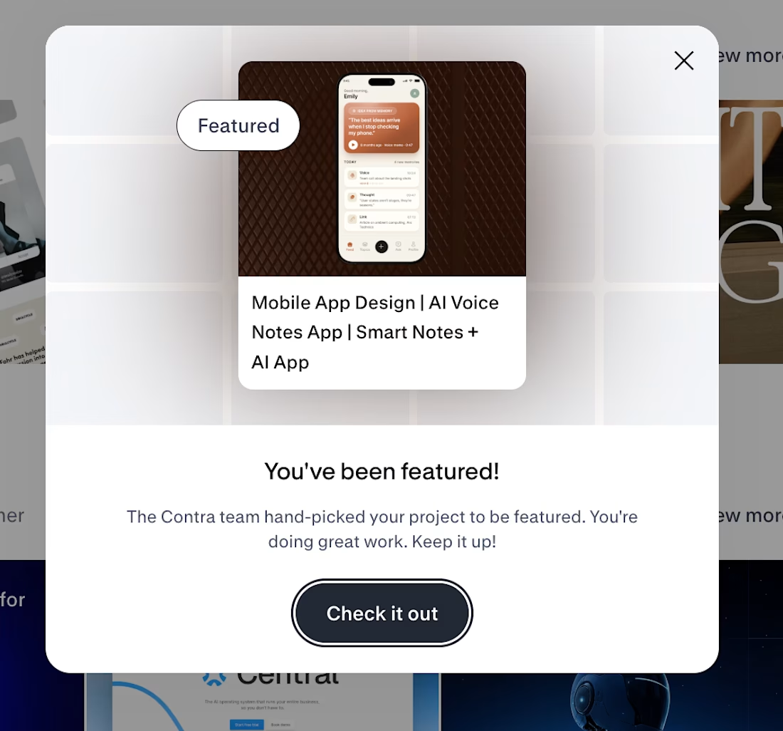
Another Asol Design project was hand-picked by the Contra team.
Feature #7.
And this time it’s our AI Voice Notes App, another mobile product concept built around the same principle I keep pushing:
Great mobile design isn’t just about making screens look beautiful.
It’s about combining product thinking, user behavior, growth logic, and strong visual execution into one clear experience.
7 features later, I think the pattern is becoming pretty obvious. 👀
Thank you, Contra team, for noticing the work again.
More mobile product experiments, growth thinking, and probably a few more Contra features are coming. 👀
Next stop: #8?
#mobileappdesign #productdesign #uxdesign #uidesign #growthdesign #iosdesign #aidesign #figma #asol_design



Congrats 🎉