The network for creativity
Join 1.25M professional creatives like you
Connect with clients, get discovered, and run your business 100% commission-free
Creatives on Contra have earned over $150M and we are just getting started
Back to feedPost
Taste Test


Which one would you poster?
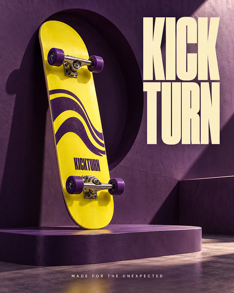
The first stands upright against a purple wall, yellow deck with purple wheels, an arched recess behind, the wordmark stacked in cream at the right.
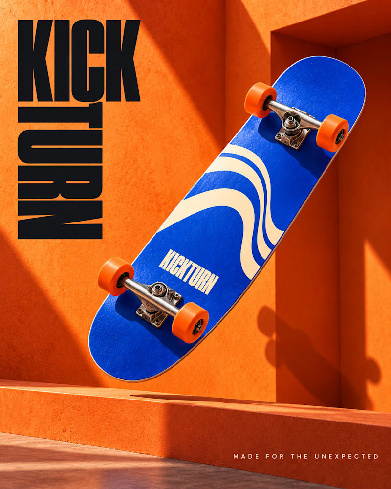
The second cuts diagonally across orange, blue deck with orange wheels, a lit alcove behind, heavy black type stacked at the left.
One is still. The other is mid move.
👇 #posterdesign #brandconcept #productphotography
1 vote
Ends in 1d
The network for creativity
Join 1.25M professional creatives like you
Connect with clients, get discovered, and run your business 100% commission-free
Creatives on Contra have earned over $150M and we are just getting started





Related posts



Looks great !

2022/23 Brand and label design for Tame Nutrition. Which format you prefer?
One was produced, the other remained as a draft.
View the project in my work archive:
https://www.mariya.design/work-archive/tame-nutrition
3 voted
75%
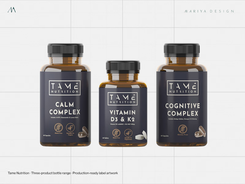
1 voted
25%
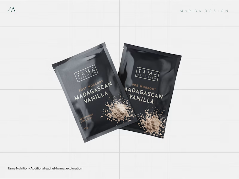
4 votes
Closed


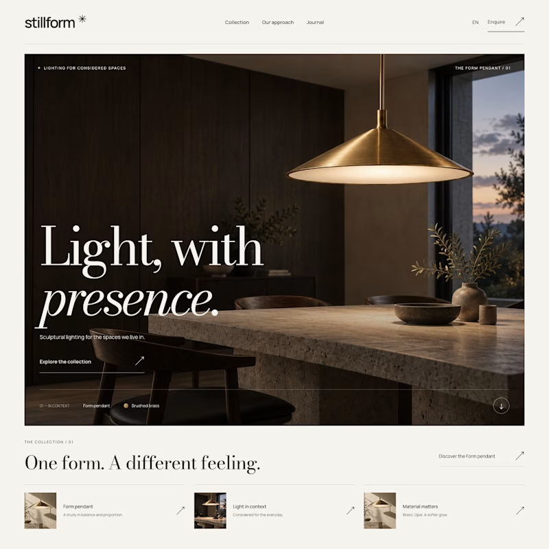
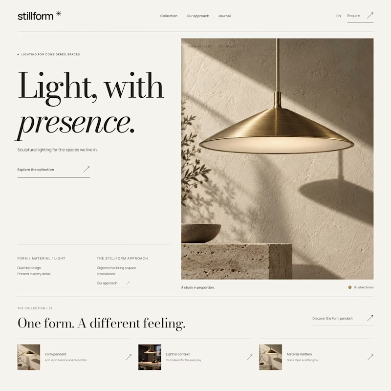

Atmospheric, and it was the photography that decided it. A lamp is a product you buy for what it does to a room, so seeing the warm glow pooling across a dark surface sells the feeling before the layout even registers. Sculptural is gorgeous but shows the object, Atmospheric shows the outcome.