The network for creativity
Join 1.25M professional creatives like you
Connect with clients, get discovered, and run your business 100% commission-free
Creatives on Contra have earned over $150M and we are just getting started
Back to feedPost

I moved Tajreed completely off Framer and rebuilt it from scratch as a real standalone product. It is officially live at tajreed.co with 1,346 free bilingual Arabic design assets ready to grab.
Here is the one problem that drove me crazy. The download counter kept rendering backwards in Arabic. Instead of 5 out of 10, ٥ / ١٠ kept flipping to 10 of 5 because the bidirectional text algorithm completely breaks numbers around slashes. I tried every technical layout fix and watched each one break.Memory+1
In the end, fixing it came down to speaking it out loud the way we actually talk. I replaced the slash with ٥ من ١٠ (five of ten), and the bug just disappeared.
Most of this rebuild was full of little details like that. It was never about complex backend architecture. It was about hundreds of micro decisions that only make sense if you actually read and live in Arabic every day.
I dropped the full case study on my profile. I built the whole thing solo from design to deployment, using AI to speed up my typing while I handled all the actual thinking.


The network for creativity
Join 1.25M professional creatives like you
Connect with clients, get discovered, and run your business 100% commission-free
Creatives on Contra have earned over $150M and we are just getting started





Related posts

Can a designer push Lovable as hard as any design tool?
Yes, and the method is simpler than you'd think. Three steps. I'll show each one on real slides from this challenge.
First, why I'm back. I sat out the last couple of challenges: I needed a real break, and other projects needed me more. I hadn't opened Lovable in a bit over a year. When this one landed, I thought: let's see if a designer can take it to the limit, the way I do with every other tool. So far, it's holding.
The client is Endorphin, a run club in Turin. Every Thursday, 19:00, under the Arco del Valentino, free, any pace. Here's the method.
1. Design every state before you prompt. Default, hover, spots left, full, waitlist, booked, past. Look at the third slide: each chip is a different state of the same event, "You're in", "23 left", "31 going". If a state isn't designed, Lovable guesses it. So I never leave it a guess.
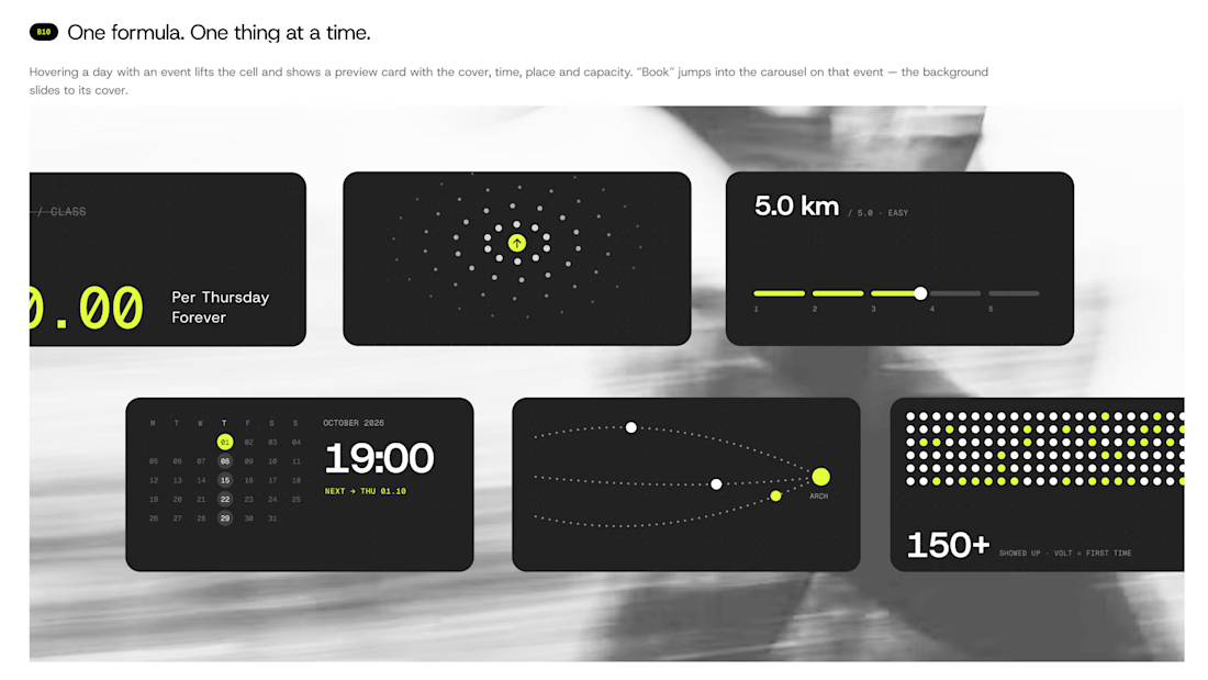
2. Write the prompt like a spec. Real sizes, real colors, real timings. Mine says things like: the slide takes 480ms, easing cubic-bezier(0.2, 0.8, 0.2, 1), no bounce. Then I attach the Figma export of that exact state and write "match this pixel for pixel". That's how the calendar on the last slide got its hover: the cell lifts, a preview card shows cover, time, place and spots left, and Book sits right there.
3. One prompt at a time. I send a piece, compare it with my board, and only then send the next. The phone view on slide two came out that way: a booking sheet with two fields and one line, "No account. No password. Just show up." Above it, a molecule where every dot is a moment from a Thursday.
The first slide shows the result of all three: the whole night as single cards. Price, distance, time, meeting point, crowd. One idea each.
The tool is only as sharp as the brief you give it.
If you've built with an AI tool: where did you hit the wall first, design or logic?

great designs, all made in lovable right?


Twenty-five years of credits, finally on a website that looks the part.
Just take a look at what kind of web we create ✨👇
Reflection of the brand history with taste, precision, and premium branding.
Scroll responsibly: https://productionportugal.com 😉🔥


Wow! Nice setup 🎥

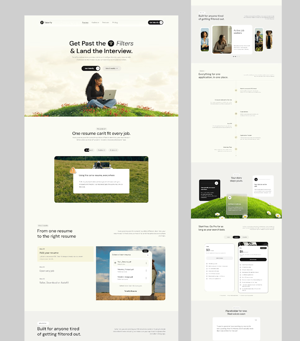
Talorify requested a high-converting landing page. Guess what?
Delivered the full design and development.
A high-converting landing page has one primary job, And this one is basically saying:
“Please get me from the store.” 🔥
Don’t overload your landing page with buttons that confuse your users. Give them one clear direction and make it easy to take action.
Check it out and tell me:
Would you call this design premium?
Hi, I’m Emmanuel Bliss, Product Designer (UI/UX).I bring clarity to what already exists and what is yet to exist.
Checkout the Live HERE


Definitely premium. Did they measure if this new design actually brought in more sign-ups and conversions compared to before?