The network for creativity
Join 1.25M professional creatives like you
Connect with clients, get discovered, and run your business 100% commission-free
Creatives on Contra have earned over $150M and we are just getting started
Back to feedPost

Imagine walking into a hotel.
Reception smiles.
Before you’ve even got your room key they ask if you’d like to book the spa.
Five steps later somebody wants to sell you dinner.
Another member of staff starts talking about conference facilities.
Next comes a leaflet about weddings.
Then there’s an advert for afternoon tea.
Eventually you stop for a second and think…
“I’m just trying to find my room.”
That’s how a surprising number of wellness homepages feel.
Somebody arrives looking for help with trauma.
Halfway down the page they’re reading about practitioner training.
Further on there’s research.
Next comes membership.
Now donations appear.
Before long the visitor has become about six different people.
Nobody stays one person long enough to feel understood.
That’s the bit I think gets missed.
Every homepage is having lots of conversations.
Very few finish the first one.
If I’m searching because life feels unbearable right now, don’t turn me into a student after thirty seconds.
Leave me where I am.
Help me there first.
Everything else can wait.
That’s usually the sort of thing I point out in my audits.
Most founders never notice it’s happening because they already know where every path leads.
A stranger doesn’t.
The network for creativity
Join 1.25M professional creatives like you
Connect with clients, get discovered, and run your business 100% commission-free
Creatives on Contra have earned over $150M and we are just getting started

Challenges
View all


Related posts

Rejuvenate Health & Wellness — Website Design & Development for a Women’s Health Clinic


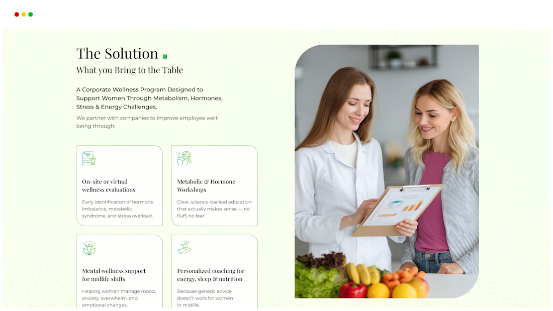
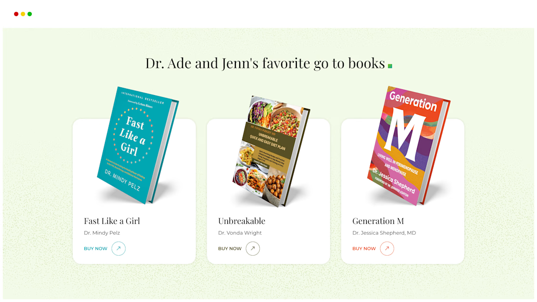
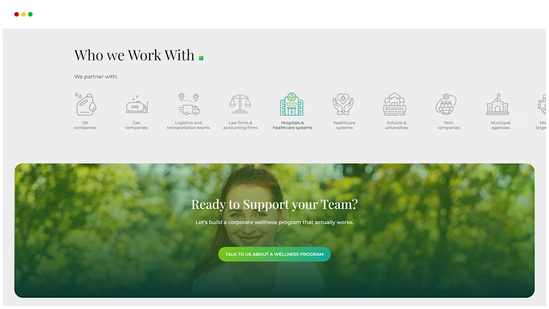

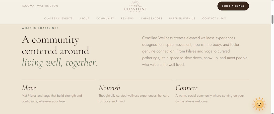
Created a website for a wellness group based in Tacoma Washington. Fully functional website with FAQ, trademarks, working links and fluent design similar to Apple website techniques, like animations on scroll, intro animations, and an A.I assistant with animations to complement.



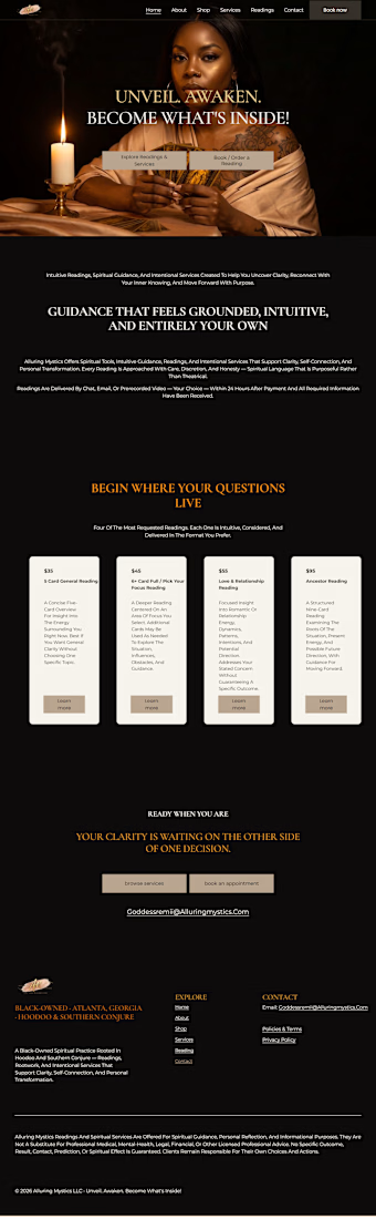
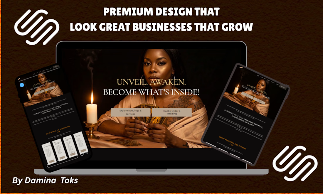
The client approached me for a website redesign that could better represent their spiritual brand and make their services easier for visitors to explore. Their existing website had an outdated interface, weak content structure, and confusing navigation, making it difficult for potential clients to understand the available readings and submit booking requests.
I developed a modern WordPress website with a responsive, mobile-friendly design and a calming visual identity suited to the spiritual wellness industry. I improved the UI/UX, reorganized the service pages, created clearer navigation, and added strategically placed calls to action to improve conversions. I also focused on an SEO-friendly website structure, website performance, page speed, and user experience to make the platform easier to navigate and discover online. The finished website provided a professional digital presence that strengthened the brand, improved engagement, and created a smoother journey from discovering a service to making an inquiry.