The network for creativity
Join 1.25M professional creatives like you
Connect with clients, get discovered, and run your business 100% commission-free
Creatives on Contra have earned over $150M and we are just getting started
Back to feedPost
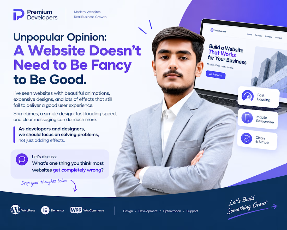
Unpopular Opinion: A Website Doesn't Need to Be Fancy to Be Good.
I've seen websites with beautiful animations, expensive designs, and lots of effects that still fail to deliver a good user experience.
Sometimes, a simple design, fast loading speed, and clear messaging can do much more.
As developers and designers, we should focus on solving problems, not just adding effects.
💬 Let's discuss:
What's one thing you think most websites get completely wrong?
I'd love to hear your thoughts
#WebDevelopment #WebDesign #Freelancing



100% agree! Simple, fast, and user-friendly websites always make a difference. 🚀

like the simple over fancy take, the campervan site is clean. do your clients usually come with a redesign in mind or do you have to show them whats wrong fir
Thanks! It’s usually a mix of both. Some clients know what they want, while others need a little guidance to see what could be improved.
The network for creativity
Join 1.25M professional creatives like you
Connect with clients, get discovered, and run your business 100% commission-free
Creatives on Contra have earned over $150M and we are just getting started
Related posts

I migrated Pi-lit's site from WordPress to a custom-coded, AI-native website with its own hosting. The result:
-A scalable design system that also supports their ecommerce
-30+ pages with consistent branding throughout
-Animated illustrations of their scenes and products that bring the roadway safety story to life
See Full Case Study


Lovely work


We’re testing two filtering layouts for a template library.
Top Filters
The filters are placed above the content. This option feels lighter, leaves more space for the cards, and works well when there are only a few main categories.
Sidebar Filters
The categories remain visible in the sidebar. This makes the available options easier to scan and works better for more complex filtering, but takes up some of the content space.
Which layout would help you find the right template faster?

24 voted
39%
37 voted
61%
61 votes
Closed

Such a clean presentation. You can tell a lot of thought went into this.

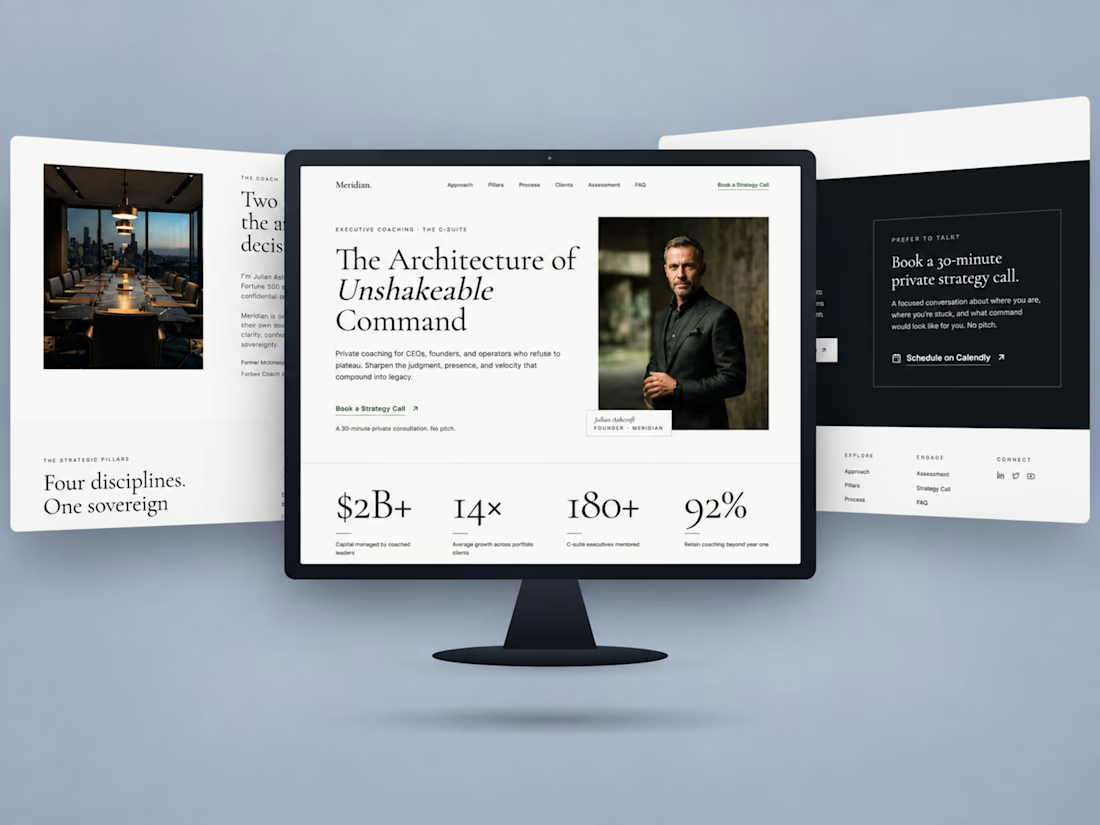
Just wrapped up this executive coaching website project.
The goal was to create a digital experience that feels as strategic and considered as the brand itself.
Built in Kajabi, the website combines editorial typography, a structured coaching framework, and a clear path toward booking a strategy call.
I paid particular attention to how each section flows into the next, keeping the experience cohesive from the first impression to the final call to action.

Awesome Work