The network for creativity
Join 1.25M professional creatives like you
Connect with clients, get discovered, and run your business 100% commission-free
Creatives on Contra have earned over $150M and we are just getting started
Back to feedPost

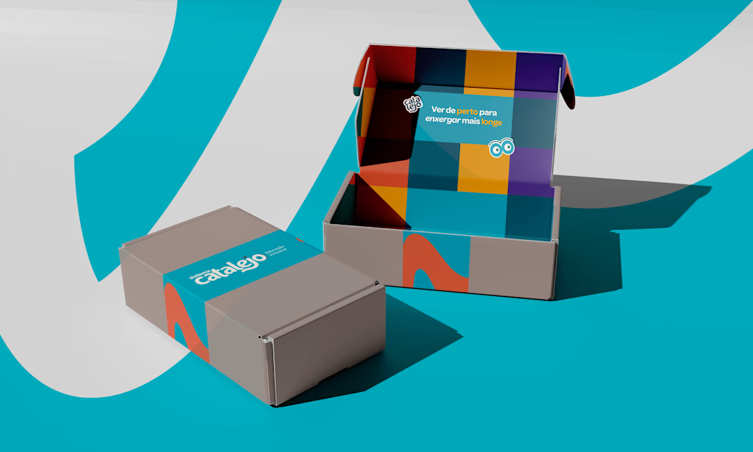
How do you make an education brand feel playful while building trust with families and educators?
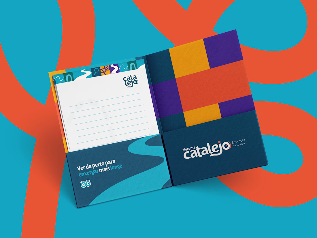
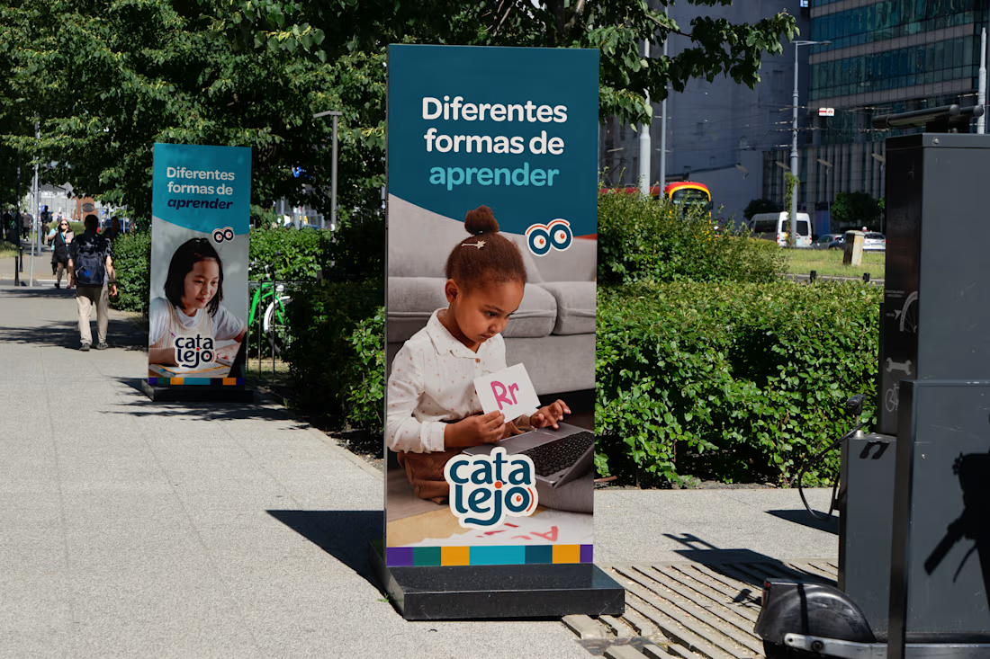
For Catalejo, I built the visual identity around a simple idea: every learner deserves to be seen. 💜
An eye within the lettering, paths that represent different learning journeys, and Lejo, a little telescope character, bring that idea to life through a warm, curious visual world.
One of my favorite parts was connecting these small details to the brand’s purpose of inclusive education.
I’d love to hear your perspective: what makes an education brand feel welcoming to you?
Explore the full Catalejo project:
https://contra.com/p/lPUEW2X6-catalejo-visual-identity-for-inclusive-education?r=thaylinevargas


The network for creativity
Join 1.25M professional creatives like you
Connect with clients, get discovered, and run your business 100% commission-free
Creatives on Contra have earned over $150M and we are just getting started


Related posts

Real Estate Website
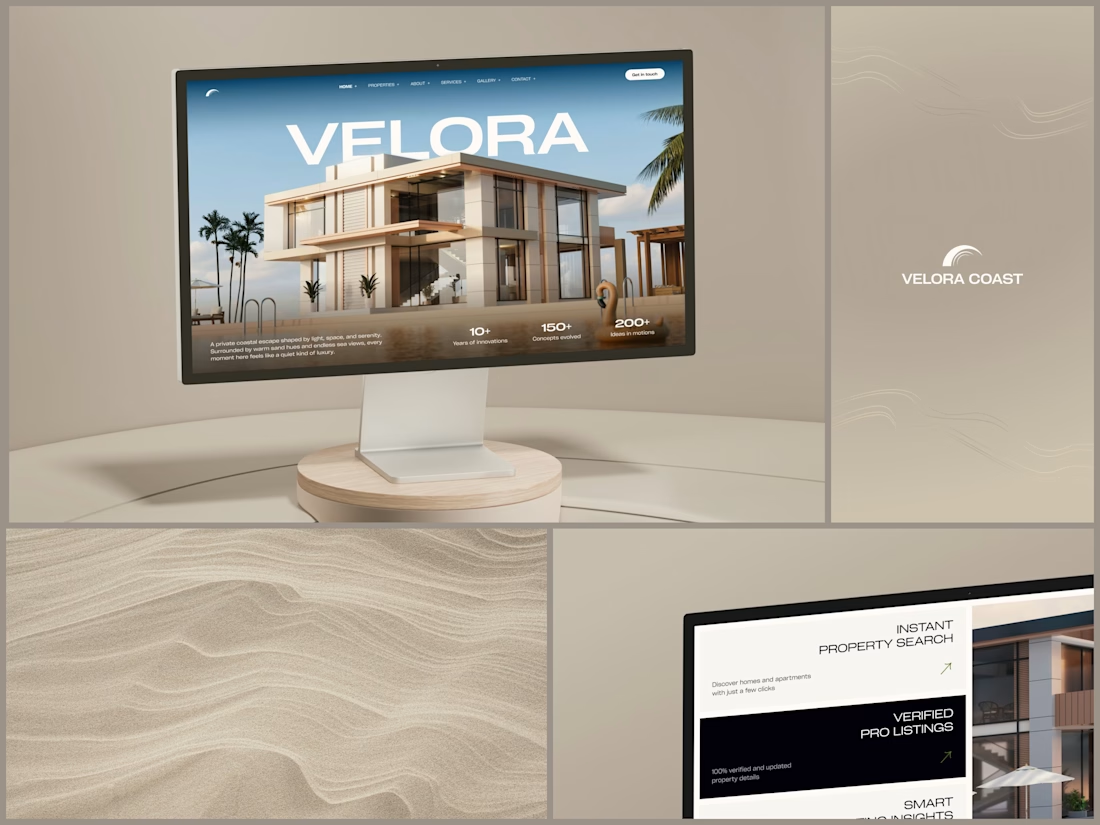
The villa stands in front of the name, on purpose.
The hero is one wide image of a modern villa under a blue sky, with palms at the sides and a pool in front. The name runs across the sky in wide white capitals, and the roof covers the bottom of the middle letters. It still reads at a glance, and the house keeps the foreground.
Lower on the page, the feature cards alternate cream and black, so it is clear where one card ends and the next begins. Each heading repeats the wide capitals of the name, aligned right, with a short line of copy and a small green arrow.
Designed by the Hue & Machine team.
#RealEstate #Architecture #RealEstateWebsite #WebDesign #LandingPage #HeroSection #Typography #UIDesign #DesktopDesign #FigmaDesign


This looks so premium! Love the concept of the villa standing in front of the name on purpose, it makes the hero feel so bold and confident. The wide image, the blue sky, palms and pool, everything feels luxurious but still clean. And the way VELORA runs across the sky in big...

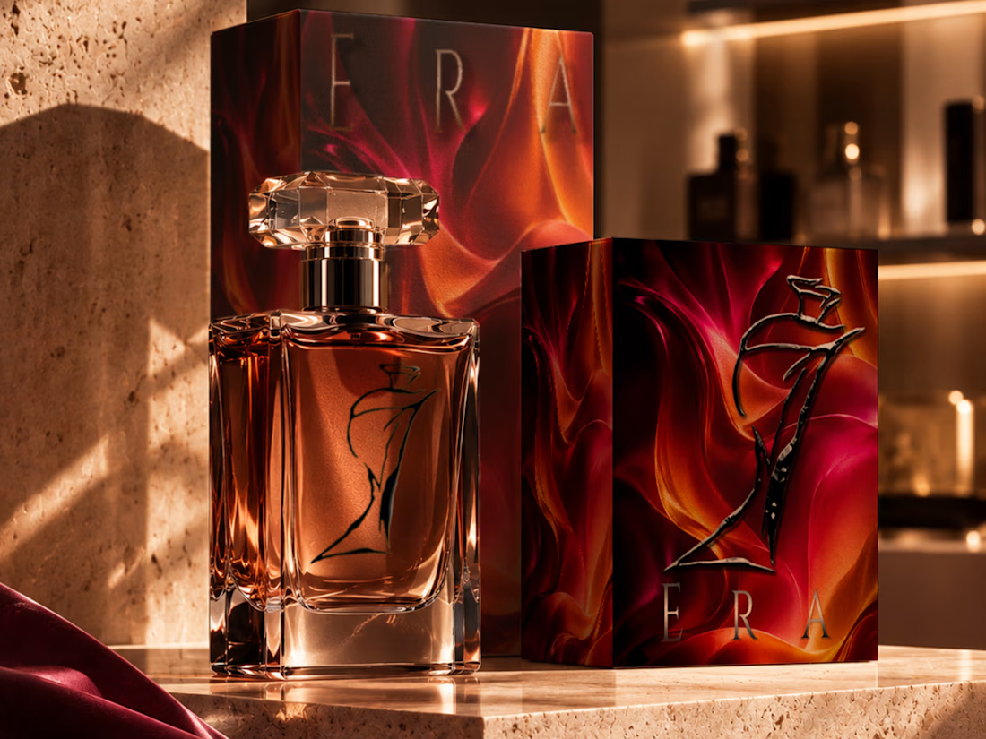
Premium visual identity, custom line-art logo, and immersive packaging artwork for a luxury fragrance concept.


that packaging is stunning

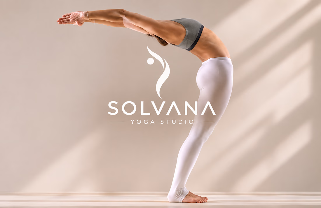
Solvana is a self initiated brand identity for a boutique yoga studio, built to feel calm, grounded and premium without the usual wellness clichés. The project

Great concept and a very strong visual direction.