The network for creativity
Join 1.25M professional creatives like you
Connect with clients, get discovered, and run your business 100% commission-free
Creatives on Contra have earned over $150M and we are just getting started
Back to feedPost


Turning "Where Is It?" Into the Best Page on the Site — 3D Mapbox Experience for an Austrian Alps Studio
A custom-built 3D interactive map experience for Wilderness Studios, a recording & event studio in the Austrian Alps. Built on Mapbox GL + @Webflow CMS: animated terrain, a drawn arrival route, live travel directions, and 96 curated points of interest — all editable by the client.
What I built
A full-screen, cinematic 3D map page that replaces the usual "Location & Contact" section — one continuous experience with two modes: The Location and The Surroundings.
1. Cinematic 3D terrain
Mapbox GL JS with custom dark terrain styling, exaggerated elevation and a hand-tuned camera. The page opens on a wide alpine shot with the studio marker sitting in the valley — the mountains do the storytelling before a single line of copy is read.
2. Animated arrival route
Instead of listing distances, the route draws itself across the terrain from the nearest town to the studio, with the camera flying along it. Every marker, label and stat fades in on its own timeline, so the whole intro reads as one choreographed shot rather than a map that happens to load.
3. Live directions panel
Airports, train stations and motorway exits with distances and drive times, each one selectable — pick Innsbruck Airport and the map re-frames to that leg of the journey. "Get Directions" hands off to native maps for the actual trip.
Stack
Webflow (structure + CMS) · Mapbox GL JS (3D terrain, custom style, markers, route layers) · GSAP (camera choreography, sequenced reveals) · vanilla JS (CMS → GeoJSON pipeline, category filtering, gallery, state between the two modes)


The network for creativity
Join 1.25M professional creatives like you
Connect with clients, get discovered, and run your business 100% commission-free
Creatives on Contra have earned over $150M and we are just getting started


Related posts

Sunny Rock — Cinematic Paris Travel Website | Creative Web Development
Experience Paris through Sunny Rock, a cinematic travel website concept designed to combine immersive visuals, elegant UI/UX, and interactive scrolling into a premium digital experience.
This self-directed project explores modern web design through cinematic imagery, scroll-driven animations, glassmorphism, smooth transitions, and responsive layouts.
🛠️ Technologies & Skills
HTML5 & CSS3 — Semantic structure, modern styling, and responsive layouts
JavaScript (ES6+) / TypeScript — Interactive behavior and animation logic
React.js — Reusable components, hooks, and state management
Tailwind CSS — Utility-first styling and responsive design
HTML5 Canvas API — 2D rendering for visual effects and image sequences
Scroll-Driven Animation — Frame-by-frame image sequences synchronized with scrolling
requestAnimationFrame & Linear Interpolation (Lerp) — Smooth animation updates
Lenis Smooth Scrolling — Fluid scrolling experiences
Intersection Observer API — Scroll-triggered reveals and entrance animations
UI/UX & Visual Design — Visual hierarchy, typography, glassmorphism, and interaction design
SVG Graphics — Scalable icons and vector elements
AI Visual Generation & Prompt Engineering — Cinematic visual assets
Cloudinary — Media hosting and image optimization
Performance Optimization — Efficient asset loading and animation rendering
Python & Browser Automation — Development utilities, asset processing, and testing
✨ Design Highlights
Cinematic, immersive visual storytelling
Premium travel-inspired aesthetic
Smooth, scroll-based animation sequences
Modern glassmorphism interface
Responsive layouts for different screen sizes
Interactive elements and refined micro-interactions
Project Type: Self-Directed Portfolio Project
Focus Areas: Creative Front-End Development · Web Design · UI/UX Design · Interactive Experiences · Animation
Designed and developed by Ubaid | Ubaid Web Studio.🔥


The only glow on the Kestra page is the reflective strip on the jacket. It comes from the image itself, so the Framer layers on top stay flat: grey, white and mono text, no glow effects on buttons or headings. That keeps the page easy to edit, because nothing in the UI depends on one lighting setup. If you swap the photo, the glow goes with it. Would you add a glow effect in Framer or keep it in the image?

wow, nothing but top notch

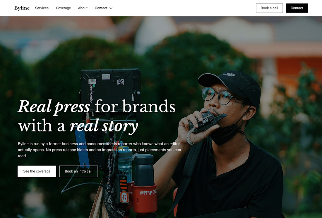
Built this in Framer as a concept project. Goal was to make it feel run by ex-journalists. Choices: editorial serif (Libre Baskerville), a dark photo with one color accent, and copy that positions against blast-style PR.
Where I’m unsure: text legibility over the photo and whether the two CTAs compete. What would you change?


That's great design it feels professional I like how the background mixed with interface ❤️❤️
Great job Cheree🎉🎉









