The network for creativity
Join 1.25M professional creatives like you
Connect with clients, get discovered, and run your business 100% commission-free
Creatives on Contra have earned over $150M and we are just getting started
Back to feedPost

Designing Fear Without Sacrificing Usability 👻
One of the most enjoyable challenges I've worked on was designing a concept website for a horror film festival inspired by ScreamFest. The goal wasn't simply to make it look "scary"—it was to create an experience that captured the atmosphere of horror while remaining intuitive and easy to navigate.
Dribbble:
https://dribbble.com/shots/17665583-Horror-Film-Festival-Website-Design-ScreamFest
When designing immersive experiences, it's easy to get carried away with visual effects. But good design still comes down to the fundamentals:
🎬 Strong visual hierarchy so users know exactly where to look first.
🩸 A dark, cinematic color palette that builds emotion without hurting readability.
⚡ Purposeful interactions and animations that enhance the story instead of distracting from it.
This project reminded me that every industry has its own visual language. Whether you're designing for fintech, healthcare, SaaS, or entertainment, the best interfaces don't just look good—they make users feel something.
#UIDesign #WebDesign #Figma #CreativeDirection #VisualDesign #BrandExperience #EntertainmentDesign #ProductDesign


The network for creativity
Join 1.25M professional creatives like you
Connect with clients, get discovered, and run your business 100% commission-free
Creatives on Contra have earned over $150M and we are just getting started





Related posts


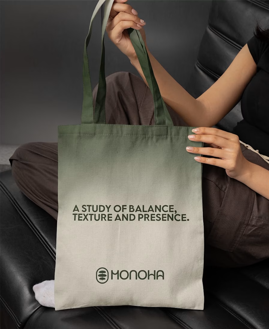
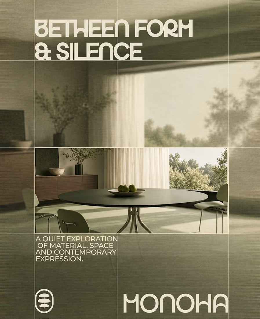

Great branding kit Alex 🎉🎉


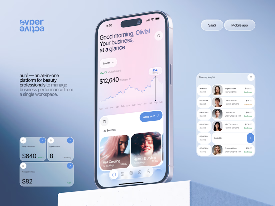
Finally wrapped up this project, and I’m excited to share the case study! 💅 A fresh product design concept for a beauty dashboard. Would love to hear your thoughts! ✨


A beauty dashboard is such a fun product design challenge, Oleksandra. The Good morning, Olivia! greeting in the header makes business metrics feel personal instead of clinical, which is exactly what a beauty professional would want.


A logo reveal created in Blender, where simple geometric shapes come together to form the Geisleris Studio identity.


Nice