The network for creativity
Join 1.25M professional creatives like you
Connect with clients, get discovered, and run your business 100% commission-free
Creatives on Contra have earned over $150M and we are just getting started
Back to feedPost

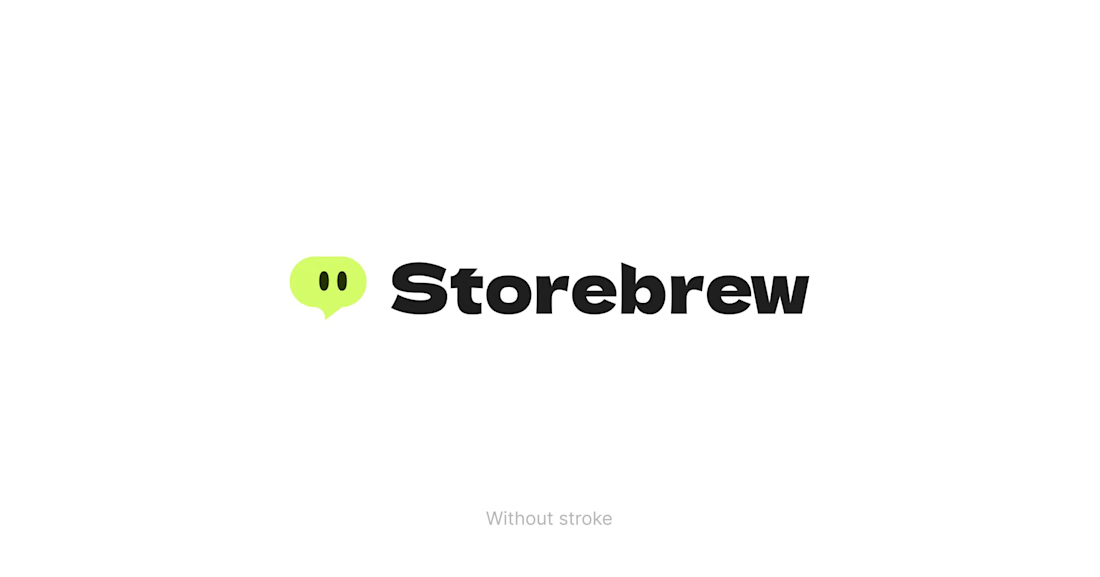
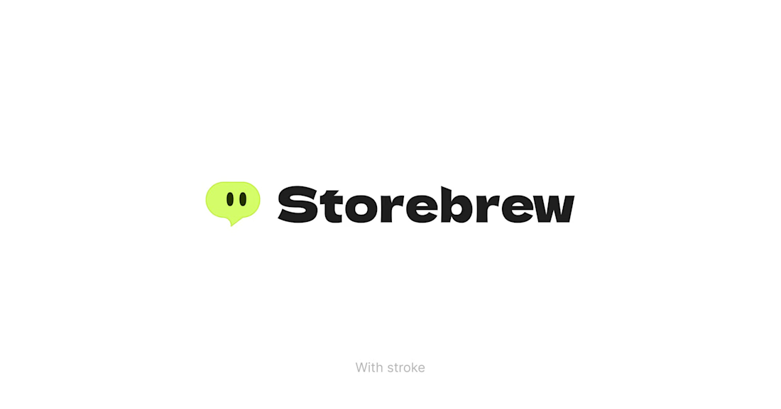
Learned this coloring trick on a logo from my mentor.
In case you want to have colors that don’t naturally like each other.
In this case, Lime Green 🟢 & White ⚪
Add a subtle saturated stroke to create a slight contrast.
It’s a small detail, but it usually changes how the whole mark feels.
Details like this rarely get noticed.
Check out the difference. Hope it helps.
The network for creativity
Join 1.25M professional creatives like you
Connect with clients, get discovered, and run your business 100% commission-free
Creatives on Contra have earned over $150M and we are just getting started
Related posts


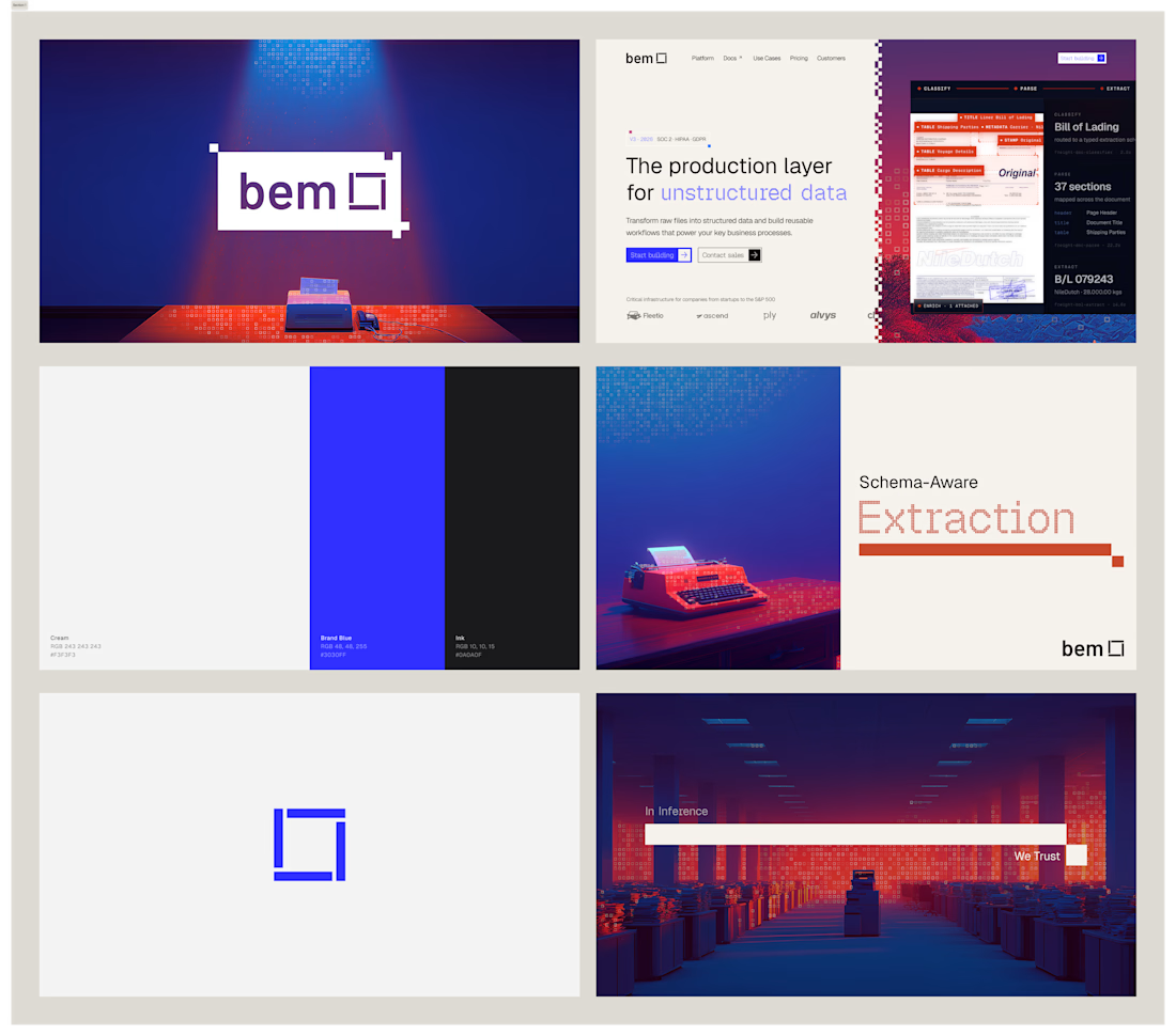
I've had so much fun working on bem. Came in with logo marks and colors, and we're looking for an identity to call home. After doing some research and inspiration exercises, we came up with this concept, which I absolutely love.


Impressive work !

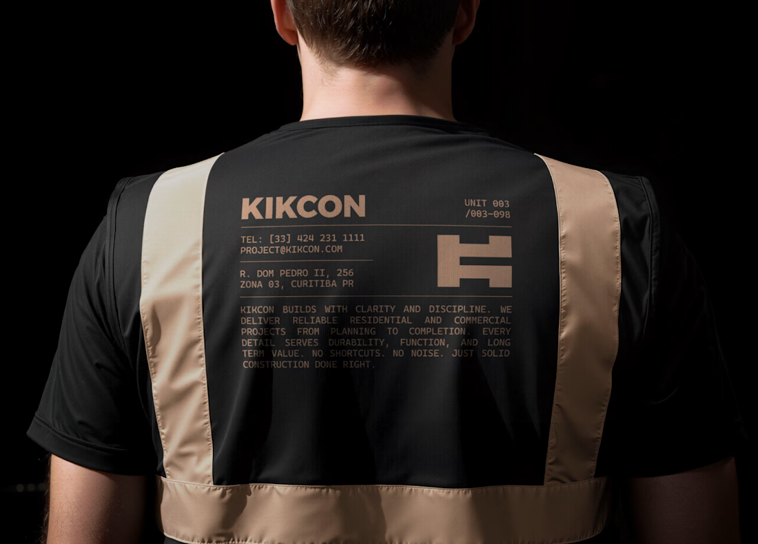
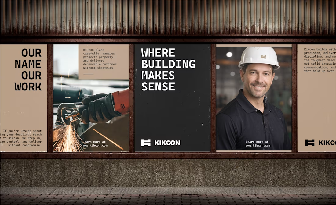
Just wrapped up final form brand identity work for KIKCON - a construction & residential build company.
developed in close collaboration with the client, Kikcon’s visual identity reflects its family-built foundation and its commitment to quality construction in South Australia.
Really enjoyed working on this project!



Looking good Pawel!
Love the color palette.


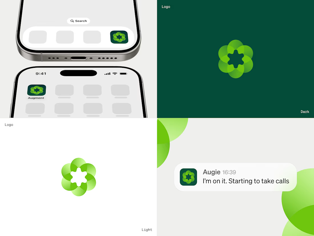
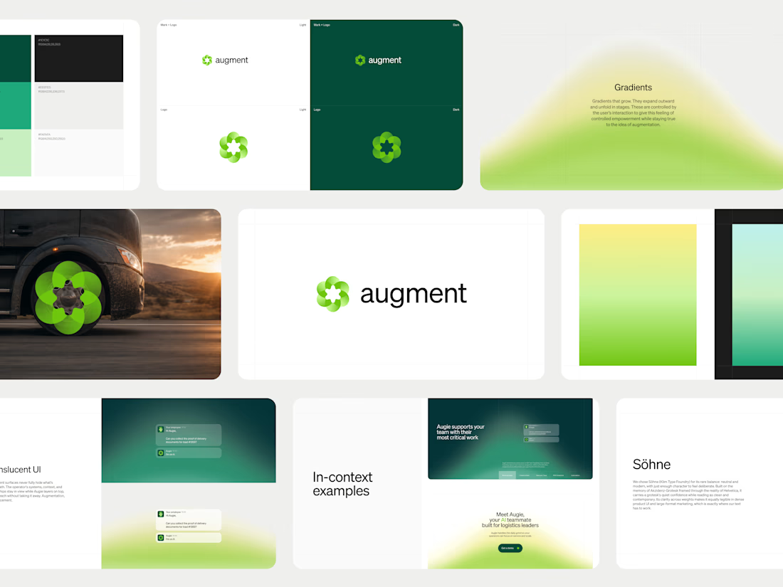
Augment is a B2B SaaS brand design project for an AI automation platform built for the logistics industry. Augment built Augie, an AI agent that works with brokers, freight operators, and carriers individually on their own workflows. Pixel One designed the brand identity from the ground up.
Pixel One built UI and gradient language that mirrors the logo, expressing how Augie integrates with a company's existing systems. Augment raised a $25M seed round followed by an $85M Series A five months later, bringing total funding to $110M. Augie now supports over $35 billion in freight under management across dozens of shippers and brokerages.
Challenges
View all



Trending

Claude
Claude has entered the design space. How are you using Claude Design?

Contra University
Learn from expert creatives how to earn more using next-gen AI tools.
fifaworldcup2026
The World Cup is here and the whole world's watching. How are you designing for the world stage?
creativeaiflow
Creative AI workflows are evolving. What tools do you use, and what are their strengths and weaknesses?
freelancerlife
Freelancer life is wins, pivots, and everything in between. What’s yours right now?