The network for creativity
Join 1.25M professional creatives like you
Connect with clients, get discovered, and run your business 100% commission-free
Creatives on Contra have earned over $150M and we are just getting started
Back to feedPost
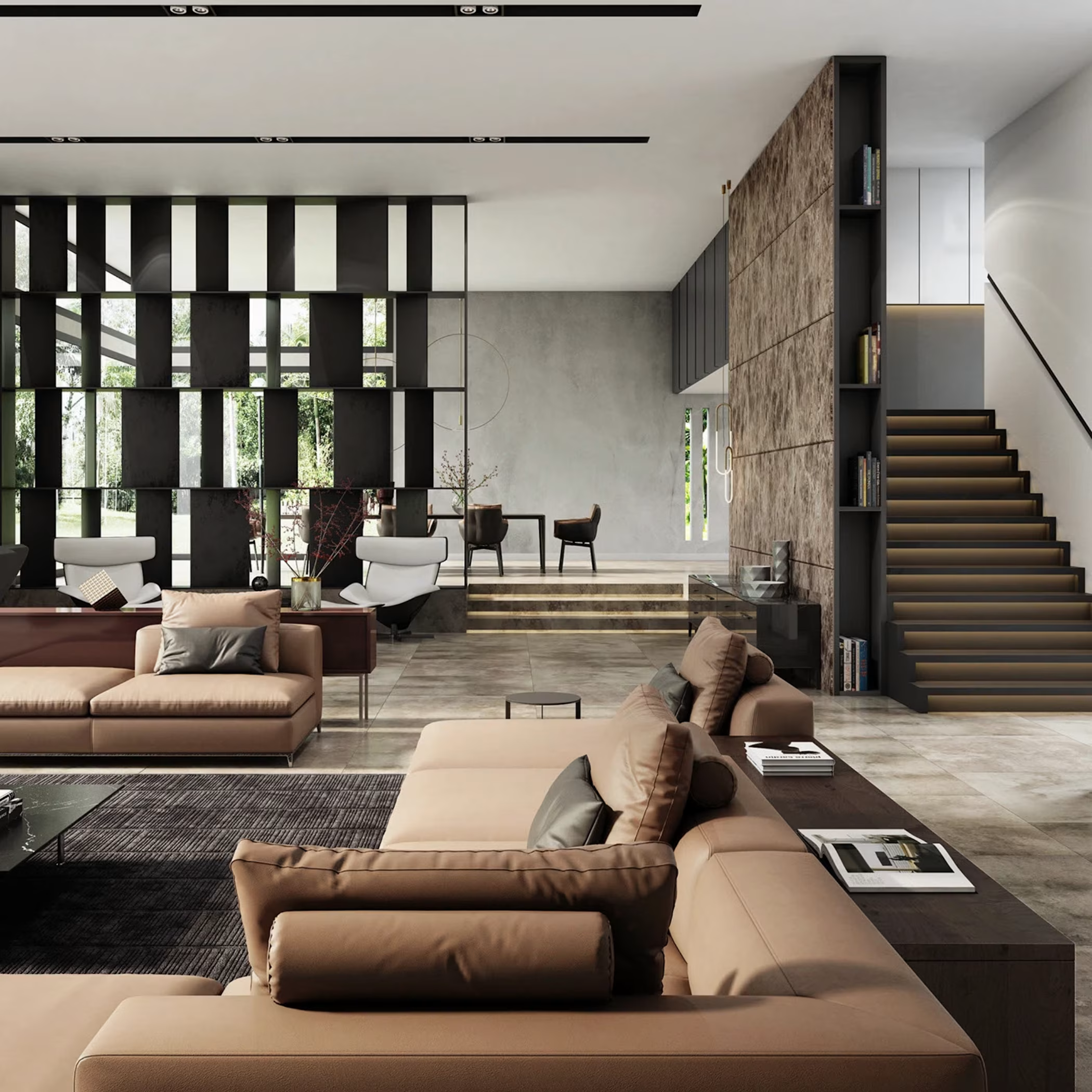
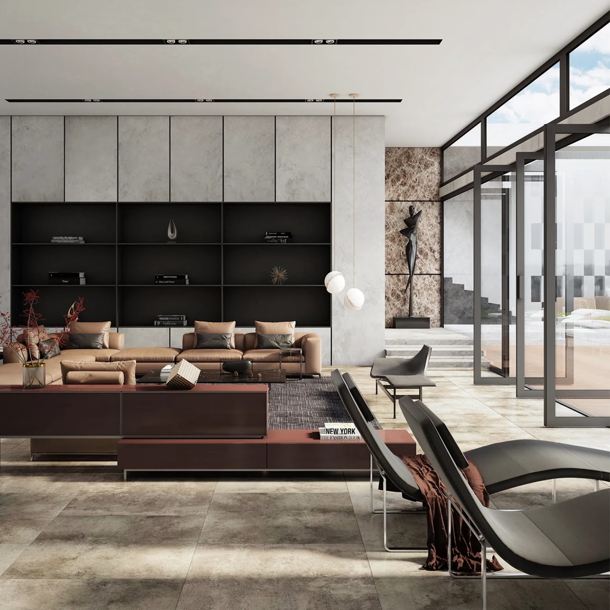
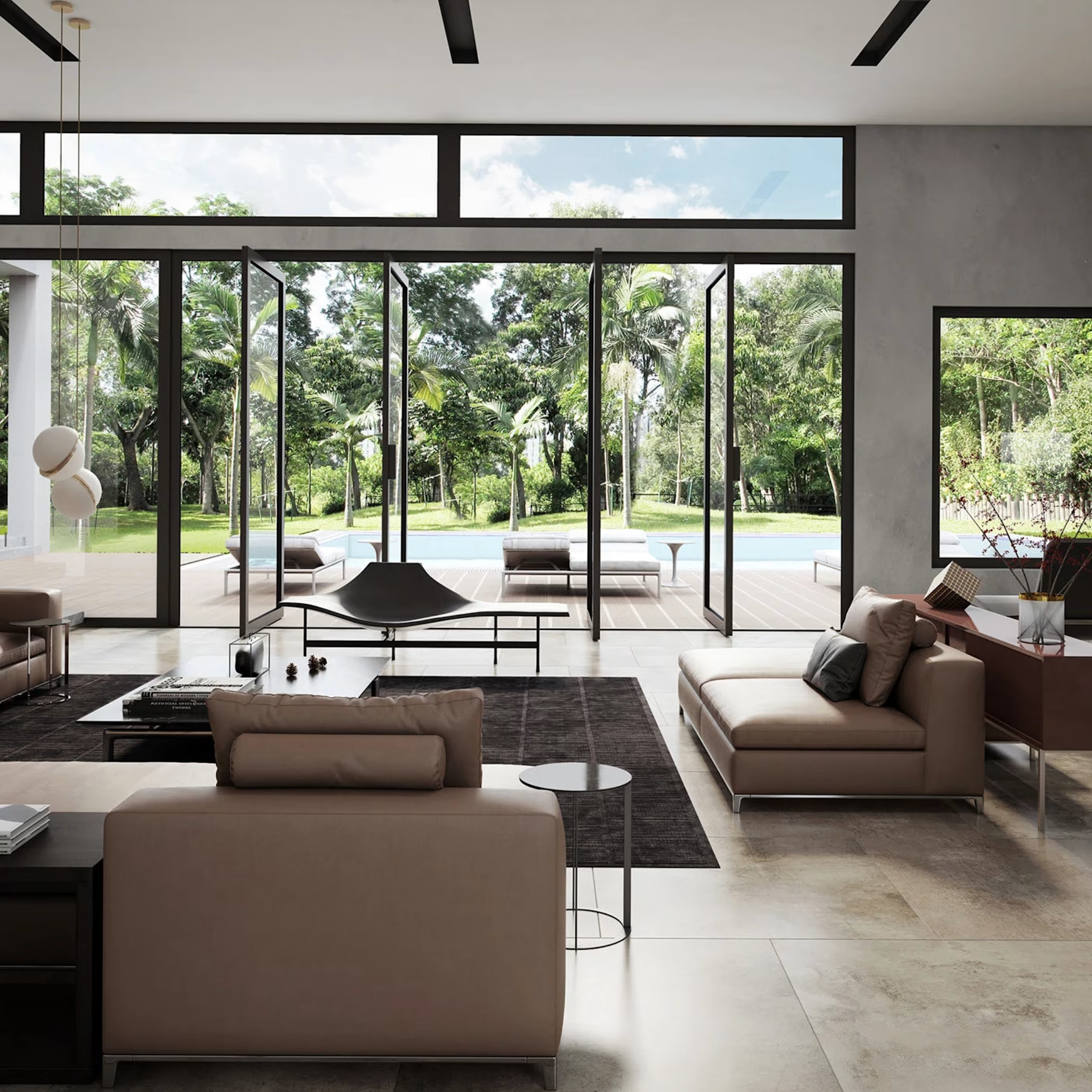
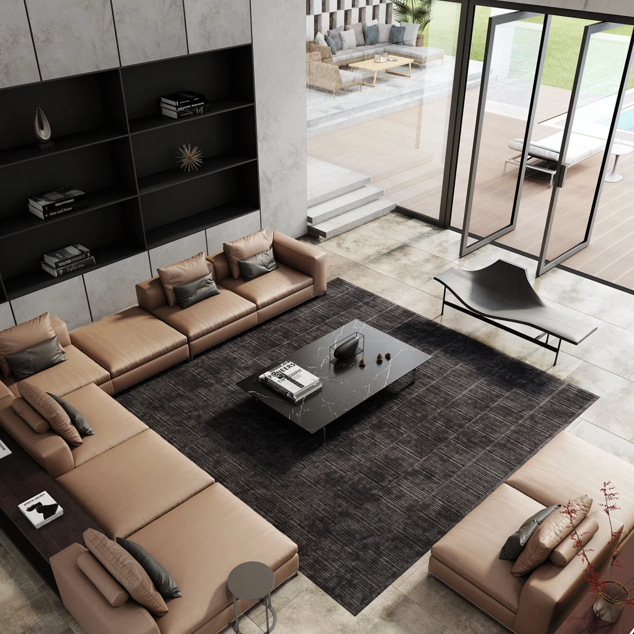
The Living Room Sets the Tone for the Entire Home
A great living room is more than just beautiful. It should be comfortable, functional, and designed around the people who use it.
For this concept, I focused on smart space planning, balanced lighting, thoughtful furniture placement, and quality materials to create a warm and inviting space.
With realistic 3D visualization, clients can see exactly how their living room will look before construction begins. This makes it easier to refine ideas and make confident design decisions.
What catches your attention first?
• Lighting
• Furniture layout
• Color palette
• Materials and finishes
#InteriorDesign #LivingRoomDesign #ArchitecturalVisualization #3DRendering #ResidentialDesign



Beautiful work!

Thank you, I really appreciate your kind words.
The network for creativity
Join 1.25M professional creatives like you
Connect with clients, get discovered, and run your business 100% commission-free
Creatives on Contra have earned over $150M and we are just getting started

Challenges
View all


Related posts


Most cookie packaging on shelf leans loud and cluttered — I wanted to see
what happens when you strip that back and let the product feel premium
instead of just sweet.
This project started as a redesign exercise on an existing cookie packaging
concept. I kept the product category and target shelf context the same,
then rebuilt the concept from scratch: new color story, new typography
system, new material direction.
What changed:
— Concept shifted from playful/busy to minimalist and premium
— Palette rebuilt around cream, charcoal, and a warm gold accent
— Custom logotype and clean geometric type system
— Matte textured finish to signal quality over sugar-rush energy
The result reads less like a snack and more like a gift — which is exactly
the shelf position a lot of artisanal food brands are chasing right now.
Open to redesign work like this for food, cosmetic, and skincare brands
looking to reposition their packaging. Let's talk about your product.
#Packaging Design, #Food Packaging, #Branding, #Product Design, #Label Design,#Package Mockup


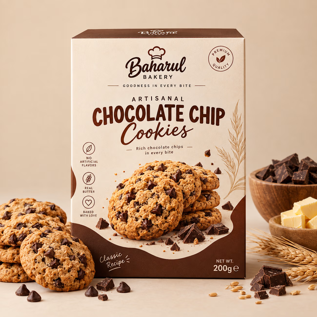

The restraint here really works—the warm chocolate palette and generous negative space make the pack feel premium without losing the product cue. The ingredient callouts are a nice touch for quick shelf scanning.


Engaging website for a New York–based architecture and construction studio, balancing bold typography, immersive imagery and a minimal editorial layout.


What does luxury look like?
A cinematic AI product of a modern apartment designed to make you stop, look, and imagine yourself there. ✨
Would you live here?


