The network for creativity
Join 1.25M professional creatives like you
Connect with clients, get discovered, and run your business 100% commission-free
Creatives on Contra have earned over $150M and we are just getting started
Back to feedPost

NFT Minting page and contract


The network for creativity
Join 1.25M professional creatives like you
Connect with clients, get discovered, and run your business 100% commission-free
Creatives on Contra have earned over $150M and we are just getting started








Related posts

Pricing section from Relatik template


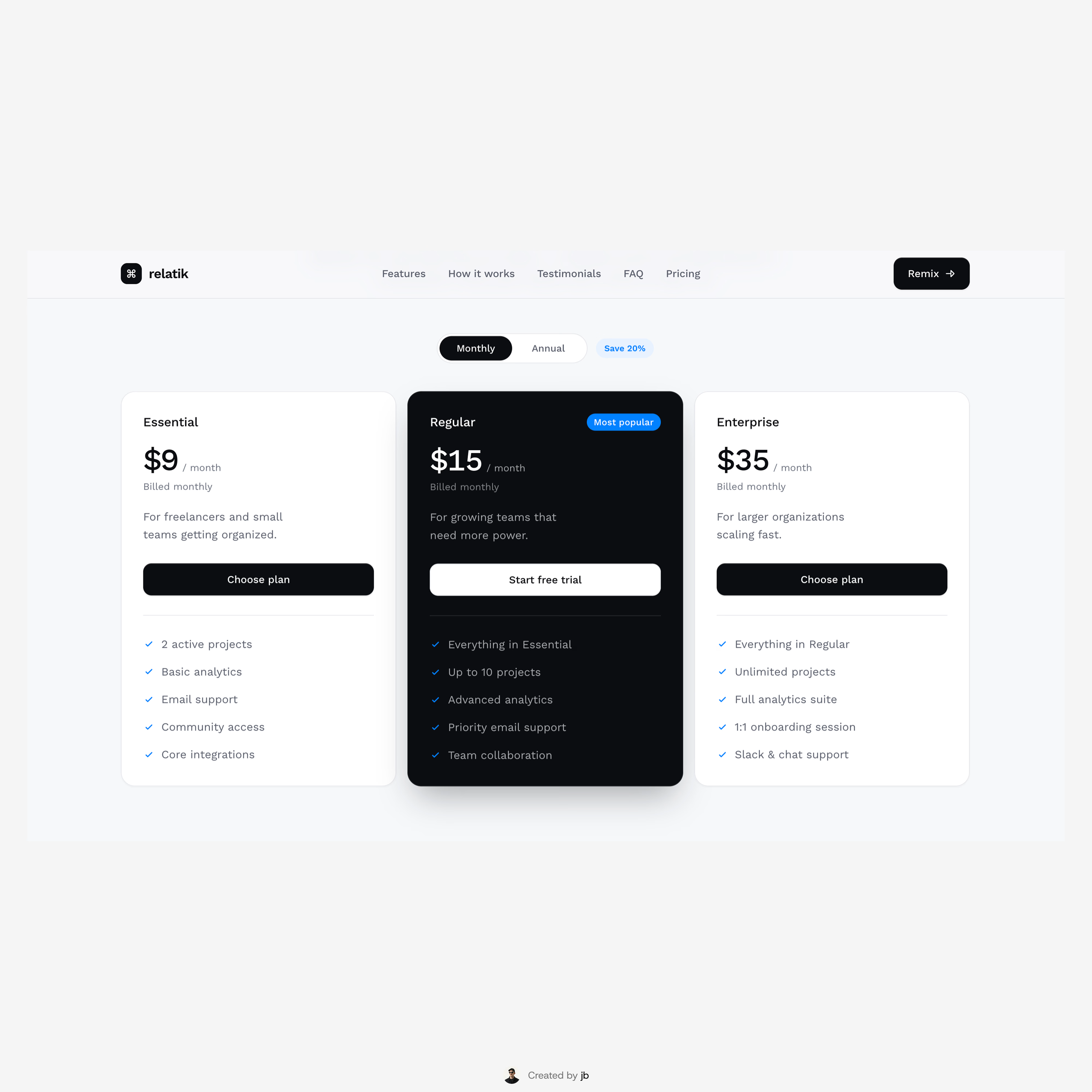

Nice price cards

A modern crypto dashboard concept focused on clarity, usability, and data visualization.
NoxFi is a web-based trading and portfolio interface designed to help users monitor crypto markets, manage digital assets, and track financial activity from one dashboard.
My Design Focus:
I worked on building a clean, structured interface where complex market information feels easier to understand.
The design uses dark surfaces, lime-green highlights, organized data cards, and clear typography to create a consistent experience across trading and portfolio sections.
Key Design Elements:
Crypto price charts and market statistics
Wallet balance and asset holdings
Portfolio performance indicators
Staking rewards and market sentiment
Transaction history and quick wallet actions
Responsive-friendly layout structure

Dark surfaces with lime-green highlights is a strong choice for a trading dashboard. The organized data cards and quick wallet actions show you are designing for clarity under pressure, which is exactly what crypto users need.

Placing hundreds of quotes inside a shape by hand takes days.
So I wrote a small tool: it reads a spreadsheet, measures the width of every band in an Illustrator file, and fits each quote inside its band. Font size follows the band, nothing crosses the edges, nothing overlaps.
The part I like most: when you re-run it, it only places new rows. Anything you moved by hand stays exactly where you left it.
Useful for signage, murals, or anything that needs lots of text on a shape.
What's the most repetitive design task you've automated?

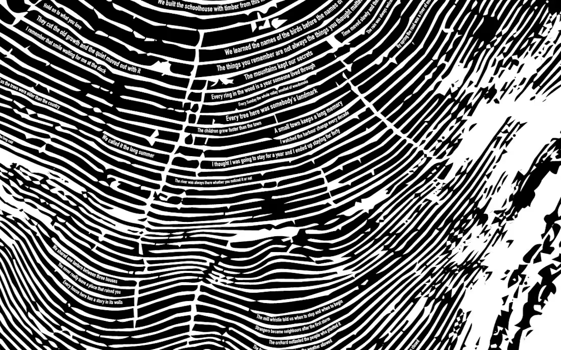

The idempotent re-run is the detail that makes this production-ready — “only place new rows, leave the hand-moved ones untouched” is exactly the behavior that separates a real tool from a one-off script. It means the designer can trust it instead of babysitting it.
My most...