The network for creativity
Join 1.25M professional creatives like you
Connect with clients, get discovered, and run your business 100% commission-free
Creatives on Contra have earned over $150M and we are just getting started
Back to feedPost
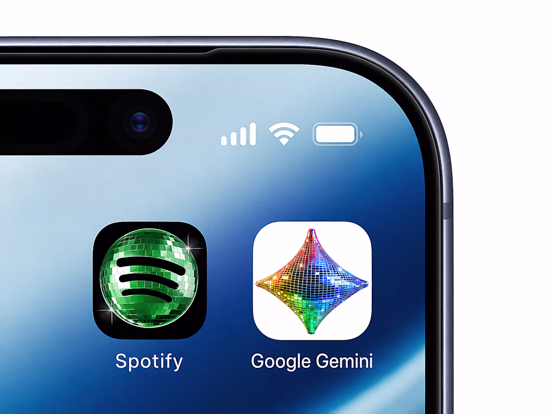
Do you think Spotify's recent logo redesign into a 3D discomorphism ball was intentional to temporarily gain extra awareness?
I think this was a perfect move from a branding & marketing perspective, since it kicked off a bunch of discourse that led to a bandwagon effect causing popular brands to hop on.
Brands transitioning their overall identity, adding new features to their product, web changes, people barely notice.
The moment one changes their logo, it immediately draws attention and sparks controversy, this is the power of the face of our brands - the logo.
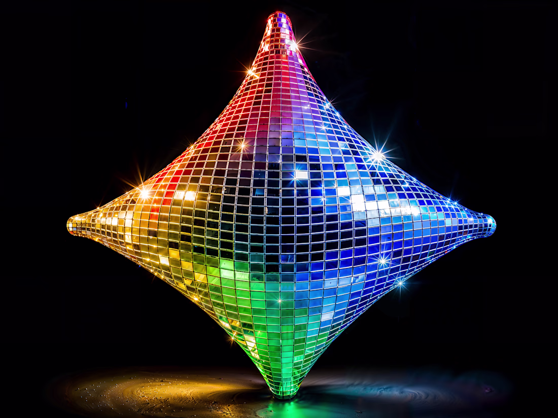
For this occasion, I turned Google's Gemini logo into a 3D discomorphism star, someone who hasn't hopped on the train, but do they need to ?
The network for creativity
Join 1.25M professional creatives like you
Connect with clients, get discovered, and run your business 100% commission-free
Creatives on Contra have earned over $150M and we are just getting started
Related posts
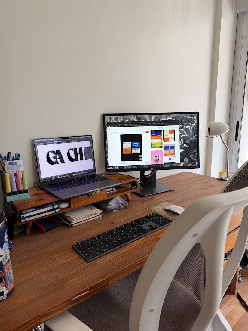
I love your work space 😊and is this a logo rebranding or what?
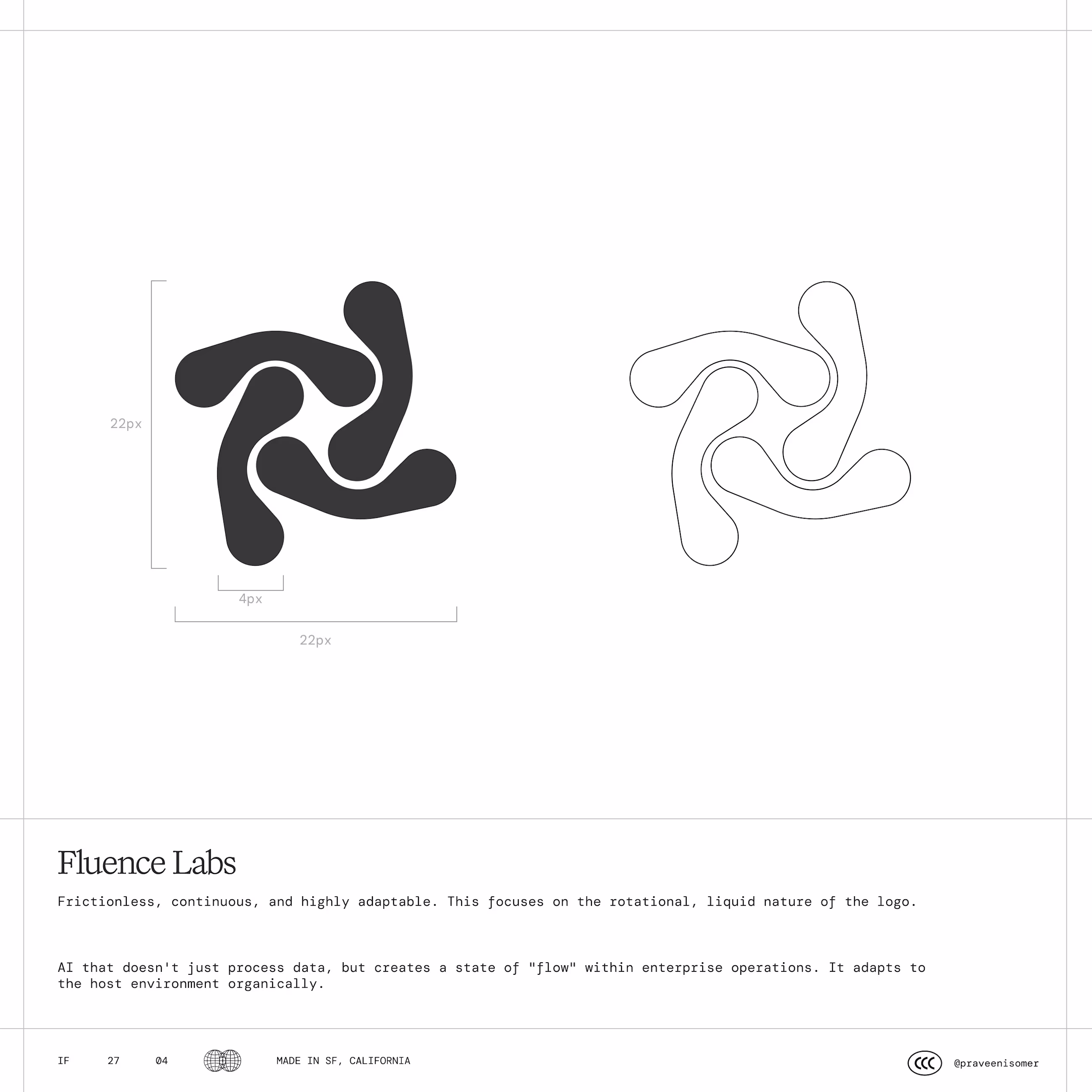
Mind The Lap is a productivity method built on a concrete premise: motivation gets you moving, but small actions keep you in motion
Together with @Alessia Visicaro , we built a visual identity that translates this idea into a language made of laps, dots, and progression.
The symbol is born from the lines of running tracks. The dot lettering transforms every word into a sum of minimum units. Images use the same treatment, bringing movement and consistency into a coherent visual system.
Full case study dropping soon, can’t wait for you to see the whole process.

Love the contrast between the two calm colors but the movement feels strong. Your style stands out.
Logo Concept for Fluence Labs
Inspired from Boomerang
Excellent work. It's clear a lot of thought went into both the strategy and the visual execution.
Trending
Claude
Claude has entered the design space. How are you using Claude Design?
Contra University
Learn from expert creatives how to earn more using next-gen AI tools.
creativeaiflow
Creative AI workflows are evolving. What tools do you use, and what are their strengths and weaknesses?
portfolioreview
The best portfolios tell a story, not just show a grid. Share yours for feedback.
freelancerlife
Freelancer life is wins, pivots, and everything in between. What’s yours right now?