The network for creativity
Join 1.25M professional creatives like you
Connect with clients, get discovered, and run your business 100% commission-free
Creatives on Contra have earned over $150M and we are just getting started
Back to feedPost


The network for creativity
Join 1.25M professional creatives like you
Connect with clients, get discovered, and run your business 100% commission-free
Creatives on Contra have earned over $150M and we are just getting started








Related posts

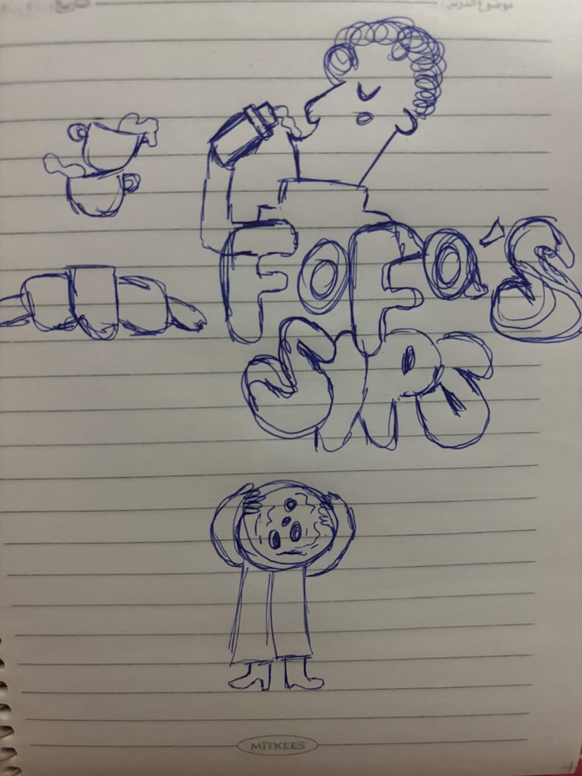
I turned one of my notebook doodles into a whole brand identity. And honestly this was way more fun than I expected I usually work on UI/UX and digital products so I wanted to take a step back from screens and explore something completely different: illustration-led branding.
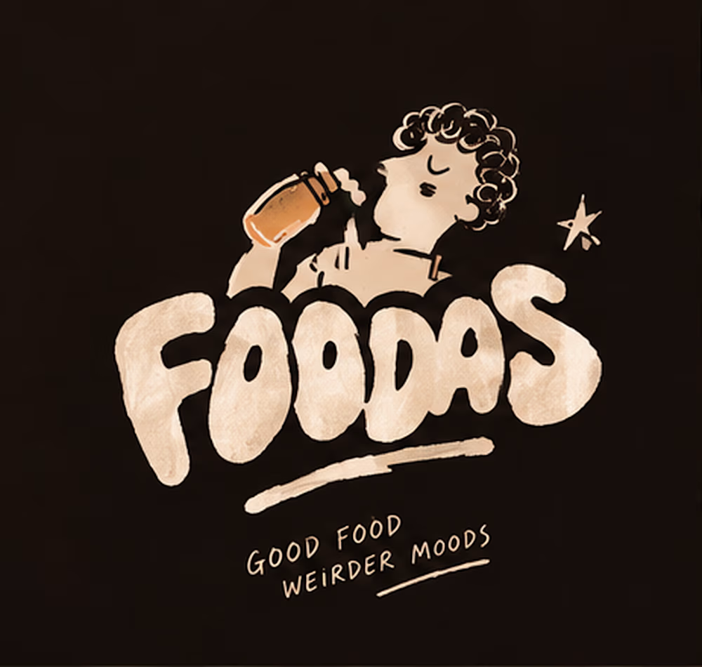
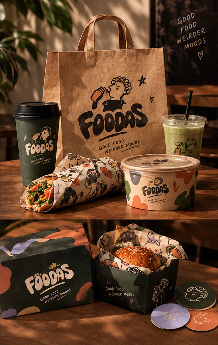
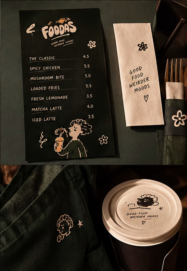
I took my original FOODAS sketch and built an entire visual world around it from the logo and mascot illustrations to the color palette packaging, cups, and menus
The goal wasn't to make it look perfectly polished and predictable I wanted it to feel playful, a little weird, and still premium.
Now I'm curious about one thing:
Can playful, imperfect illustrations make a brand feel more premium or do you think premium branding needs to be more minimal?
I have a feeling designers will disagree on this one


I love that it feels playful without losing that premium touch This is such a fun direction and I honestly want to see more branding projects like this from you 👏

Not every client comes to me for a brand identity and not all my clients are skincare or cosmetic brands.
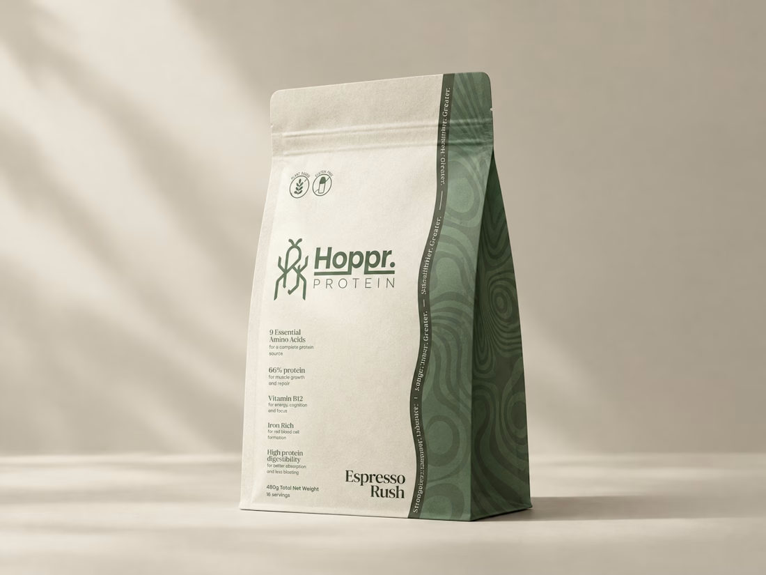
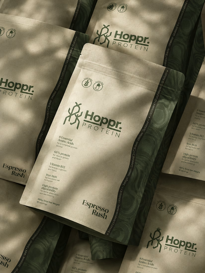
That was the case with Hoppr, a protein powder brand made from crickets. 🦗 YES, CRICKETS!
Sometimes the logo, colors, and visual system are already there and my job is to bring them to life on packaging and see how far I can push them.
I love projects like this because I get to play with typography, layout, and materials while working within an existing identity.
How much freedom do you think a designer should have when working with an established brand?


Great packaging work, nice job

WIP - Brand Identity
Which one?
9 voted
47%
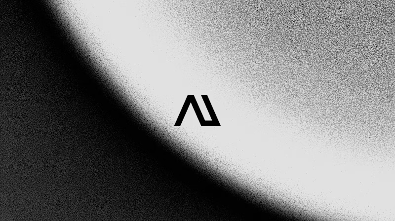
10 voted
53%
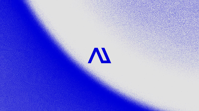
19 votes
Closed

B is more suitable for these textures ❤️❤️
Great job Gaber🎉🎉🔥🔥