The network for creativity
Join 1.25M professional creatives like you
Connect with clients, get discovered, and run your business 100% commission-free
Creatives on Contra have earned over $150M and we are just getting started
Back to feedPost
A logo should look good — but it should also mean something.
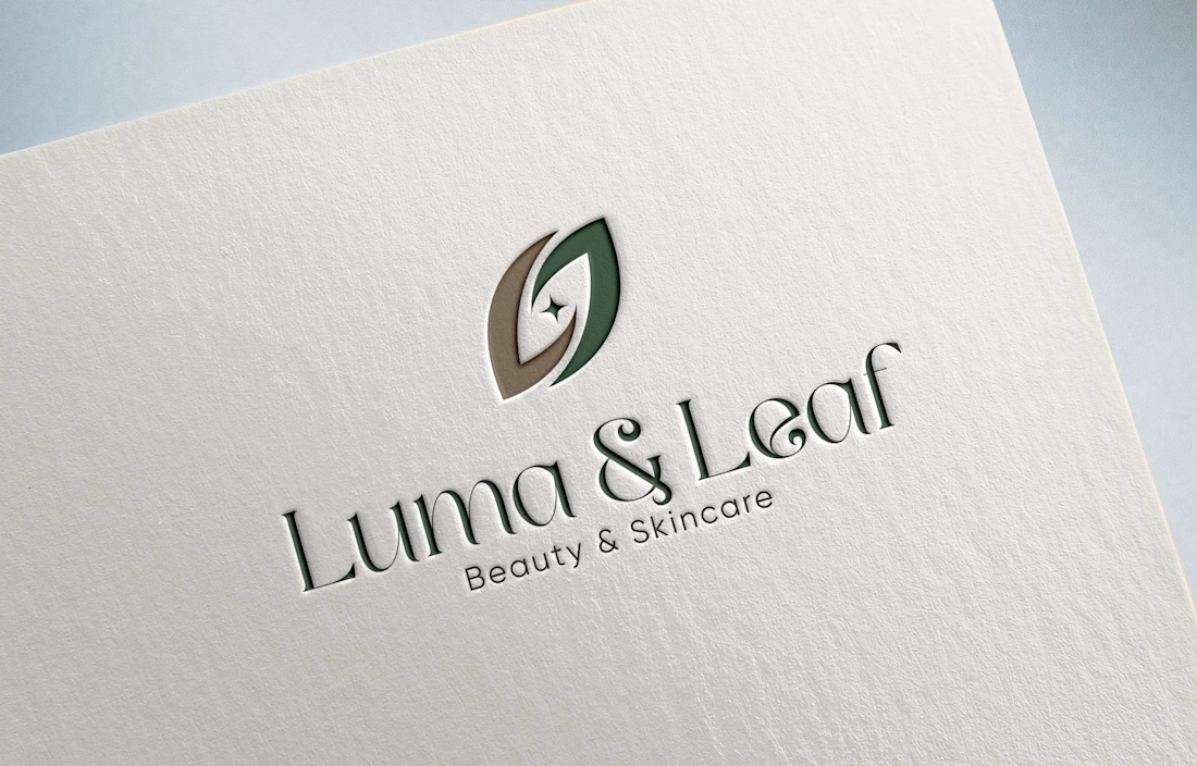
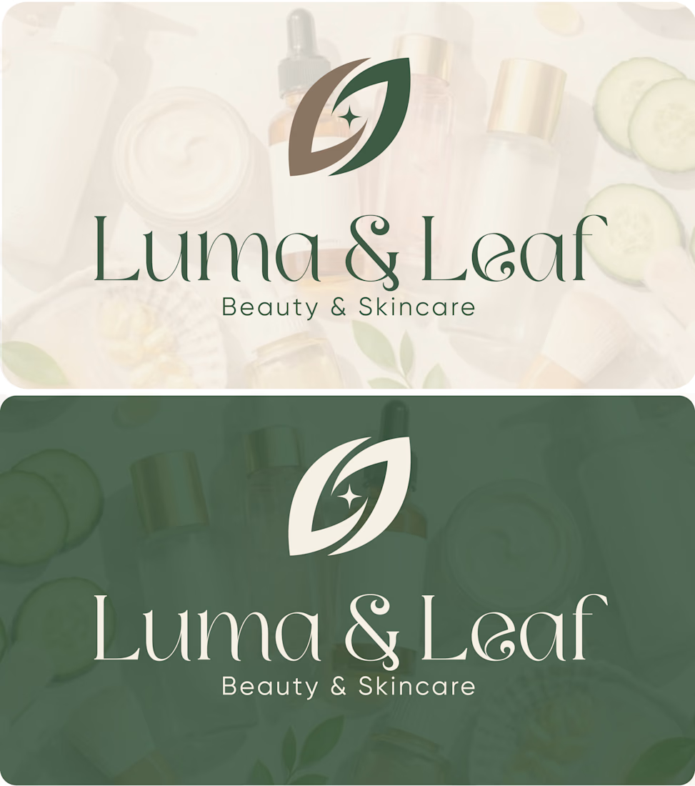
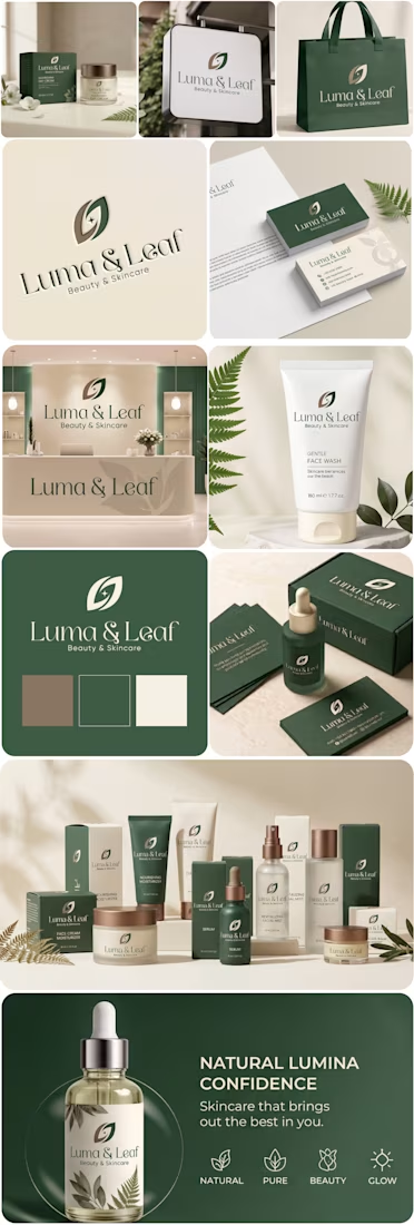
For Luma & Leaf, every element was designed with purpose.
The symbol subtly brings together L + L — one Luma, one Leaf — forming two leaves in opposite directions.
At the center, the glow/spark represents Luma’s idea of light, radiance, and glowing skin.
And the overall leaf-inspired form connects back to the brand’s organic, plant-based skincare identity.
A simple mark, but built around a complete brand strategy.
What do you think of the concept?
Need a logo with strategy behind it, not just a pretty mark? DM me.


Absolutely, i think logo without thinking n strategy is like nothing,
Thnku for you kind words dear😊
The network for creativity
Join 1.25M professional creatives like you
Connect with clients, get discovered, and run your business 100% commission-free
Creatives on Contra have earned over $150M and we are just getting started

Challenges
View all


Related posts

Returning to foundational assets is always a valuable exercise in brand scalability. Currently, I am preparing and structuring the master delivery files for a new sub-brand—built upon a visual identity system I originally designed a couple of years ago. Designing adaptable brand frameworks from day one is what allows a business to expand seamlessly over time while maintaining complete visual coherence. Looking forward to sharing the final execution soon.




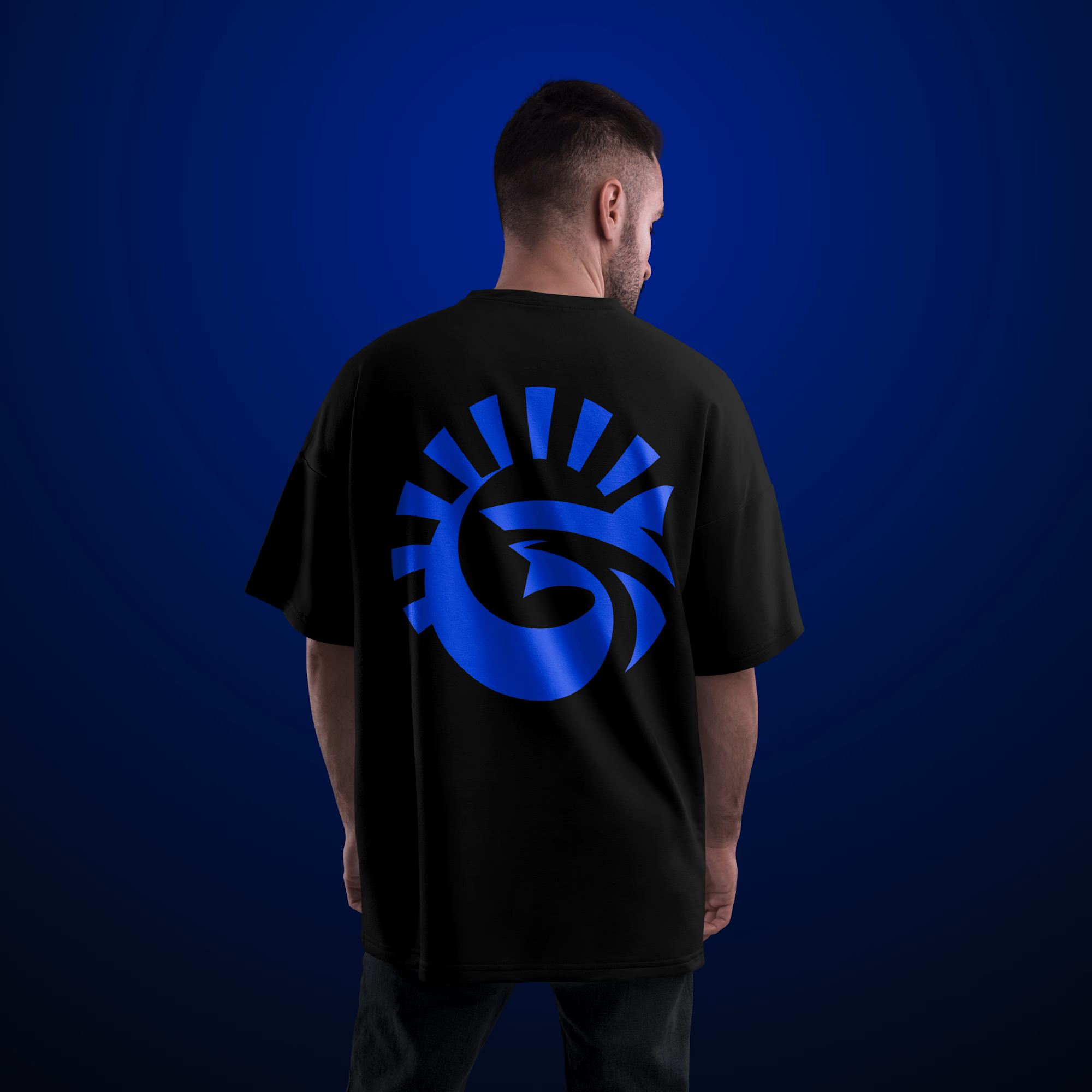

Real Estate Agency Logo
A brand identity concept for a modern real estate agency, designed to create a professional and recognizable presence across digital and physical touchpoints.
The logo system focuses on simplicity, scalability and distinctiveness — allowing the identity to work across property listings, signage, stationery, social media and web applications.
The goal was to create a mark that feels established without falling into familiar real estate branding clichés.
Design focus:
• Logo Design
• Real Estate Branding
• Brand Identity
• Visual Identity
• Brand Applications
• Art Direction
Designed by WaxyWeb.
Brand DesignGraphic DesignAdobe IllustratorAdobe PhotoshoprealestatelogoLogo Designbrandinggraphicdesign

Good!


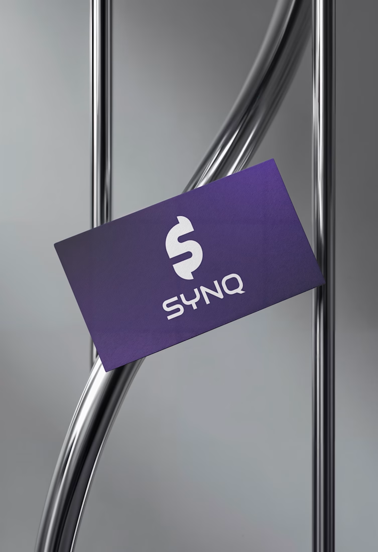
The Synq logo is built around a distinctive geometric “S” symbol, created through clean, precise forms that reflect connection, movement, and technology. The structured geometry gives the mark a modern and intelligent character, while its simplicity keeps it highly recognizable and versatile across digital platforms.
The Synq brand identity is designed to communicate innovation, connectivity, and forward-thinking technology. A minimal visual language, refined typography, and a focused color system create a clean and contemporary presence suitable for a modern tech company. The geometric “S” acts as the core visual element, providing a consistent foundation across digital products, social media, presentations, and other brand touchpoints.

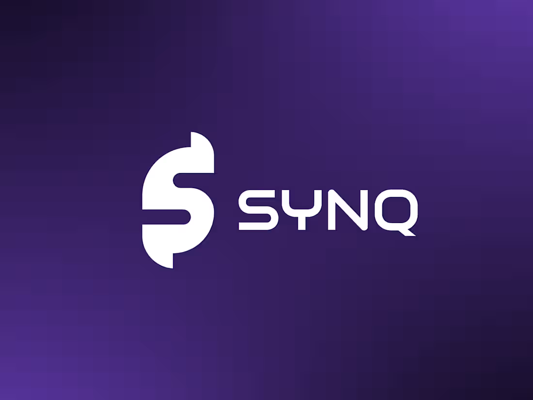
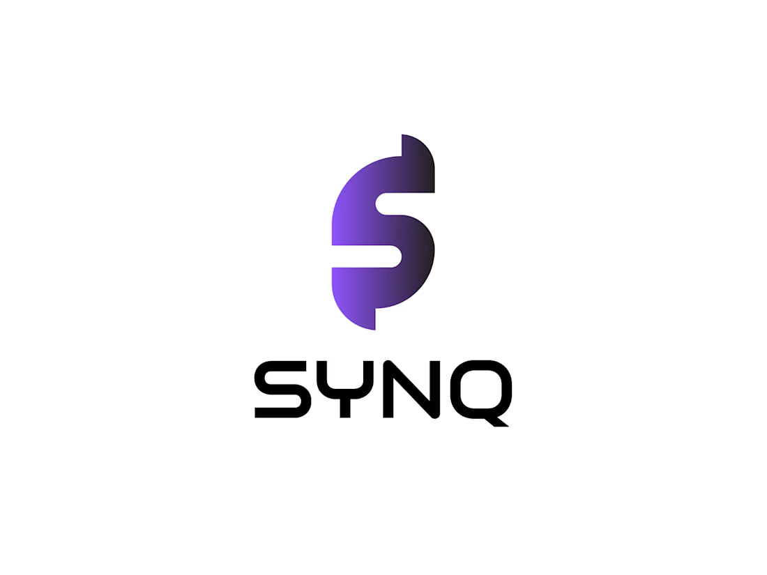

Clean geometry and the purple gradient on the card hold together well. One risk worth testing: the S with a vertical bar through it can read as a dollar sign at small sizes, which sends a very different signal than connection. Try it at favicon size before it ships.