The network for creativity
Join 1.25M professional creatives like you
Connect with clients, get discovered, and run your business 100% commission-free
Creatives on Contra have earned over $150M and we are just getting started
Back to feedPost

Just shipped a site for TruTerms Consultancy, a legal consultancy in Dubai that acts as a part-time in-house legal team for founders.
The idea I kept coming back to: what if the website looked like the thing they sell? So it reads like a contract. Numbered sections, the retainer written up as Schedule A, and each clause shows the actual legalese first, then what it means in one normal sentence.
The fun part was the compass. It starts in the hero, then travels with you down the page as you scroll, landing in a different spot in each section. Mapping out where it goes and when took a lot of back and forth, but it's the bit I'm happiest with.
Every project teaches me something I didn't know going in, and this one was no different. Already itching to start the next one and push it a bit further.


Numbered clauses for a legal site is a smart idea, and the serif fits it well.
Thanks 😊
The network for creativity
Join 1.25M professional creatives like you
Connect with clients, get discovered, and run your business 100% commission-free
Creatives on Contra have earned over $150M and we are just getting started





Related posts


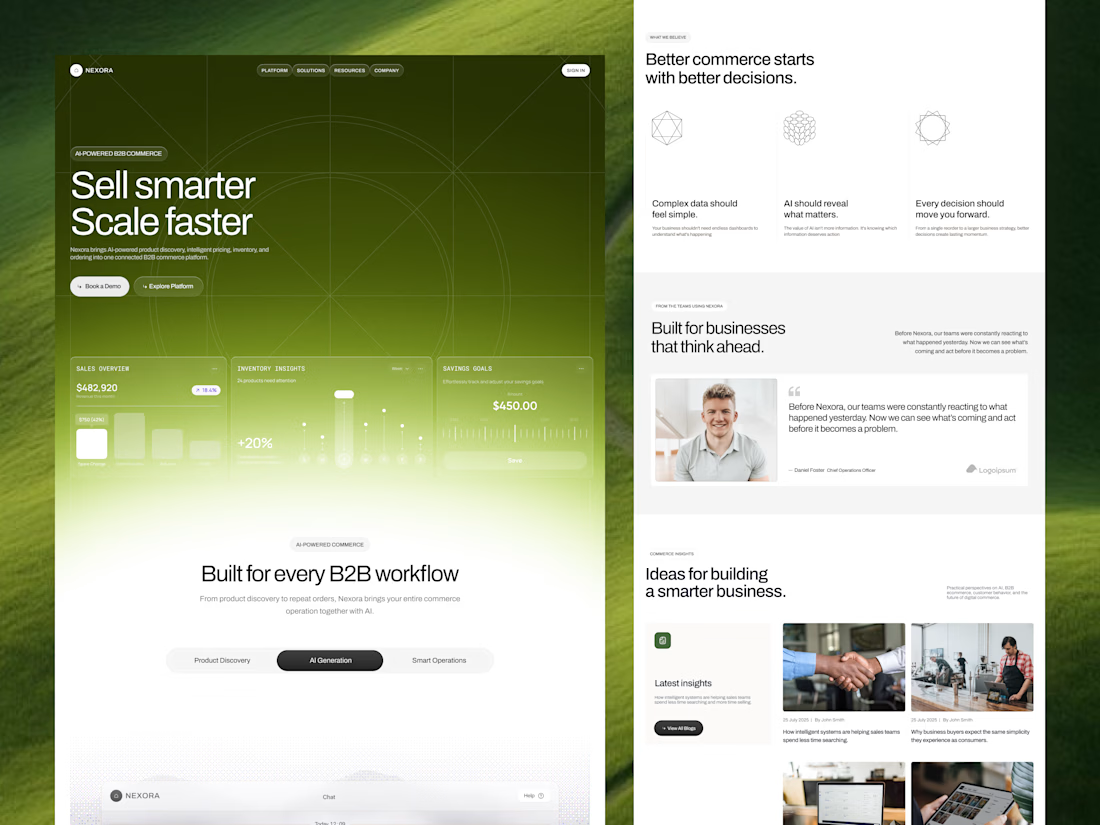
Our goal was to make pricing, inventory and ordering data feel simple and human for an AI-powered B2B commerce platform. We'd love to hear your thoughts!

Engaging background and nice gradient to not make the section look seprate 🔥


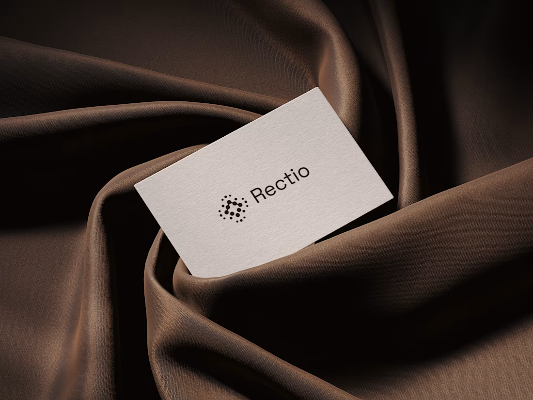
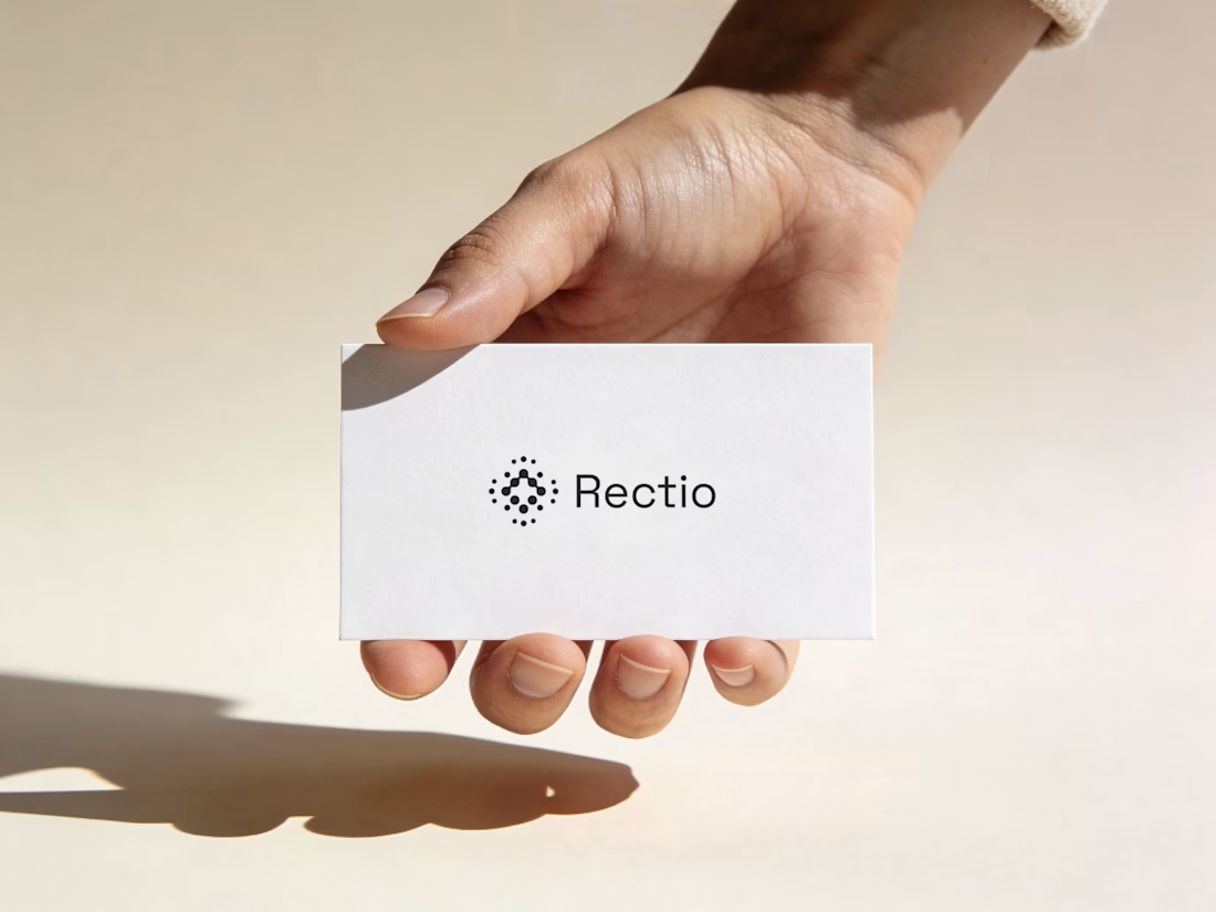
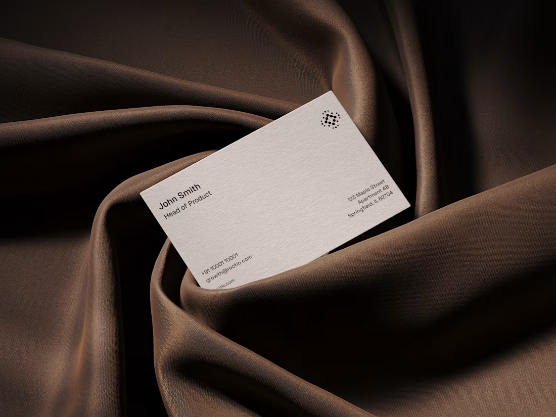
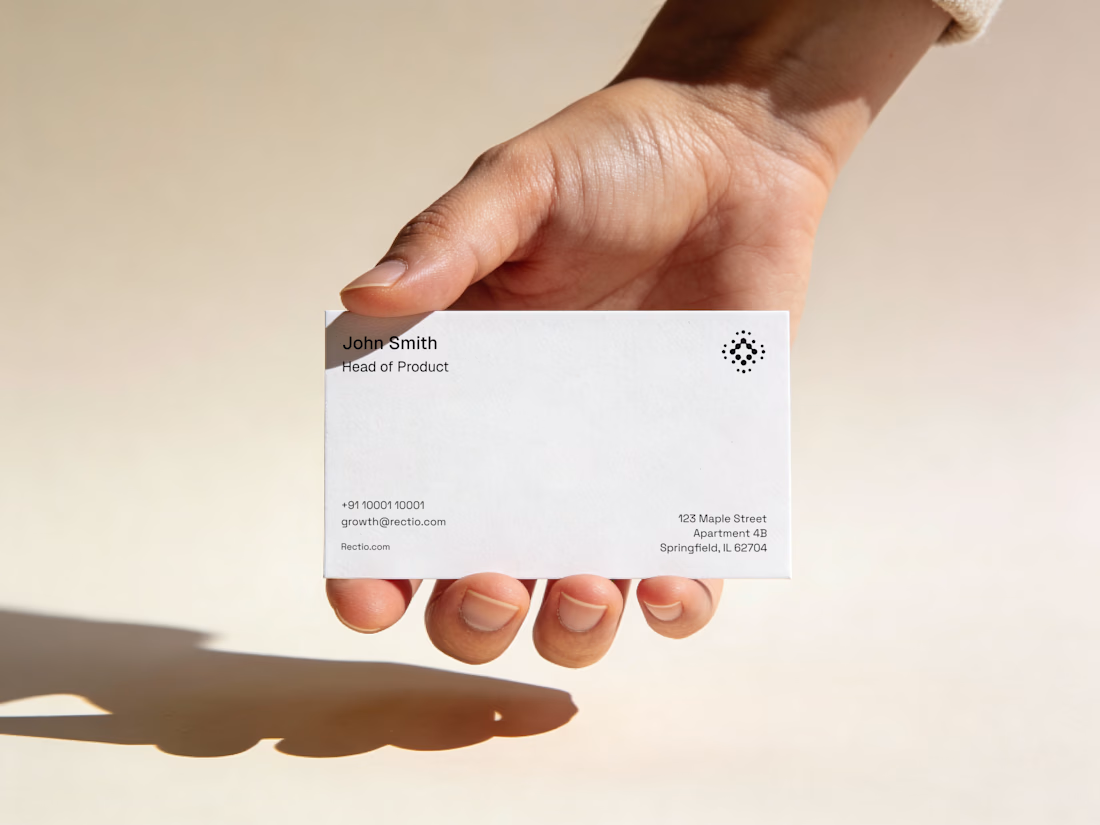
Rectio — Brand Identity
Brand Identity • Visual Direction • Business Cards • Mockups
A modern and minimal branding direction for Rectio, from visual identity to business card applications.
Created by Artonest Design Studio — artonest.design





Its feel like your archive is full of honey. wonderful