The network for creativity
Join 1.25M professional creatives like you
Connect with clients, get discovered, and run your business 100% commission-free
Creatives on Contra have earned over $150M and we are just getting started
Back to feedPost

This idea came from my daily work.
Every afternoon, I write a short report for my clients.
A simple summary of what was done on their project that day.
Clients love it.
It reassures them that their project is moving forward.
But those reports always end up lost in chat threads.
Hard to find. Hard to revisit.
So I started thinking about a better way to organize them.
A place where reports live together, in order, and can be reviewed anytime.
That’s why I built FocusProof.
A simple app that lets you document your daily work
and share it on one clean page your client can always access.
Who pays + why
Freelancers like me.
People who want their daily reports organized, professional, and easy to share.


really creative

wonderful!

Amazing

Good thinking behind this!!
The network for creativity
Join 1.25M professional creatives like you
Connect with clients, get discovered, and run your business 100% commission-free
Creatives on Contra have earned over $150M and we are just getting started








Related posts

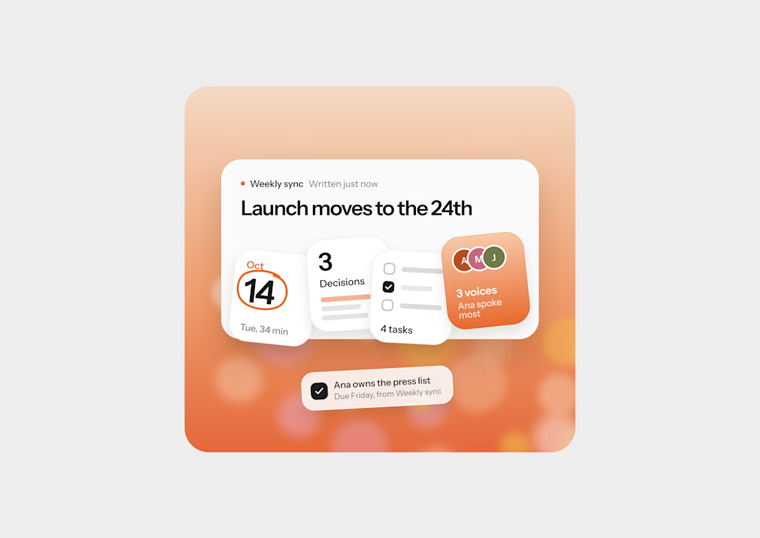
Designed a recap card for Lasso, an AI notetaker app, and it’s one of my favorite small pieces lately.
The business goal was simple: get people to open the notes after every meeting. Most notetakers lose users right there, because the summary looks like homework. Nobody reads a wall of text after a 34 minute call.
Warm gradient and slightly tilted tiles keep it feeling like a quick recap from a teammate instead of a report.


After weeks of 14–16 hour workdays, late nights and countless iterations, our new website is finally live! 🚀🌙
Built using Claude Code, Codex, Claude Design, Higgsfield and Figma.
AI is incredibly powerful when used correctly. With the right expertise, creativity and attention to detail, you can create something truly unique that doesn’t look or feel AI-generated.
AI accelerated. Expert led.
I’d love your feedback! What part of the website do you like the most? 👀:


The AI accelerated, expert led framing nails it, Adrian. That Our new website is live opener with the golden sparkle treatment is a striking hero, and it clearly shows the human expertise guiding all that AI tooling.

As a Ul/UX designer, I've learned that great design isn't about adding more, it's about removing what gets in the way. Simplicity doesn't limit an experience, it enhances it.
If users can navigate effortlessly, the design is already doing its job.