The network for creativity
Join 1.25M professional creatives like you
Connect with clients, get discovered, and run your business 100% commission-free
Creatives on Contra have earned over $150M and we are just getting started
Back to feedPost
Taste Test
I came across this vase on pinterest & I gave it a bit of a makeover in FLORA - Which one would you prefer?!


11 voted
73%
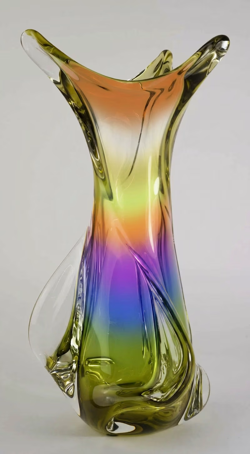
4 voted
27%
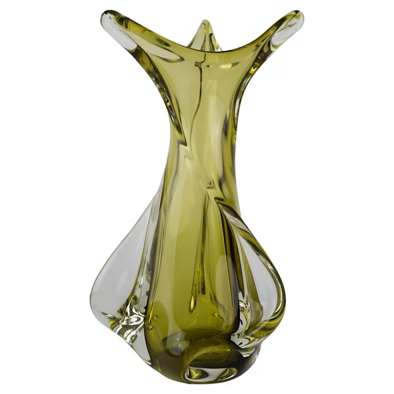
15 votes
Closed

Voted for The NEW. The rainbow gradient gives it a completely different energy, almost like it was lit from within. Curious how much of that color was FLORA vs post-processing.

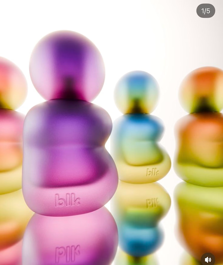
thanks ! I actually got the colorway inspo from this fragrance ad that I had saved a while ago & - extracted the color-way seperately in copilot & then I used each ombre as a reference point for my vision of the vase!



The new


I love the new

I prefer the new version
The network for creativity
Join 1.25M professional creatives like you
Connect with clients, get discovered, and run your business 100% commission-free
Creatives on Contra have earned over $150M and we are just getting started




Related posts


Hot take: aesthetics and clinical results should walk hand in hand.
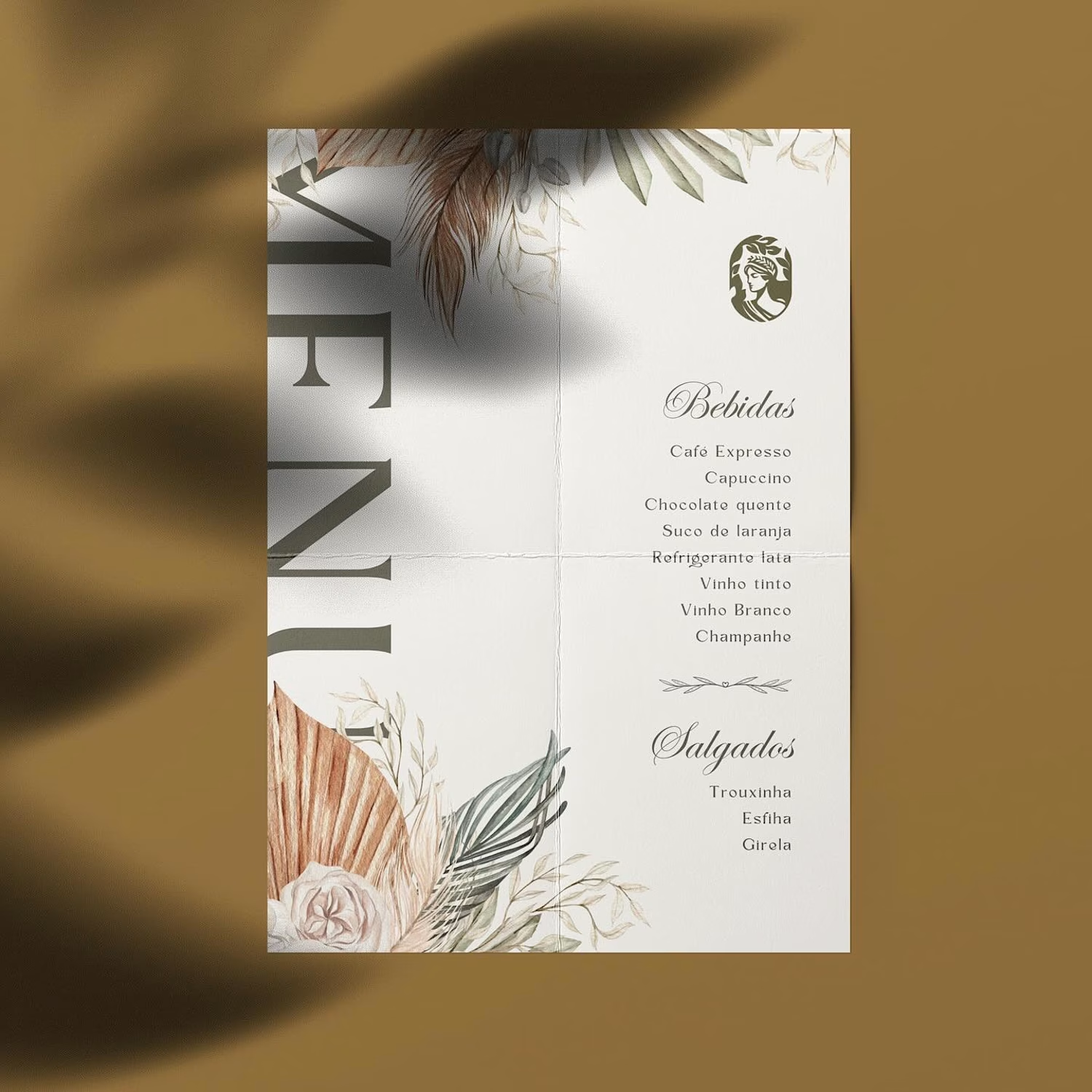
Most brands in this space lean into cold, sterile whites or aggressive dark tones. It reads functional, but it also feels like something you'd hide in a medicine cabinet, not display on your vanity.
For this rebrand, we anchored the identity in classical beauty and organic sophistication. By combining warm earthy tones, botanical cues, and timeless iconography, we moved away from the "pharmacy product" feel into true high-end personal care.
It was a deliberate shift: positioning the brand not for someone who feels like they are treating a flaw, but for someone investing in a premium daily ritual.
Would a piece like this deserve a spot on your display shelf?





This is brilliant!


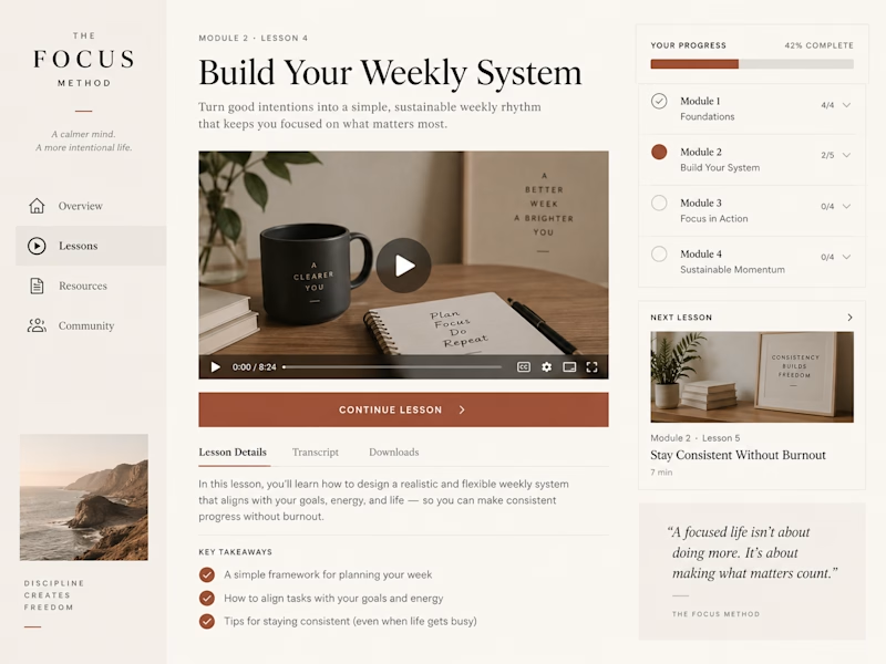
Same course, two completely different Kajabi product designs—which would you rather learn inside?

23 voted
61%
15 voted
39%

38 votes
Closed
Editorial for sure

