The network for creativity
Join 1.25M professional creatives like you
Connect with clients, get discovered, and run your business 100% commission-free
Creatives on Contra have earned over $150M and we are just getting started

The network for creativity
Join 1.25M professional creatives like you
Connect with clients, get discovered, and run your business 100% commission-free
Creatives on Contra have earned over $150M and we are just getting started








Related posts


A hot take in branding: Should premium always play it safe?
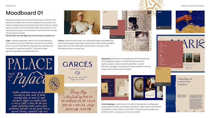
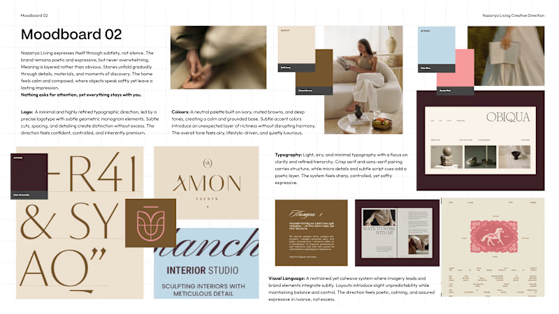
We recently explored two contrasting creative directions for a premium carpet and home décor brand based in Jaipur, India.
Moodboard 01: Challenges category conventions with a maximalist, editorial approach. Inspired by visual journals, printed matter and the stories objects carry.
Moodboard 02: Embraces familiar premium codes. Neutral colours, conventional logo forms and spacious layouts that let the products take centre stage.
Both serve a purpose, but the brand's core idea is “Stories Worth Keeping.”
Which direction would you remember for a brand that sells more than objects, but the stories behind them?
01 or 02?


4 votes
Ends in 1d

luxury logo, fashion brand, vogo, brand identity, premium logo, monogram logo, minimal logo, clothing brand logo, timeless lux, high-end fashion, gold logo, luxury branding, apparel logo, designer logo

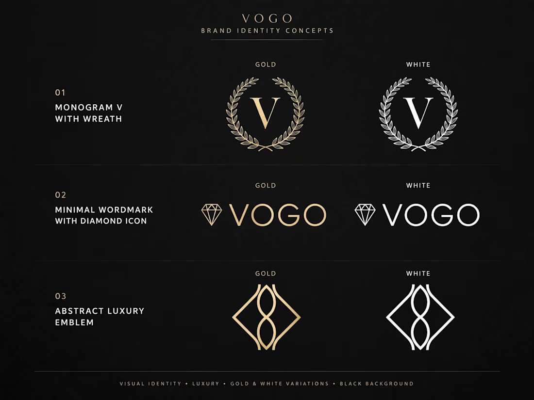

Concept 02 is my pick. The diamond icon before the wordmark gives it that jewellery-house feel without leaning on the wreath like everyone else does. Of the three directions, which one feels closest to what a fashion client would actually brief?