The network for creativity
Join 1.25M professional creatives like you
Connect with clients, get discovered, and run your business 100% commission-free
Creatives on Contra have earned over $150M and we are just getting started
Back to feedPost
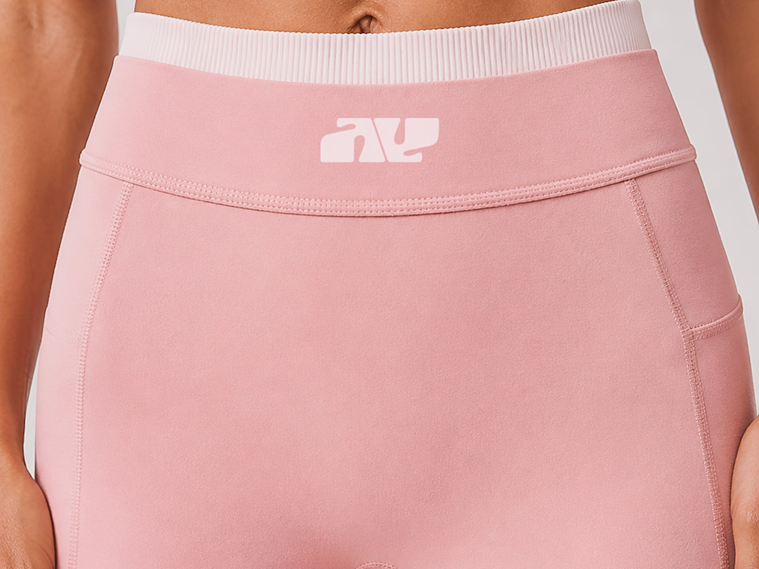
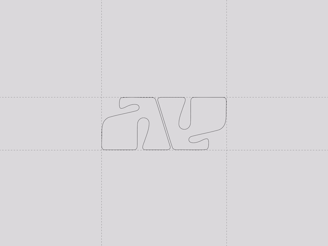
Not every logo needs a symbol.
Sometimes two letters are enough.
AY is a Pilates studio and activewear brand built around the idea that strength and softness can coexist. I explored that contrast through a custom monogram that combines bold forms with fluid curves.
Simple shapes. Intentional movement. Distinct personality.
Would you have gone more geometric or more organic with this direction?
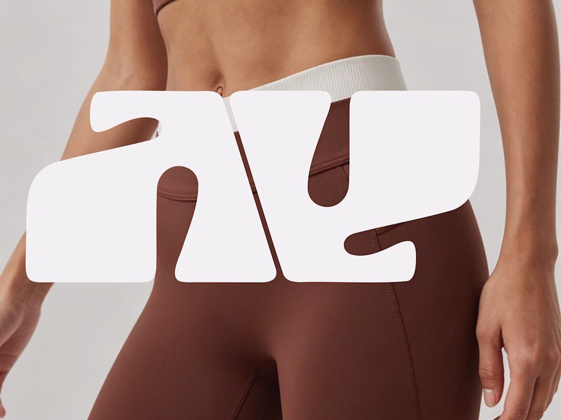
More organic, honestly. The brand concept of strength and softness coexisting feels like it needs a little imperfection to read as authentic. Too geometric and it starts to feel like a sportswear giant, not a Pilates studio.
I like that perspective. My thinking was that if it became too organic, it might start to lose some of the strength and structure I wanted to communicate. I tried to find a middle ground where the bold forms suggest stability while the curves bring in movement and softness. Definitely an interesting tension to explore, though.
One of the best designs have seen so far todayyy,, keep it up
Thank you, Bolu.🥰
The network for creativity
Join 1.25M professional creatives like you
Connect with clients, get discovered, and run your business 100% commission-free
Creatives on Contra have earned over $150M and we are just getting started
Related posts
Woaah! Finally I've found the time to post this project and share it everywhere, we have been building out this 𝟲𝟬𝟬+ 𝗽𝗮𝗴𝗲 𝘄𝗲𝗯𝘀𝗶𝘁𝗲 for the past few months and its a BANGER! 🛩️
It's been so good to be working with this company and recently we've established a longer, retainer form collaboration working and continuing building the digital presence of BLAK! 🌍
Amazing where @Contra HQ took me in my career, I never expected to be partying with this client on Ibiza next weekend! 🕺🏼
Feel free to check out the project, leave some kudos and excited to be showing y'all what else I'm working on! ⚡️
600+ pages in Framer is no small thing to maintain consistently. Curious how you handled template logic and CMS structure at that scale.
For my Figma Makeathon submission, I built The Postcard, a web app that transforms ordinary messages into personalized digital postcards.
Users can customize their postcard with fonts, colors, stamps, and photos, then instantly generate a unique link to share with friends and family. The goal was to make digital communication feel more expressive while keeping the experience simple and accessible.
Built using Figma Make, the project explores how customization and thoughtful interaction design can turn a basic message into something worth sharing.
✨ Personalize it. 🔗 Share it. 💌 Deliver it.
Figma site link: thepostcard.figma.site
Try it out and send your first postcard!!
🧠 MindLoop
A vocabulary learning app that helps you remember new words through personalized audio loops.
📚 Create word cards
🗂️ Organize them into folders
🎧 Listen while walking, studying, doing chores, or before sleep
🌊 Add rain sounds, ocean waves, or relaxing background music
For this project, I created a short animated commercial to showcase the experience and workflow behind MindLoop.
🎙️ Voice generation: ElevenLabs
🎵 Music generation: Suno
🎬 Animation & workflow: ElevenLabs Flow
🎨 UI/UX Design & Prototype: Figma
🔗 Try MindLoop:
https://plot-stung-03436308.figma.site
🐦 Twitter/X Post:
https://x.com/Naghdaliyevaart/status/2064003914320502936?s=20
The passive listening angle is a genuinely smart UX bet. Did you test whether users preferred scheduled loops or just on-demand playback?
Challenges
View allTrending
Claude
Claude has entered the design space. How are you using Claude Design?
Contra University
Learn from expert creatives how to earn more using next-gen AI tools.
MagicPath
The canvas is infinite, and exploration is becoming the workflow. How are you using MagicPath?
creativeaiflow
Creative AI workflows are evolving. What tools do you use, and what are their strengths and weaknesses?
freelancerlife
Freelancer life is wins, pivots, and everything in between. What’s yours right now?