The network for creativity
Join 1.25M professional creatives like you
Connect with clients, get discovered, and run your business 100% commission-free
Creatives on Contra have earned over $150M and we are just getting started
Back to feedPost


The network for creativity
Join 1.25M professional creatives like you
Connect with clients, get discovered, and run your business 100% commission-free
Creatives on Contra have earned over $150M and we are just getting started







Related posts

What if your watch collection had a dashboard this luxurious?
Meet Chronova. Built for collectors who care about every detail.
Would you use this?


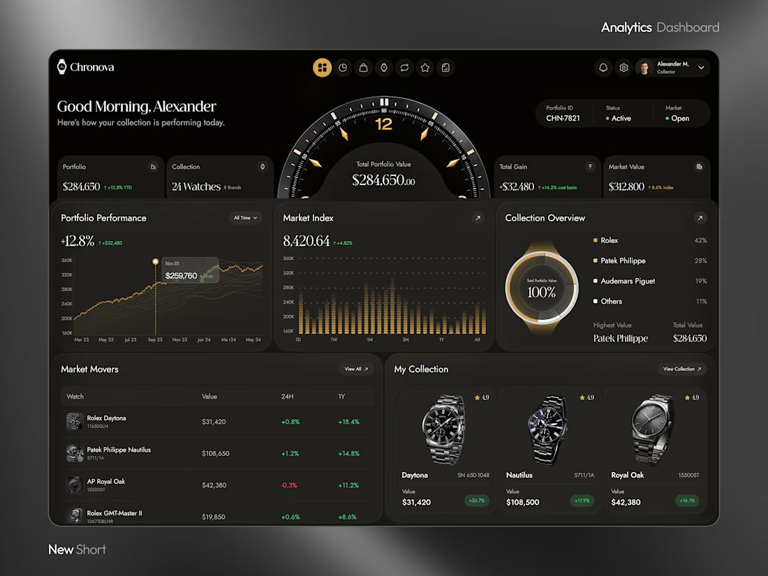
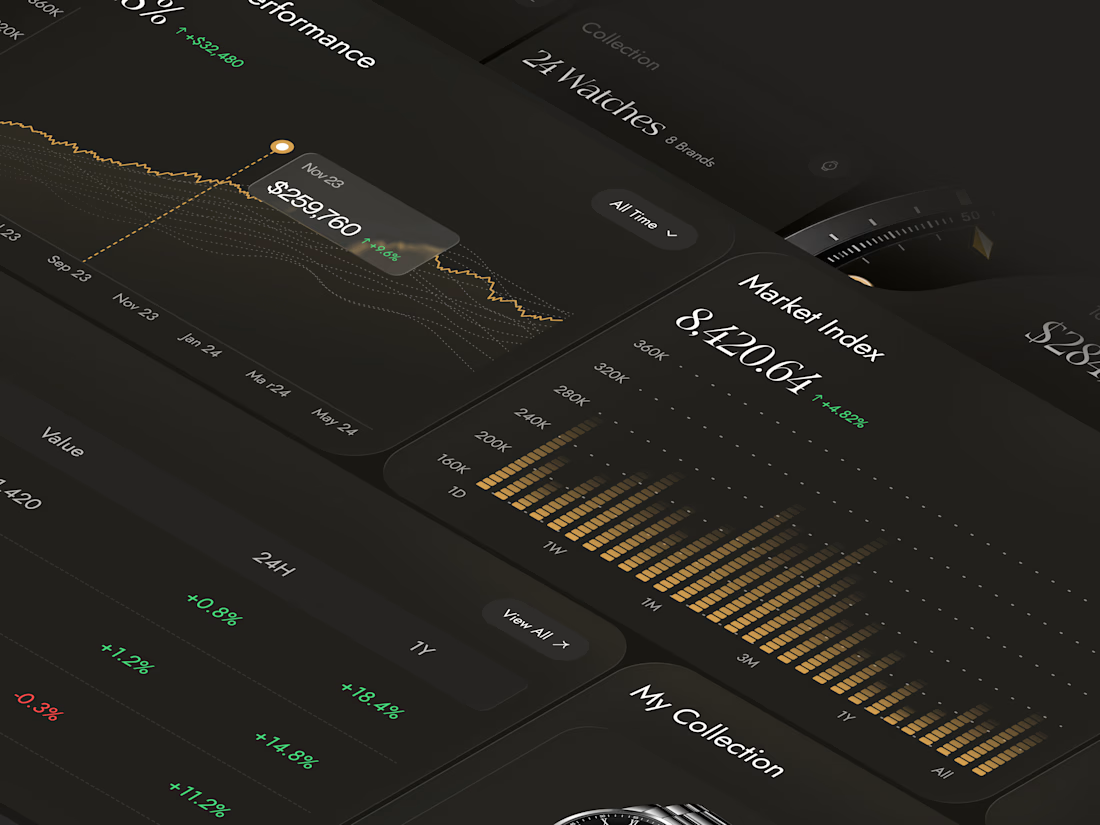
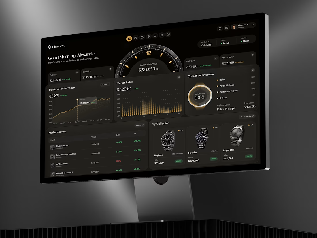

a dark dashboard makes sense here, the watches get to be the brightest thing on screen. how do you show a collection's value changing without it feeling like a trading app?

Recent work on MAE - Visual identity

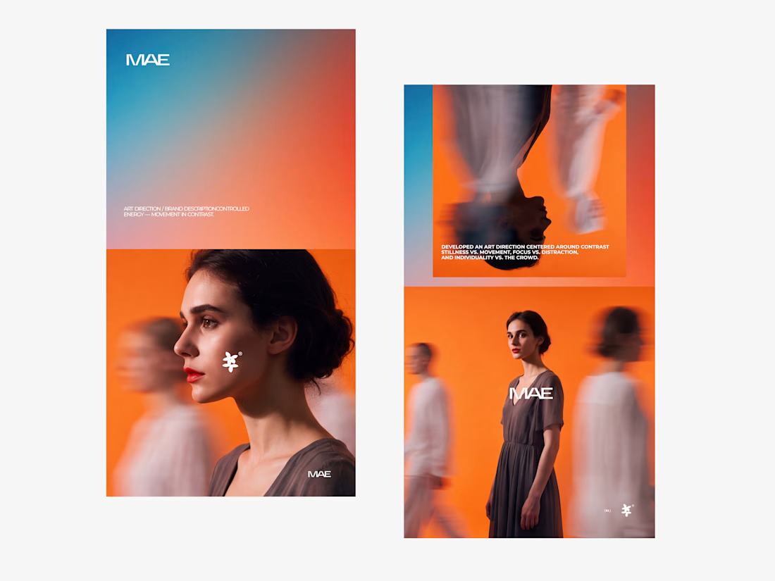

The motion blur on the figures gives the orange-to-blue gradient a reason to be there, and the small star mark stays readable on both the cheek and the shirt. Did the star come first as a standalone mark, or did it grow out of the photography direction?

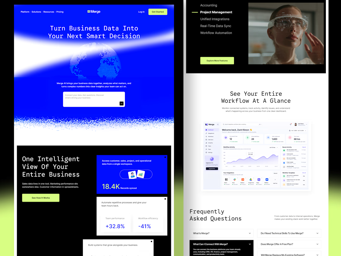
Merge — AI-Powered Business Intelligence SaaS Landing Page Design
Businesses often struggle with disconnected tools, scattered data, and complicated workflows. When important information lives across multiple platforms, teams waste time switching between tools instead of focusing on growth.
For Merge, I designed a modern SaaS landing page concept that presents business intelligence, unified integrations, and workflow automation through a clear and engaging user experience.
The goal: Create a landing page that communicates product value quickly, builds trust, and helps potential customers understand how the platform fits into their workflow.
Design focus
Clear value proposition and messaging
Strong visual hierarchy and conversion-focused CTAs
Dashboard UI to demonstrate product capabilities
Feature sections that simplify complex functionality
Consistent design language across the entire page
A SaaS website should do more than look attractive. It should help the right customers understand the product, recognize its value, and feel confident taking action.


Outstanding work