The network for creativity
Join 1.25M professional creatives like you
Connect with clients, get discovered, and run your business 100% commission-free
Creatives on Contra have earned over $150M and we are just getting started
Back to feedPost
Taste Test

Which card better expresses CATCHLIGHT?
The decision: let the material speak, or explain the idea through the graphics?
I explored two business cards for CATCHLIGHT. One uses dark board and a restrained mark. The other brings the light-return idea into a technical drawing.
CATCHLIGHT is a self-initiated concept brand for everyday reflective goods.
Which feels closer to a calm, discreet brand, and what detail makes you choose it?
2 voted
40%
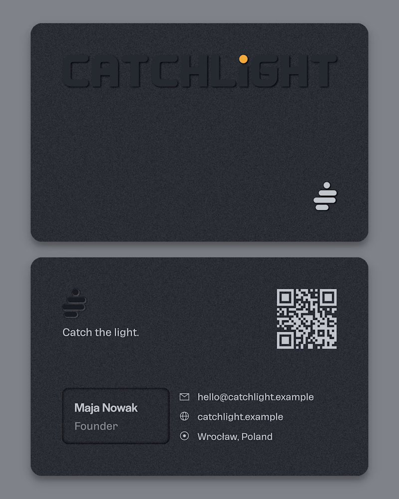
3 voted
60%
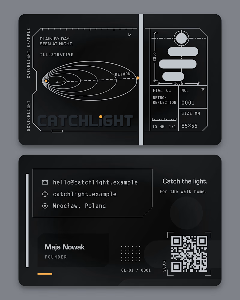
5 votes
Closed

card 1 is certainly calm & discreet, but i think card 2 shows so much of the thought poured into the work that it'd almost be a disservice not to put that attention to detail in the spotlight!
Thank you, Nicolette, and the vote agreed with you. The final card landed between the two: a gloss black card with the walker and wordmark proposed as a blind deboss, so the detail moves into the finish instead of the drawing. The full CATCHLIGHT case study is on my profile now if you'd like to see where it ended up.
The network for creativity
Join 1.25M professional creatives like you
Connect with clients, get discovered, and run your business 100% commission-free
Creatives on Contra have earned over $150M and we are just getting started
Related posts

Two warm ups today, both might become full case studies:
Parlata: an audio-postcard service that records and archives local dialects. Every recording becomes a small printed card with a QR link.
MODULO: an Industrial IoT brand. Olive, navy, one wobbly blob.
One is warm and human. One is technical and playful. Which would you want to see go all the way?
31 voted
63%
18 voted
37%
49 votes
Closed

Love it

Your crypto landing page has 3 seconds to earn trust. Which direction gets it right?
One crypto homepage feels built for serious traders. The other makes crypto feel effortless.
Which one would make you click “Start Trading” without hesitation: #1 or #2?


10 voted
37%
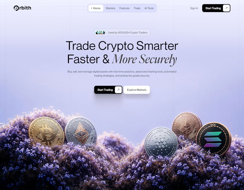
17 voted
63%
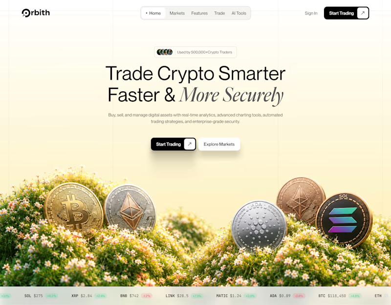
27 votes
Closed


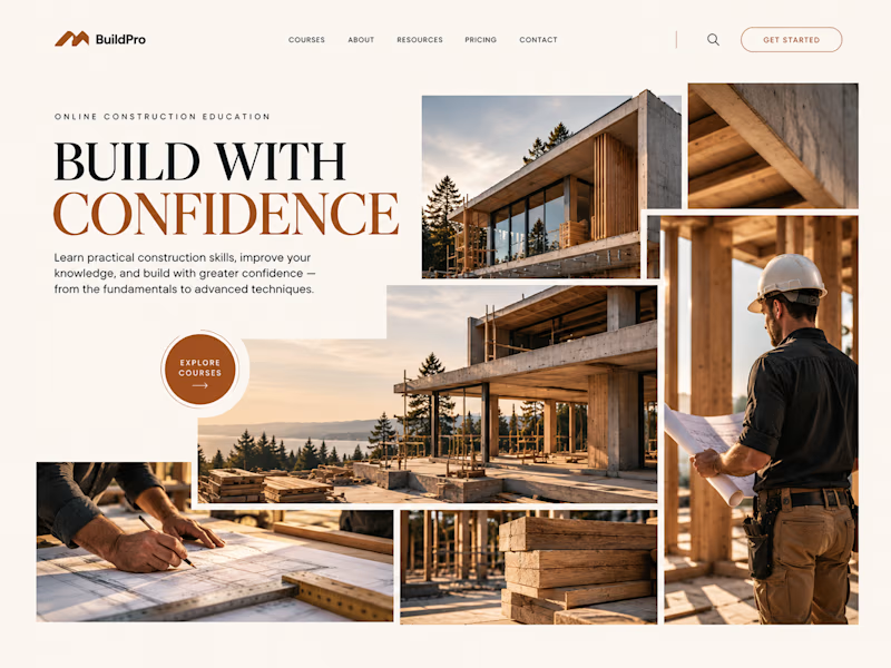
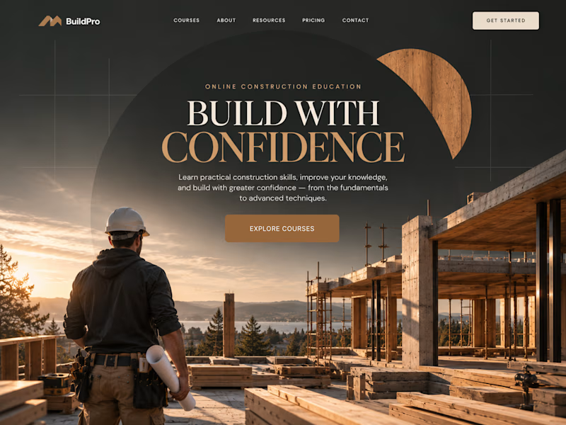
Same course. Same content.
But two completely different feelings ✨
Which version would you choose?

18 voted
31%
40 voted
69%
58 votes
Closed
option 2 feels a bit more cinematic, the confident feeling is embedded into the layout!