The network for creativity
Join 1.25M professional creatives like you
Connect with clients, get discovered, and run your business 100% commission-free
Creatives on Contra have earned over $150M and we are just getting started
Back to feedPost

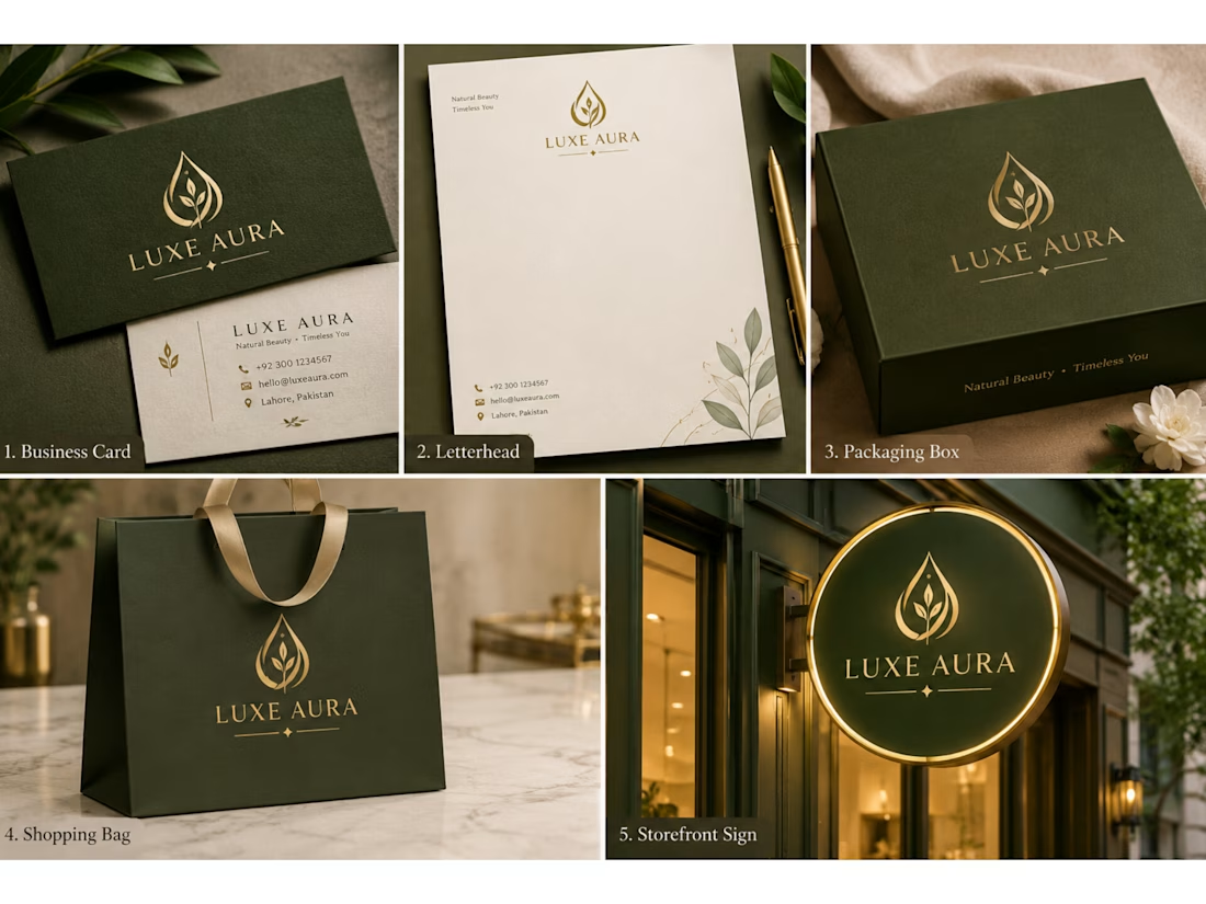
✨ Luxury Brand Identity Design | LUXE AURA ✨A timeless blend of elegance, sophistication, and minimalism. 💚✨
This luxury brand identity features a refined gold emblem, elegant typography, and a premium olive-green and gold color palette — designed to create a memorable and cohesive brand experience.
🎨 Designed with creativity. Crafted with elegance.


The network for creativity
Join 1.25M professional creatives like you
Connect with clients, get discovered, and run your business 100% commission-free
Creatives on Contra have earned over $150M and we are just getting started











Related posts

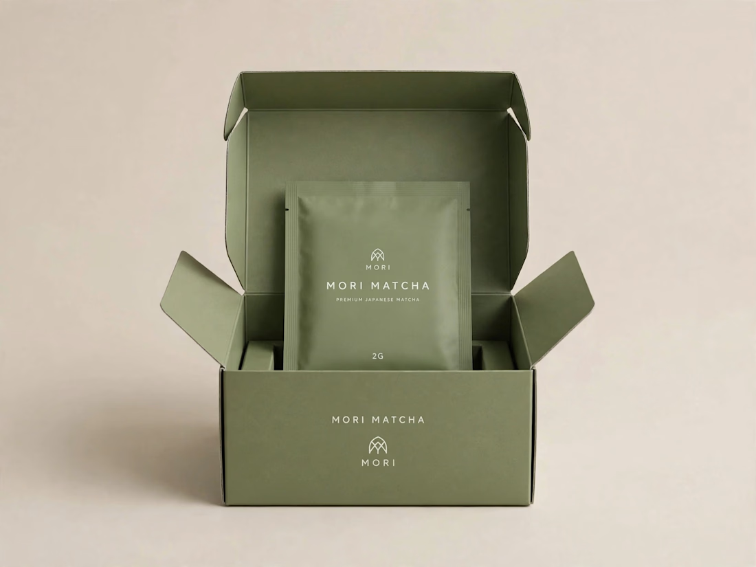
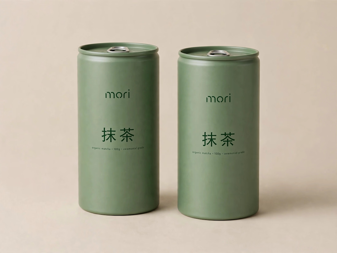
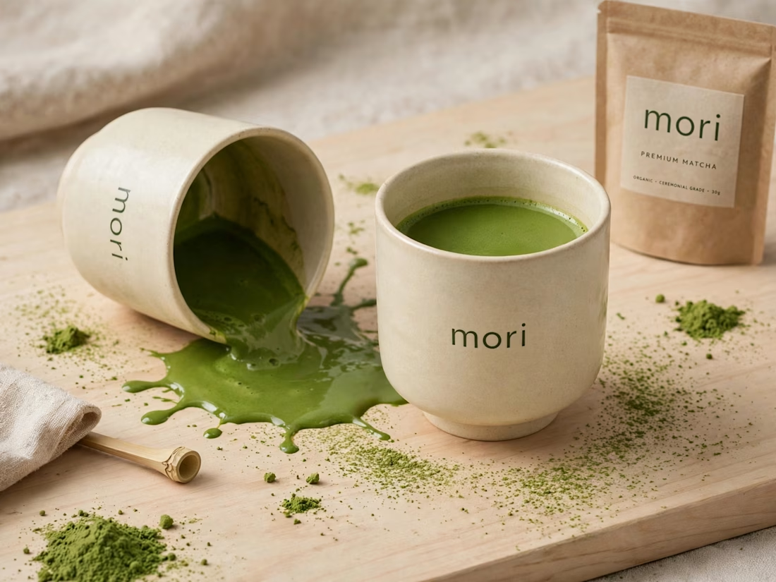
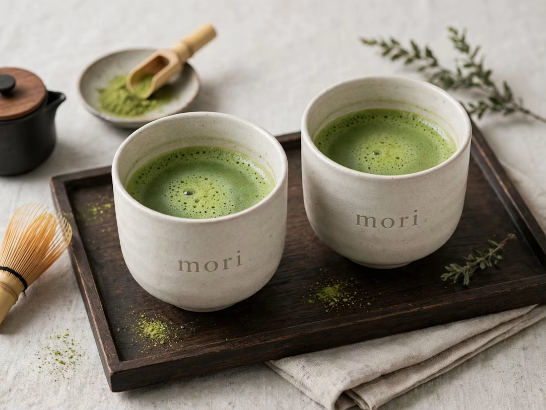
more visuals from my latest project — mori matcha 🍵
explored minimal Japanese packaging with earthy greens and calm typography.
focusing on premium ceramic cups and clean can design.
#branddesign #packagingdesign #visualidentity #brandstrategy #matcha #minimaldesign #japanesedesign #figma #mockup #branding




Slowly but surely on a mission to make sure that decks have brands and brands have decks!
What's your mission, I'm curious?
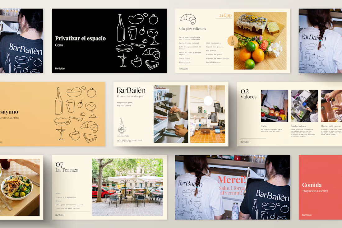
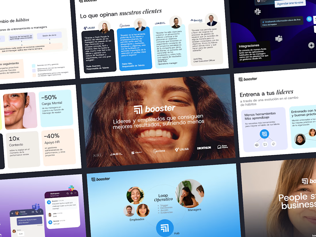
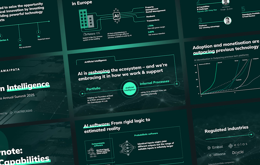
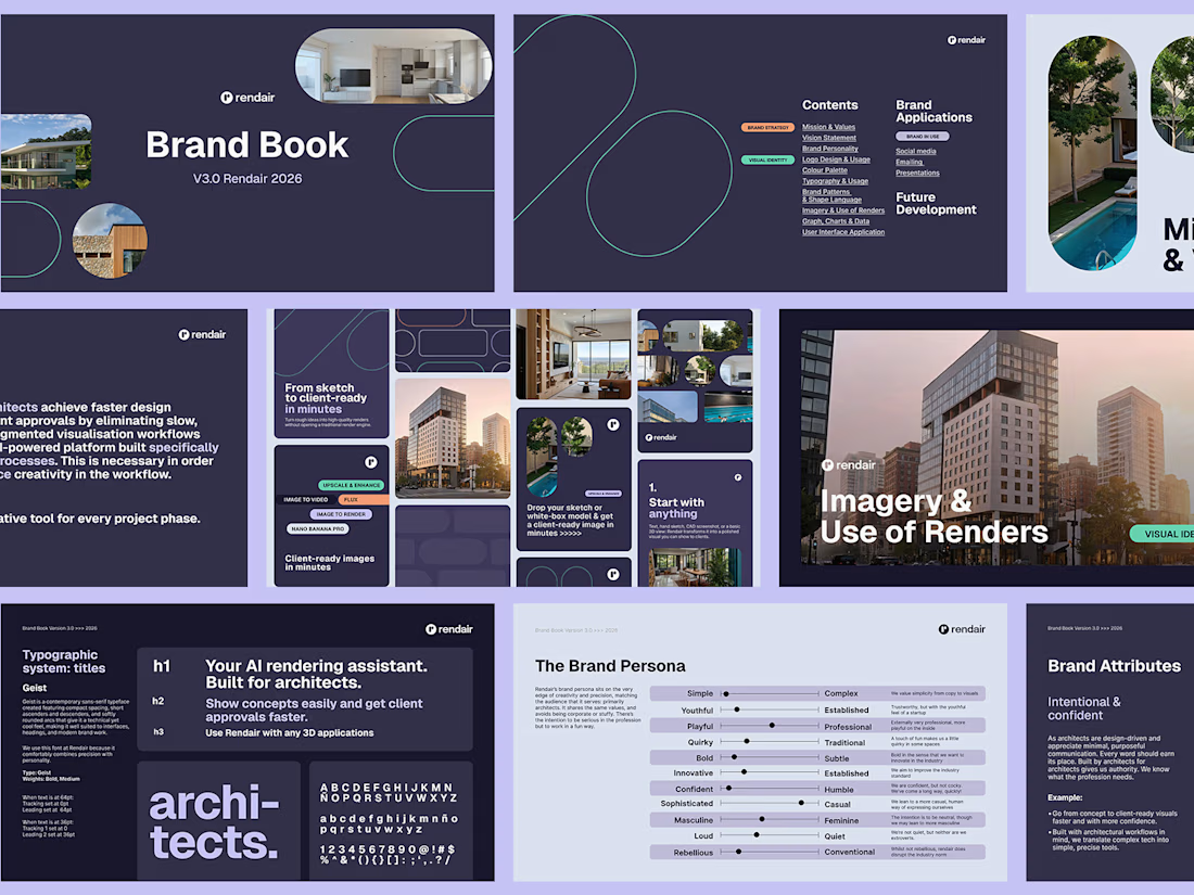

Mine is the same problem from the other side: making brand guidelines usable by whoever builds the next deck, not just the designer who wrote them. In your experience, what breaks first once decks leave your hands, the type hierarchy or the imagery rules?

A logo is not a brand identity.
It’s the signature at the bottom of the letter.
Most founders start by asking for a logo.
What they need is a system that still looks like them on day 100.
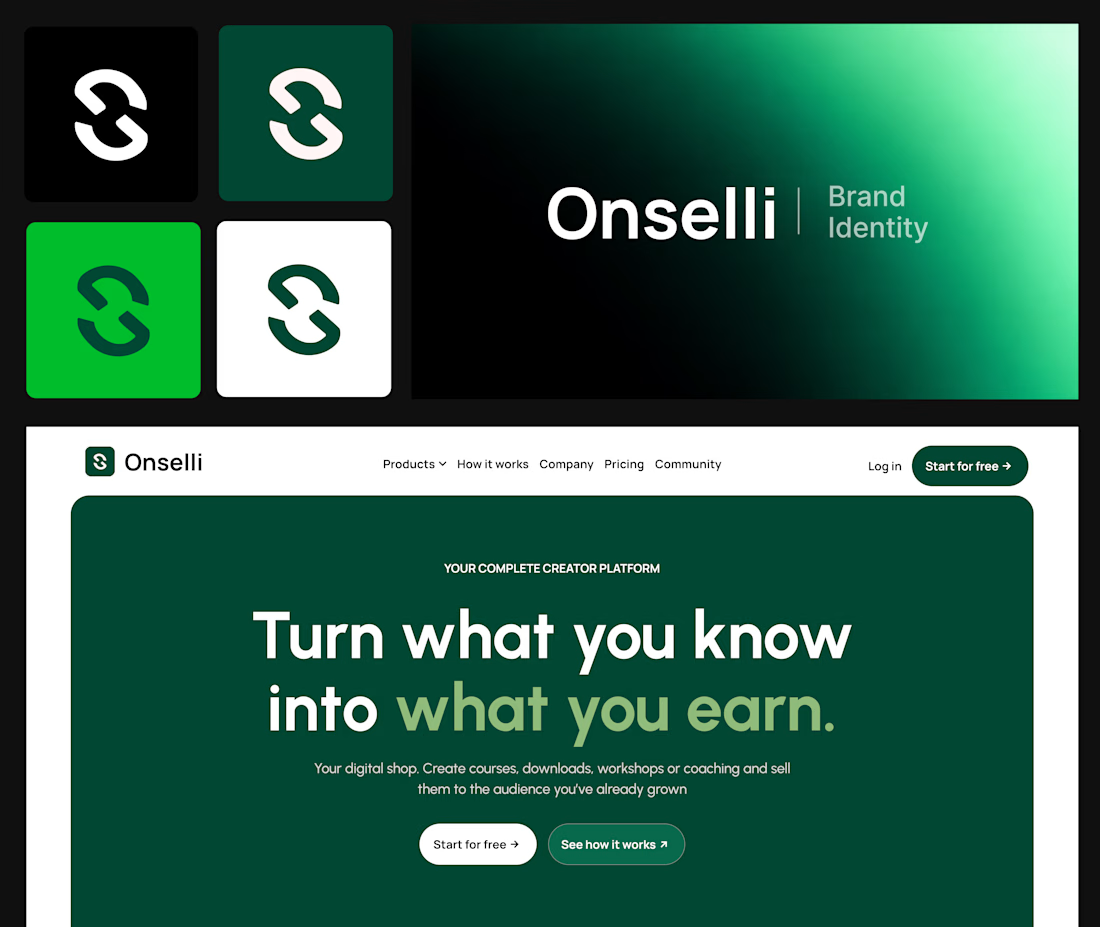
Here’s what sits behind the Onselli mark 👇
- A mark that holds on any background
- A style guide, with a color system where every color has a job and type with a point of view
- The brand principles, with the logo use cases on socials, mockups, or any surfaces.
- Components that match: buttons, cards, hero, forms, etc...
- Social creatives and copy that sells the product: “Turn what you know into what you earn.”
- A live website that carries all of it
Skip one and the whole thing starts to look like a template.
A logo gets you noticed.
A system gets you trusted.
Which of the 6 is your brand missing?
Drop the number below, and I’ll tell you how I’d fix it.
Know a founder who thinks branding is a logo?
Repost ♻️ and save them an expensive redo.
I’m Daniel, a Design Engineer. I craft premium web, motion, product design, and brand identities for startups.
Follow for more breakdowns like this, or DM me “identity” if you’re building something.

Great job Daniel 🎉🎉