The network for creativity
Join 1.25M professional creatives like you
Connect with clients, get discovered, and run your business 100% commission-free
Creatives on Contra have earned over $150M and we are just getting started
Back to feedPost
Dark or Light? I built both, and now I can't decide.
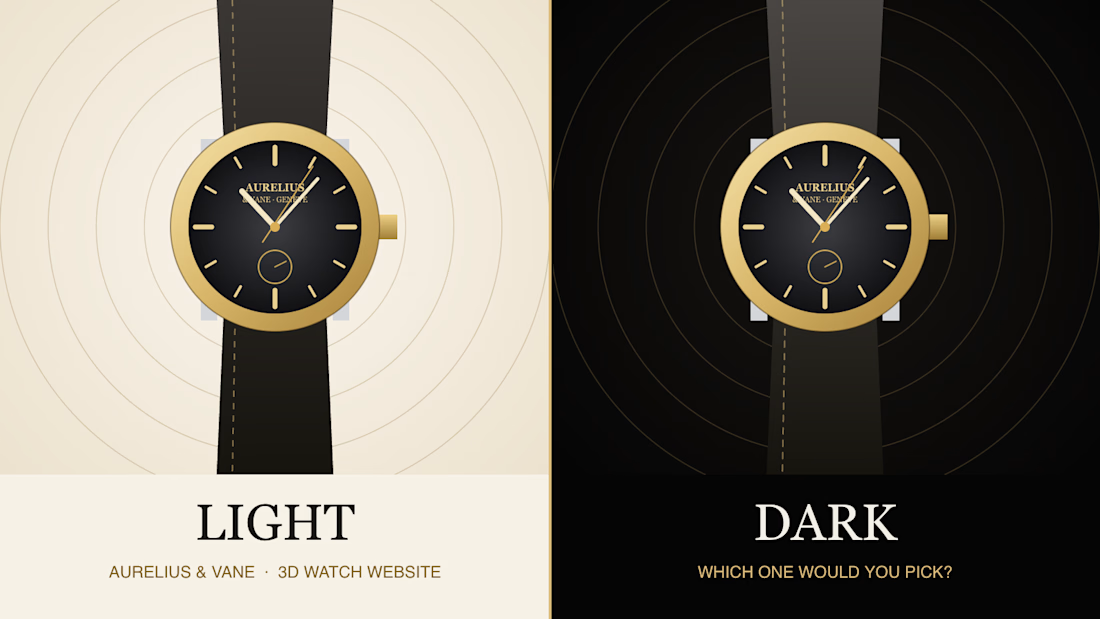
Same luxury watch website. Same 3D watch you can spin with your mouse. Only the mood changes.
Left: warm ivory with gold. Calm and elegant.
Right: deep black with gold. Bold and cinematic.
Which one would you choose for your brand, and why?
Comment "L" for Light or "D" for Dark. I read every reply.
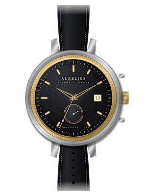
The project is Aurelius & Vane, a 3D luxury watch website built with Next.js, Three.js and GSAP. Live: cl.liaqatali.dev (use the sun/moon button at the top to switch themes).
If you run a premium brand and want a site that makes people stop scrolling, send me a message. I build these at MIAVRO Systems.

Live demo (use the sun/moon button to switch themes): cl.liaqatali.dev | Want a premium 3D site like this for your brand? Message me, I build these at MIAVRO Systems. #webdesign #nextjs #threejs #3dwebsite
The network for creativity
Join 1.25M professional creatives like you
Connect with clients, get discovered, and run your business 100% commission-free
Creatives on Contra have earned over $150M and we are just getting started



Related posts

A great example of how a course landing page can have its own personality.
I really like the bold typography, immersive visuals, and how the entire design reflects the freediving experience.
Good work👏
#Kajabi #KajabiWebsiteDesign #WebDesign #LandingPageDesign


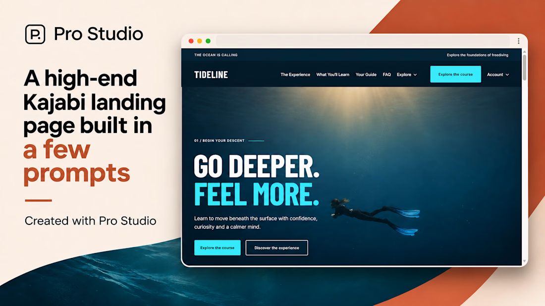
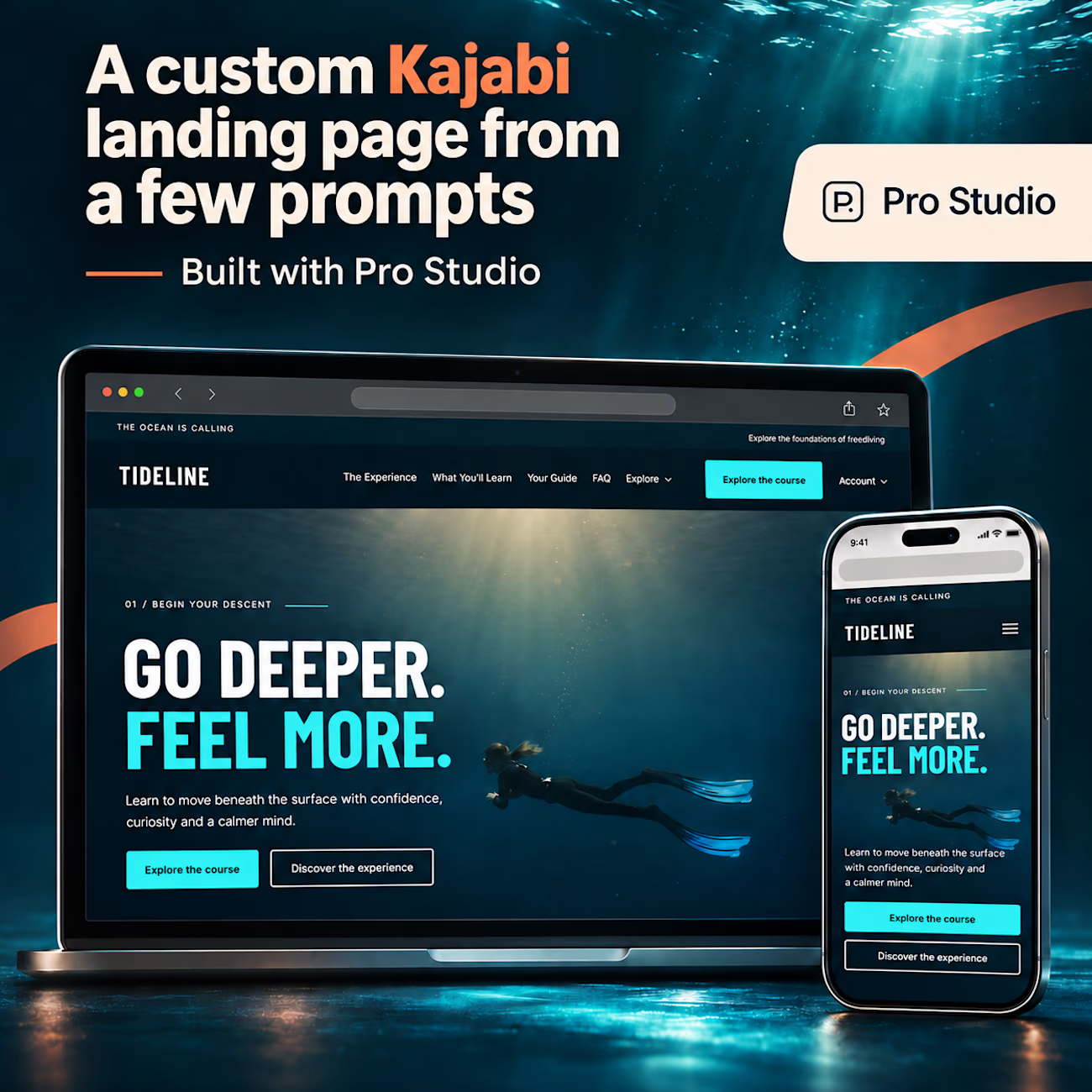
A high-end Kajabi landing page, built in just a few prompts with Pro Studio. 🌊
Meet TIDELINE: a fictional freediving school demo with immersive visuals, oversized typography, a custom header with dropdown navigation, and carefully crafted layouts. One page, with a whole lot of...

Amazing

Meet Silk Ribbon for Framer. A wavy image ribbon with momentum drag, hover focus and CMS support. Your gallery, finally moving.


momentum drag on a ribbon is such a nice touch. does it hold up on mobile?

For Ranch University, I designed and built a custom Kajabi website and course platform + community around ranch ownership and life on the land.
Earthy colors, ranch photography, and spacious layouts carry through the site, membership pages, and course presentation. I also handled the course structure and offer setup behind the scenes.
