The network for creativity
Join 1.25M professional creatives like you
Connect with clients, get discovered, and run your business 100% commission-free
Creatives on Contra have earned over $150M and we are just getting started
Back to feedPost

Peanut Save logo & Visual identity highlights, full project on behance, still open to gigs this August


The network for creativity
Join 1.25M professional creatives like you
Connect with clients, get discovered, and run your business 100% commission-free
Creatives on Contra have earned over $150M and we are just getting started








Related posts

VÉLLE - Minimal Luxury Fashion Brand Identity
A conceptual fashion brand built on quiet luxury and timeless essentials.
What I did:
→ Logo Design (Primary + Secondary)
→ Brand Identity & Color System
→ Product Mockups (T-Shirt, Cap, Tote Bag)
Concept: Less is more. Clean serif typography with subtle accent for premium feel.
Palette: Beige #E8DDD0 / Black #0A0A0A
Full case study on Behance: behance.net/gallery/257321557
Open for freelance projects - DM for fashion branding.

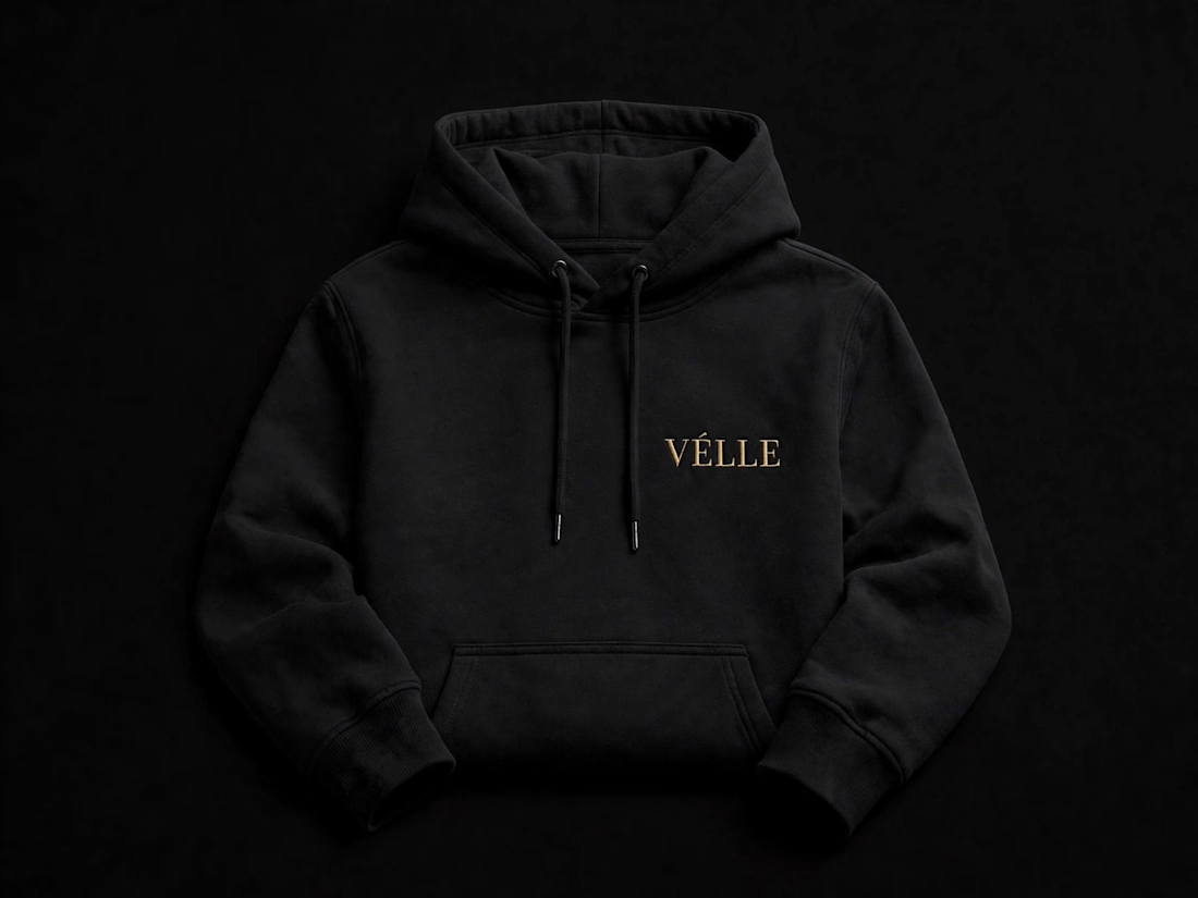
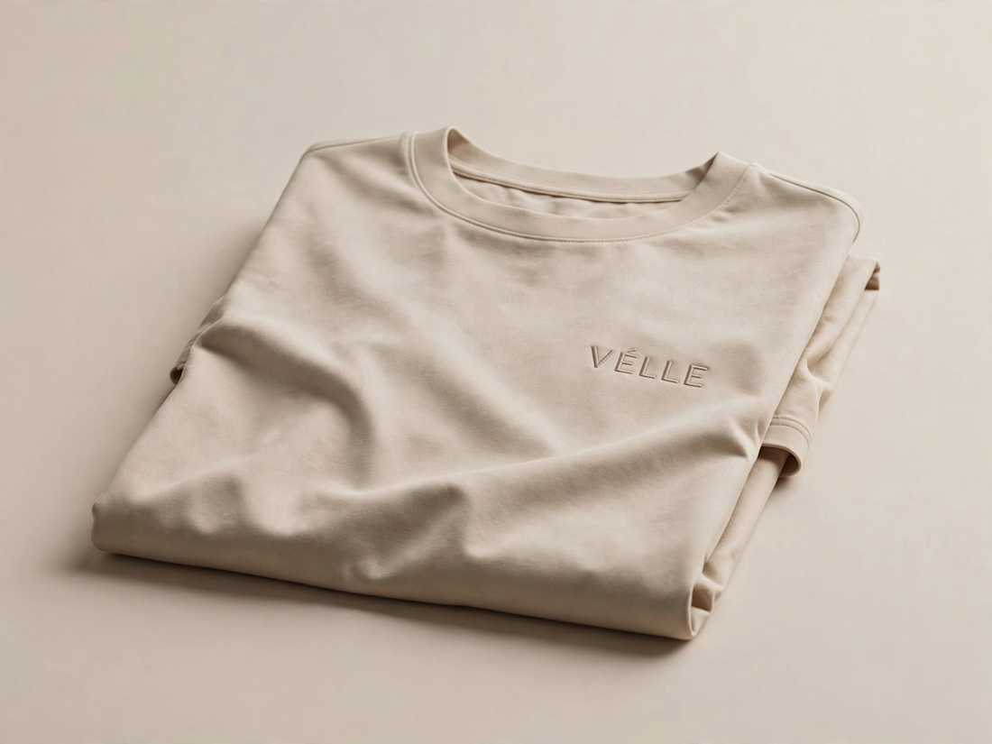
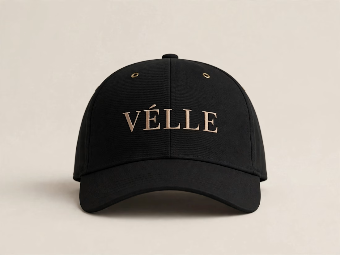
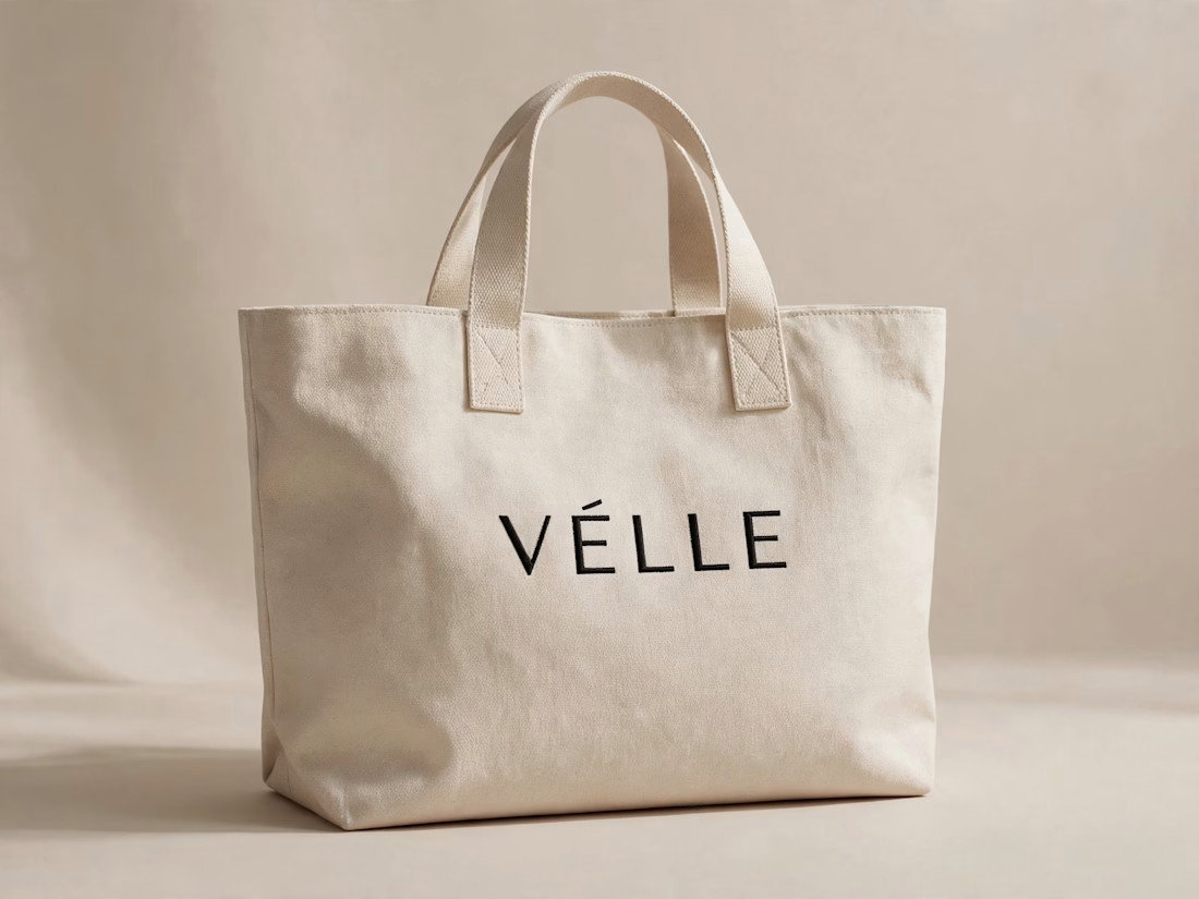

love the minimal direction on this. VÉLLE feels expensive but not loud, the tote and cap mockups are so good


Same brand. Same palette. Two completely different proposals for a real estate developer.
A: An isotype built from blocks. Geometric, precise, the language of construction. It says we build.
B: Custom lettering with movement. Warmer, more editorial. It says we build places you’d want to live in.
36 voted
51%

35 voted
49%

71 votes
Closed

My vote is B, Milagros. Custom lettering with movement has real editorial warmth, which suits a developer selling places people actually want to live in.

Exploring hero sections for Nation e-commerce
Loving the direction

Solid layout, Miguel! The contrast between the clean typography and those interactive bento-style cards is crisp. Building this layout with smooth CSS grid transitions or GSAP pin scrolling would make the UX feel incredibly interactive.