The network for creativity
Join 1.25M professional creatives like you
Connect with clients, get discovered, and run your business 100% commission-free
Creatives on Contra have earned over $150M and we are just getting started
Back to feedPost

FlowMetrics :- SaaS Dashboard UI/UX Design
FlowMetrics is a modern SaaS analytics dashboard designed to simplify complex data and improve decision-making. The product focuses on delivering clear insights through structured layouts, intuitive navigation, and visually organized metrics.
From real-time analytics to user management and system settings, the design emphasizes clarity, usability, and efficiency, helping businesses track performance, manage teams, and take action faster.
Built with a strong focus on user experience, FlowMetrics transforms overwhelming data into a seamless, easy-to-understand interface.

The network for creativity
Join 1.25M professional creatives like you
Connect with clients, get discovered, and run your business 100% commission-free
Creatives on Contra have earned over $150M and we are just getting started



Related posts

End-to-end retail analytics pipeline that turns raw, messy CSV exports into business decisions, built in Python and SQL and runnable with one command.
What it does:
Cleans and validates 6 relational tables, fixes 585 data-quality issues and logs every action
Loads a SQLite warehouse with keys, constraints and window-function SQL
Customer analytics: RFM segmentation, cohort retention, CAC / LTV by channel, product Pareto, market-basket analysis
Churn prediction model validated on future data (ROC-AUC 0.71, no data leakage)
6-month revenue forecast, best of 3 models by backtest (4.2% MAPE)
Auto-generated Excel report (live formulas, native charts) and an interactive Streamlit dashboard
18 automated tests




AI Analytics Dashboard
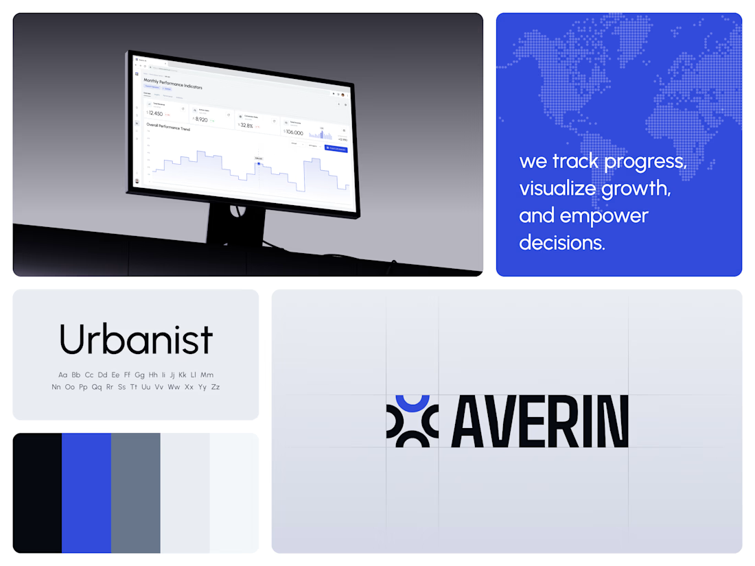
One blue runs from the logo to the chart line.
Revenue, active users, conversion rate and income sit in a row of cards above the trend chart. The cards answer where the numbers stand. The stepped line answers how they got there, holding each period's value until the next, with a tooltip on a dashed guide line for the exact figure.
The identity pairs a four-arc mark with a condensed wordmark, drawn to the same top and bottom lines on the construction grid. The top arc's blue comes back in the slogan tile, the chart line and the main button, so the brand and the product share one accent.
Designed by the Hue & Machine team.
#DashboardDesign #DataVisualization #SaaS #Analytics #AI #WebApp #BrandIdentity #UIDesign #ProductDesign #FigmaDesign



Skincare labels can be difficult to decipher, especially when you’re trying to understand ingredients, spot potential allergens, and find products that fit your budget.
Purefy is an AI-powered clean beauty app designed to make that process simpler. Scan a product barcode to explore ingredient information, then compare personalized alternatives across different price points. The experience brings product discovery and comparison into a clear, approachable mobile interface.
Soft pastels, rounded elements, and expressive typography give the app a fresh visual identity while keeping product information at the center.